How AI Decision-Making is Improving Enterprise Outcomes
Blog
Share 
TABLEAU 2019.2 RELEASE
Tableau 2019.2 Release – A Deeper Dive
Tableau has released the newest version of the platform that enhances the way people visualize and interact with data. In this article we’ll go through some of the exciting new changes included in Tableau 2019.2 and how business will benefit from these newly enhanced and released features.
The major release of Tableau has on-boarded some impressive features and functionality that will have big influence in data visualization and business productivity. In this post, we will highlight some significant and exciting features that are a part of this release.
1. Upscale your Viz with Vector Maps:
Vector Maps enhances your mapping experience by rendering a crisp output as you pan, zoom in, and zoom out to explore your geospatial data. This new feature also leverages the census data from American Community Survey (ACS) to incorporate demographics data into your dashboard.
Highlights:
Enhanced mapping interaction with sharp rendering
Improved default maps styles: Dark, Normal, and Light
New map styles: Street, Satellite, and Outdoor
New background mapping styles: subway and train stations, building footprints, terrain, and water labels
Demographics data from American Community Survey (ACS)
Usability:

Above recording is a view of the new map styles that is a part of the Tableau 2019.2 release. Here you can see how simple it is to include and switch between the newly added map layers. The maps have become crisper while zooming and panning.
2. Enable Interactivity with Parameter Actions
Improved parameter actions is another powerful feature that powers up interactivity in your dashboards and help your viewers gain deeper insights into the trends. It unlocks the ability of a viewer to visually change a parameter’s value thereby offering you endless possibilities to create a truly interactive dashboard.
Highlights:
Interactive relationships between data, dashboard, objects, other workbook sheets and web
Enhanced interactivity by creating marks on a Viz
Improved user experience by transferring control to the end user
Allows users to dynamically change SQL queries, drive reference lines, calculations and filters
Usability:

With this feature the end users can dynamically view the parameter values. In the above example, we have created a parameter ‘order date’ and placed Day of order date and sales into the view and we have added reference line for sales. When applied in a parameter action, the values get changed dynamically.
3. Left Nav, Favorites, and Recent for Enhanced Navigation
Navigate seamlessly and find the content you are searching with the improved navigation. The new navigation features will intensify the already powerful content browsing experience. You can easily find your favorite and recent content including projects and prep flow at the top.
Highlights:
Improved access to key pages and content
New quick access navigation bar with personalized content relevancy
Welcome screen with navigation walk-through for new users
Completely re-designed homepage
Usability:

4. Talk to your data with AskData
AskData is a fairly new module and growing quickly in popularity with the 2019.1 release. Tableau is continuing to expand on this by adding streamlined and innovative capabilities to AskData. You now have the option to add calculations on the fly without having to build them into the data source. You can also ask more sophisticated questions and get answers with the enhanced AskData.
Highlights:
Improved interface to allow more conversational interactions
Enhanced language processing to edit statements from an existing question
Features to execute calculations on the fly
Usability:

In the above example, you can experience the power of the natural language processing engine built into the latest version of ask data. When we ask ‘How are my sales doing by numbers?’, the system automatically understands our query and displays the sum of sales by segment. We can further segment it by year by asking further questions or adjust the values according to our requirements.
These are only a few of the many exciting updates Tableau has incorporated to continue pushing the boundaries of data analytics and prepare for the future market changes. A complete list of updates and features could be found in Tableau’s release notes: https://www.tableau.com/products/all-features
Beinex is a digital transformation organization en-rooted with ideas, innovation and unparalleled customer service. Our mission is to transform the way individuals and the organizations work with the data through innovation and experience.
If you are interested in learning more about the latest Tableau 2019.2 features and updates, please contact us at training@beinex.com/ info@beinex.com and we would be happy to schedule a Tableau demo or training for you and your company.
-
Related Articles

AWS Serverless Evolution: What's New in the World of Cloud Innovation
Serverless Computing
Serverless computing, often referred to as "serverless," is a cloud computing model where developers can build and deploy applications without having to manage the underlying server infrastructure. In a traditional server-based architecture, developers need to provision, configure, and manage servers to run their applications, which can be complex and time-consuming.
In a serverless architecture, the cloud provider (such as Amazon Web Services with AWS Lambda, Microsoft Azure with Azure Functions, or Google Cloud with Google Cloud Functions) abstracts away the server management aspect. Developers can focus solely on writing code for the specific functions or tasks their application needs to perform without worrying about server provisioning, scaling, or maintenance.
Serverless services offer several significant benefits that can have a positive impact on application development, deployment, and management. Some of the key significances of serverless services include:
- Simplified Infrastructure Management
- Auto-Scaling
- Rapid Development and Deployment
- Event-Driven Architecture
- Reduced Administrative Overhead
- Global Scalability
- Resource Optimization
- Improved Fault Tolerance
Amazon Web Services (AWS) continuously introduces new capabilities and features to their serverless services for several reasons aimed at improving the developer experience, expanding use cases, and meeting evolving customer needs.
Latest buzz in AWS serverless services
1. General availability of AWS Database Migration Service Serverless
On June 2nd, 2023, AWS unveiled the widespread availability of AWS Database Migration Service (AWS DMS) Serverless. This release simplifies database migrations by automating the provisioning and scalability of migration resources. With AWS DMS Serverless, users gain the ability to seamlessly replicate data across a diverse range of widely used databases, analytics engines, and services—think PostgreSQL, MySQL, Oracle, Amazon Redshift, Amazon DynamoDB, Amazon Aurora, and more. By handling the often-cumbersome work of database migration, AWS DMS Serverless minimises the need for manual resource estimation, provisioning, monitoring, and scaling. This advancement translates to migration timeframes measured in hours, and cost savings realised through payment solely for consumed data migration resources.
2. Provisioned Concurrency for Amazon SageMaker Serverless Inference
As of May 10th, 2023, AWS has introduced the general availability of Provisioned Concurrency support for Amazon SageMaker Serverless Inference. This innovative feature ensures that models deployed on serverless endpoints offer consistent performance and impressive scalability. Through the integration of provisioned concurrency, users can infuse their serverless endpoints with a predetermined volume of concurrency, effectively maintaining the readiness and responsiveness of SageMaker endpoints. This offering particularly suits scenarios where traffic is predictable, yet throughput remains relatively low.
3. Amazon Aurora Serverless v2 is now available in 4 additional regions
The footprint of Amazon Aurora Serverless v2 has now expanded to include four additional regions. Aurora Serverless v2, an adaptive, automatic scaling configuration for Amazon Aurora, has the remarkable ability to instantaneously scale to accommodate even the most resource-intensive applications. By making precise capacity adjustments, Aurora Serverless v2 ensures that an application always receives the optimal database resources it demands. This dynamic resource allocation extends to encompass an impressive range of Amazon Aurora features, spanning read replicas, multi-AZ support, Performance Insights, and Global Database functionality. This powerful suite is ideally positioned to serve a diverse spectrum of applications. Enterprises dealing with an extensive array of applications or Software as a Service (SaaS) providers managing multi-tenant environments replete with numerous databases can harness the capabilities of Aurora Serverless v2 to deftly manage database capacity across their entire infrastructure.
4. AWS Lambda introduces response payload streaming
AWS Lambda, the bedrock of serverless computing, has ushered in an exceptional enhancement: response payload streaming. This capability enables AWS Lambda functions to gradually stream response payloads back to clients, even accommodating payloads that surpass the 6MB threshold. A monumental leap forward for web and mobile applications, this feature marks a departure from the conventional request-response model. Previously, applications built on Lambda necessitated the complete generation and buffering of responses before they could be sent to clients—an approach that often resulted in delayed first-byte transmission times. With response payload streaming, Lambda functions can transmit partial responses to clients as they are ready, substantially improving the all-important first-byte transmission time, a facet crucial for web and mobile applications alike. This innovation stands to elevate the performance of AWS Lambda-powered applications to new heights.
As AWS continues to introduce new capabilities, it's evident that the serverless paradigm is here to stay. This shift isn't just a technological trend; it's a fundamental change in how we architect, deploy, and scale applications. With each enhancement, AWS reinforces its commitment to providing customers with the tools they need to succeed. With AWS's ongoing dedication to pushing boundaries, the future of cloud computing holds the promise of even more remarkable advancements.
Beinex+ AWS Offerings
AWS provides security services such as AWS Shield and AWS WAF to help protect against phishing attacks. Strengthen your defences by integrating robust security software from the AWS Marketplace and embracing Two-Factor Authentication (2FA). Safeguard against evolving threats like homograph phishing for a safer online experience.
Beinex is an AWS consulting partner, and we empower customers to host their BI solutions, provide security services and much more on the cloud. Our cloud migration experts bring in best-in-class stability and reliability by understanding your business strategy and working closely with you to deploy AWS infrastructure as a service.

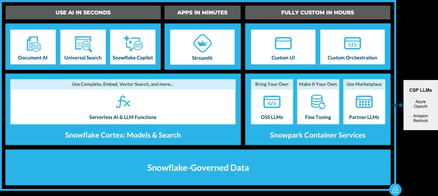
Snowflake and GenAI: Revolutionizing Data Analytics
Snowflake Cortex: AI-Powered Data at Your Fingertips
Snowflake Cortex provides access to industry-leading AI models, including large language models (LLMs) and vector search functionality. These serverless tools simplify everyday analytics and AI development, all within a single line of SQL or Python.
 Source: https://www.snowflake.com/en/blog/use-ai-snowflake-cortex/
Key benefits include:
• Instant Access to AI Models: Snowflake users can leverage specialized machine learning and LLM models without managing expensive infrastructure. • Enhanced Data Insights: With Cortex, users can analyze vast datasets using Snowflake’s powerful AI capabilities, unlocking strategic insights to improve decision-making. • Simplified AI App Development: By removing technical barriers, Cortex democratizes AI access, enabling users of all skill levels to build AI applications.
LLM-Based Models for Unstructured Data (in private preview):
• Answer Extraction: Extract key information from unstructured datasets. • Sentiment Detection: Identify the sentiment in textual data. • Text Summarization: Create concise summaries of lengthy documents for quicker insights. • Translation: Perform large-scale text translation efficiently.ML-Based Models (available soon):
• Forecasting: Automatically forecast time series based on historical data, adjusting for seasonality and scaling. • Anomaly Detection: Detect outliers in time series data, useful for monitoring data pipelines. • Contribution Explorer: Identify key factors contributing to changes in metrics between two time intervals. • Classification: Categorize data into predefined classes to offer recommendations based on trends.
General Purpose Models for Broader Use Cases:
• Complete: Generate text completions using state-of-the-art open-source LLMs like Llama 2. • Text2SQL: Convert natural language queries into SQL, powered by Snowflake’s LLM, similar to the Snowflake Copilot feature. These serverless functions offer out-of-the-box capabilities that can be integrated into analytics workflows and app development in Snowflake. For example, with just a few lines of code, developers can embed these functions into chatbots using Streamlit. This allows Python-savvy users to build secure and powerful LLM applications quickly, often within hours.
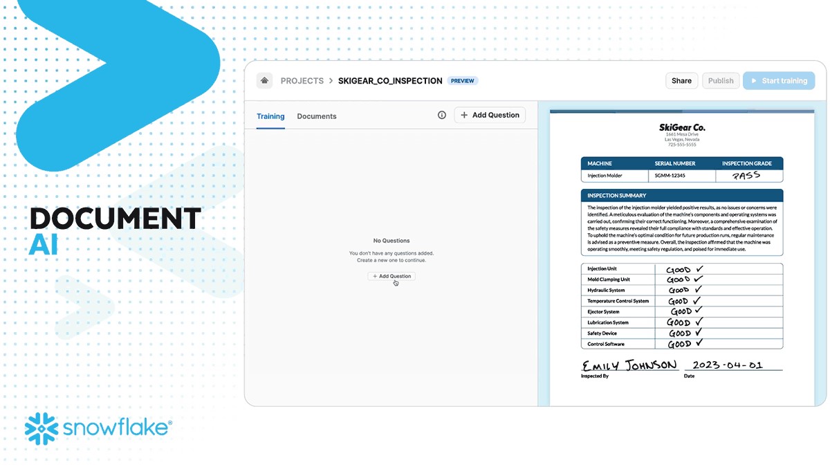
Document AI
Document AI (currently in private preview) leverages large language models (LLMs) for seamless data extraction. By utilizing a pre-trained model and a user-friendly interface, customers can process various document types—such as PDFs, Word files, text files, and even screenshots—to quickly obtain answers to their queries. This capability can be scaled to build pipelines that automate data extraction, significantly reducing manual effort and saving time.
 Source: https://www.snowflake.com/en/blog/use-ai-snowflake-cortex/
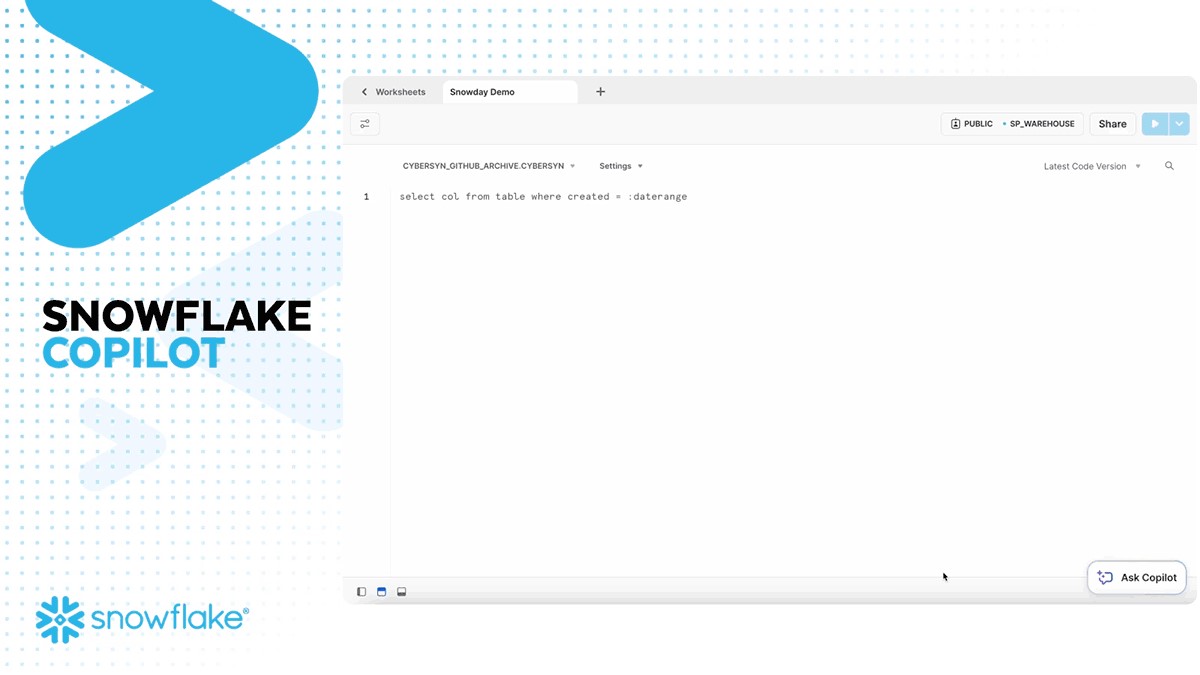
Snowflake Copilot: Your AI-Powered SQL Assistant
Snowflake recently introduced Snowflake Copilot, an AI-driven solution that makes SQL query generation faster and more efficient. With Snowflake Copilot, users can ask data-related questions in plain English, and the AI will generate SQL queries to deliver the desired insights.
Key Features of Snowflake Copilot:
• Text-to-SQL: Users can interact with their data using natural language, eliminating the need for complex SQL coding. • Enhanced Accuracy: The AI continuously refines its understanding of user queries, providing more accurate SQL code suggestions. • Data Exploration: Ask open-ended questions about your data and receive detailed insights without writing complex queries.
The Future of Generative AI with Snowflake
Snowflake is pushing the boundaries of Generative AI with its continuous development of AI tools like Snowflake Cortex AI and Snowflake Copilot. These innovations pave the way for a future where natural language becomes the primary interface for data analysis, enabling businesses to extract more value from their data while maintaining robust governance.
By integrating AI capabilities directly into the data platform, Snowflake empowers users to streamline workflows, reduce processing times, and unlock new levels of productivity—all without needing deep AI expertise.
A Transformative Partnership for the Future
Generative AI, coupled with Snowflake’s powerful data platform, is a game-changer for businesses looking to innovate and scale. Whether it’s enhancing productivity, improving decision-making, or driving customer engagement, Snowflake’s AI solutions are built to transform how enterprises interact with their data.
As AI continues to evolve, so will Snowflake's offerings, bringing more capabilities, deeper insights, and greater efficiencies to businesses worldwide. Ready to experience the future of data analysis with Snowflake and AI? The journey has just begun!
Snowflake + Beinex Partnership
Beinex is a Snowflake Services Partner Premier Tier, and the partnership reaffirms Beinex’s commitment to delivering exceptional data solutions and positions the company at the forefront of industry advancements. Harnessing the true potential of the data, partnership drives innovation and success in the digital era.
Belonging to Snowflake Services Partner Premier Tier, Beinex leverages Snowflake’s advanced capabilities and seamlessly integrates them into its comprehensive data solutions. This enables Beinex to accelerate the pace of Digital Transformation for its clients, providing them with the tools necessary to extract maximum value from their data and thrive in an increasingly data-centric world.
Connect with us for a free demo: https://beinex.com/contact-us/

Beinex Achieves Snowflake Select Tier Partner Status

Benefits: Enhanced Data Cloud Capabilities
The partnership will let Beinex turbocharge services on the AI-ML, analytics fronts by utilising storage and compute scalability unlocked by the unique collaboration. It awards Beinex and its clients the capability to flourish in terms of cost leadership, domain leadership and added utilisation of potential in sync with market conditions.
Data marketplace enhancement
The partnership also means that acquiring and testing third-party data is now easier which also entails the Snowflake users to imbibe the expanded third-party data into their environment, attach it to their first-party data and evaluate the data efficacy vis-à-vis customer experience along with the impact it can create.
There is little doubt that the capability is very much in demand as Beinex clients are into delivering powerful customer/ user experience as a part of their service efforts
Features:
- Privacy-safe
- Secure sharing platform
- No need to set up extra secure portals to support sharing of Personally Identifiable Information
The power of partnership
Beinex partnership with Snowflake enables it to offer clients advanced features like automated tuning and elastic compute with unlimited decoupled computing capability, along with the analytics modernization services, to help organisations realise exponential Return on Investment. This upgrade in status will take business to the next level for both Beinex and its esteemed client line-up.
Partnerships are what make Beinex stronger. The company has strong partnerships with some of the leading technology firms, research labs, and universities around the globe.
Businesses can leverage the power of our partner ecosystem to maximize the value of their end-to-end analytics journey.
Beinex is ecstatic to receive this recognition as a Snowflake select services tier partner and is grateful to Snowflake for acknowledging its client services.
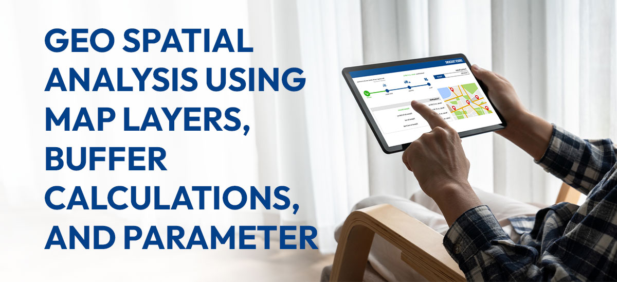
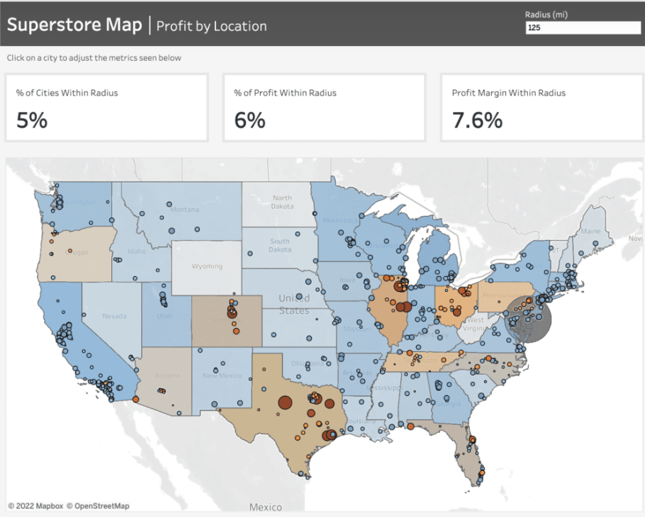
Geo Spatial Analysis Using Map Layers, Buffer Calculations, and Parameter Actions
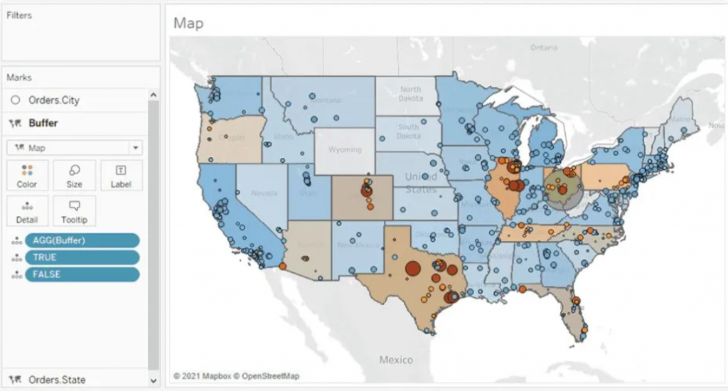
For instance, the dashboard given below mirrors a project undertaken for a client seeking insights into the pandemic's impact on their business across specific areas. They wanted to determine the number of stores stocking their product within a defined radius, highlighting the local business impact amid the pandemic.
 To craft the map showcased in this dashboard, we leverage Tableau's map layers feature introduced in version 2020.4. For further insights into this functionality, additional details can be found here.
Prior to initiating the map creation process, frequently refer to the Profit Margin field. Here's the calculation for this field: it computes the percentage of Sales that translates into Profit. This calculation enables us to gauge the profitability derived from our sales figures.
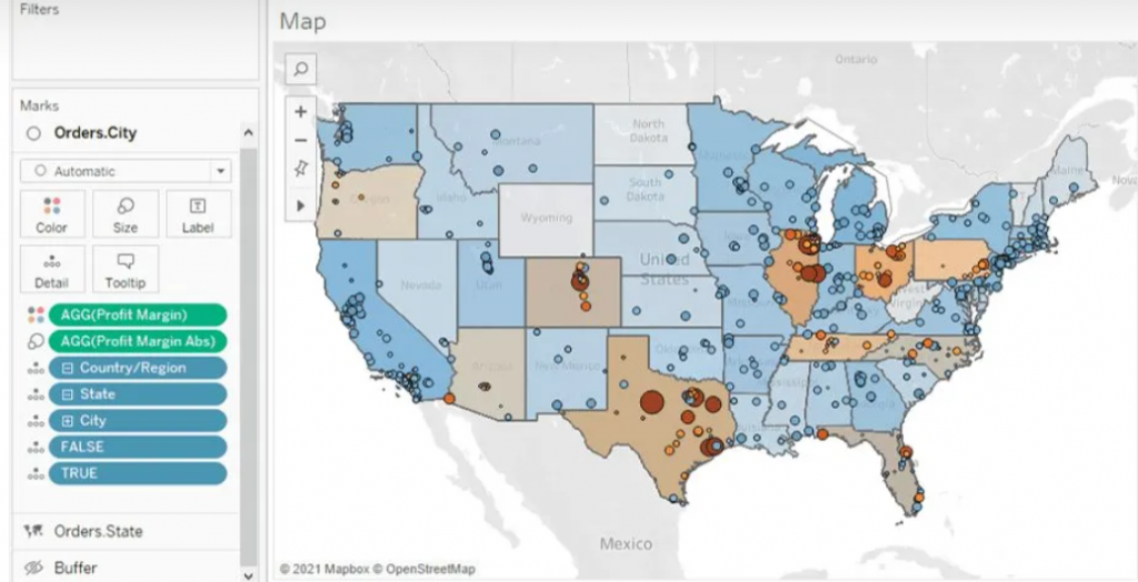
 For the States map layer, the State field is utilized and placed on the 'Detail' shelf. Each state is color-coded based on its Profit Margin.
Moving to the Cities layer, the City field is added onto the top left area labeled "Add a Marks Layer." To ensure the visibility of every city, the State level of detail is included as well. This accounts for cities existing in multiple states, displaying every city/state combination. Cities are color-coded using the Profit Margin field, with additional color based on the absolute value of the Profit Margin. This helps visualize the range and direction of profitability for each city.
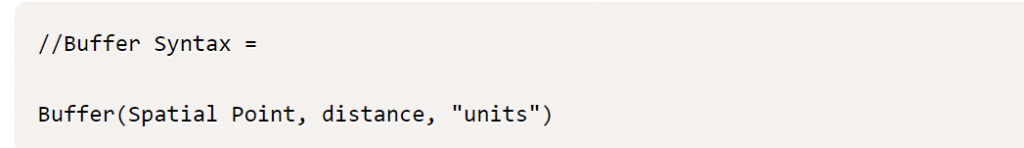
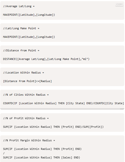
Buffer Calculation
The Buffer calculation generates a radius, known as a "buffer," around a specific map point, defined within the syntax parameters. Here's the syntax breakdown for the Buffer: The initial part determines the center location, followed by the distance around the point, and finally, the chosen unit of measurement.
 To establish the desired centroid point, we employ the Makepoint function. This function simply utilizes latitude and longitude coordinates to generate a point on the map. Below is the calculation illustrating its usage.
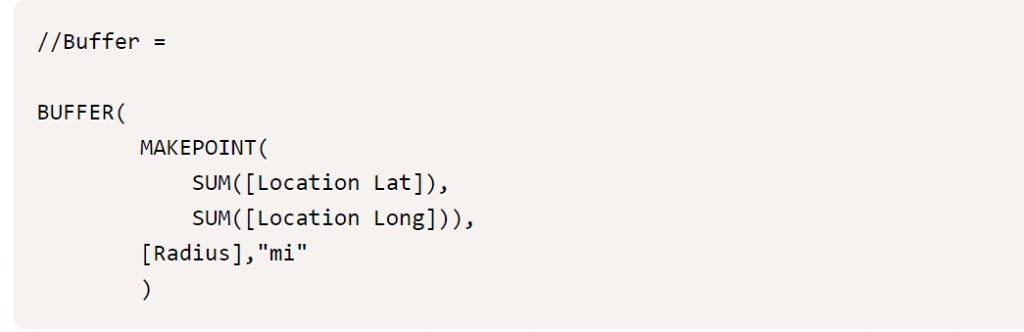
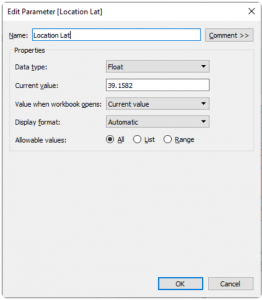
To achieve the interactivity you desire, you'll begin by creating three parameters: [Location Lat], [Location Long], and [Radius]. These parameters offer flexibility, allowing you to adjust them within the dashboard interface.
As you click on different cities, the [Location Lat] and [Location Long] fields dynamically change, altering the central point. Meanwhile, the [Radius] field, functioning as an input parameter, enables you to modify the radius distance according to your preferences. This setup grants you personalized control over these parameters directly within the dashboard.
With the creation of the final map layer field, you can now drag this field to the top left of the map and add it to the existing layers. Once done, you'll have all the map layers integrated into the map, allowing you to recreate the dashboard as depicted below. This comprehensive setup will mirror the dashboard layout and functionality.
Parameter Actions
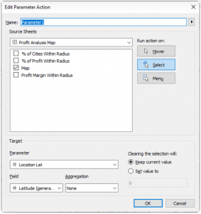
Parameter Actions are essential at this stage to ensure dynamic interaction within the map layers. By implementing parameter actions, we enable the Location Lat and Location Long fields to adjust dynamically when clicking on a city. This action directly affects the MAKEPOINT() field within the Buffer calculation, effectively altering the radius location. Below, you can observe the setup of the parameter action and how it facilitates this dynamic transformation.
 Finally, we aim for these parameters to influence the available metrics showcased at the top of the dashboard. These metrics offer insights into the concentration of profit and profit margin within the selected radius. Below, you'll find the supporting calculations and the formulae for the metrics displayed on the dashboard. These metrics serve as indicators of profitability and profit margin concentration within the chosen radius.
Wrapping up, creating interactive data visualizations opens doors to explore and comprehend information, fostering informed decision-making and exploration of new analytical paths.

Digital Transformation in Banking: The Golden Touch of RPA
The brick-and-mortar banking model faced an existential threat with the emergence of Fintech (financial technology), or new technology that aims to enhance and automate the delivery and use of financial services. And later, new-gen technology companies started to deliver these services on secure digital platforms at a lower cost, resulting in traditional banks adopting advanced technology too.
Most banks were apprehensive about adopting automation to the finance function. This concern is frequently centered on whether it is possible to replace existing systems entirely with automation. The core banking system is perhaps the best example. Automating ‘untouchable’ core functions is not necessary. Instead, it can deal with the issues that surround them. But rooting your digital transformation in all other banking processes in intelligent, digital workflows is feasible.
What is digital banking?
Digital banking involves digitising all traditional banking products, procedures, and activities to serve customers through online channels. Examples include obtaining bank statements, cash withdrawals, funds’ transfers, accounts management and checking opening deposit accounts, loan management, bill payment, cheque management, and transaction records monitoring.
With digital banking, all banking services are accessible round-the-clock on mobile phones, PCs, and other intelligent devices. Thanks to digital banking software, all traditional services are now easier to obtain, comprehend, and manage.
Leading banks in the UAE make significant financial investments in the digital transformation of their banking operations and launch digital-only banks in the country.
Pros of digital banking
Here are some of the most known benefits of digital banking:1. Scalability
Numerous functions provided by digital banks are just absent from traditional banks. This includes investing directly in stock markets and acquiring cryptocurrency and gold using the banking app. The user of digital banking can modify their security preferences, transaction caps, and even whether they wish to enable NFC or magnetic stripe transactions.
2. Personalisation
In digital banking, sophisticated personalisation tactics are powered by artificial intelligence (AI) and machine learning (ML). Customers can get timely financial solutions, interactive tools, and instructional resources from banks. Automatic budgeting, expenditure analytics, and savings reminders are a few technologies that can inform and engage customers.
3. Cost savings
Traditional banks spend a lot of time and expense on the checking and accounting processes. The elimination of unnecessary operations is what makes digital banking software's operational costs less expensive. With digital banking systems, banks may take on less labour by automating the procedures related to routine transactions. Because fewer persons and stages are required for transactions when technology is used, there is a lower chance of financial mistakes, and money transfers are more straightforward.
The touch of automation
Let’s also look at the most automated processes in the banking industry that have undergone complete digitization with the touch of automation.
1. Loan processing
RPA or Robotic Process Automation can reduce lengthy procedures that typically take months to as little as 10–15 minutes. Automation enables essential data extracted from customer-submitted documents to validate all details. Systems employ Machine Learning to make better-informed judgments based on data analytics supported by more straightforward statistical methods. Intermediary bots infer business logic and ask the user to correct any inaccurate entries to ensure safer loan judgments and automatic confirmation letter creation
2. Know Your Customer (KYC)
Not only is Know Your Customer (KYC) a necessary compliance procedure for any bank, but it is also the trickiest. To execute the customer checks, this process requires at least 150 and maybe thousands of FTEs.
According to Thomson Reuters, a small number of banks annually invest at least $500 million in KYC compliance. Banks have recently begun utilising RPA to gather and flawlessly check consumer information to cut costs and resources. Because of this, banks can now complete the KYC procedure with fewer resources and mistakes.
3. Anti-Money Laundering (AML)
One of the most data-intensive processes, AML, can be made simpler with some help from Robotic Process Automation (RPA). Implementing RPA has proven more efficient than labour-intensive traditional banking solutions in identifying suspicious banking transactions or automating repetitive operations.
4. Fraud Detection
Banks are concerned about enhancing their fraud detection system due to the rising banking fraud scenario. Banking fraud has increased since the introduction of cutting-edge technologies. Considering this, it is virtually hard for banks to manually review each transaction to spot fraud trends in real-time. RPA cleverly uses the "if-then" principle to spot any potential fraud and report it for prompt resolution with the relevant department.
5. Mortgage processing
Both banks and their clients find mortgage processing extremely labour-intensive and cumbersome. Before processing each loan request, banks manage their mortgage procedure for more than a month, going through several unnerving stages like job verification, credit checks, and inspection. The processing of mortgage loans could be severely delayed by even the slightest mistake made by either the customer or the bank.
But RPA has accelerated this process for banks. Robotics goes through a defined set of rules to eliminate potential bottlenecks and speed up mortgage processing.
Customer acceptance of digital banking services has rapidly increased throughout the UAE. According to bankers, the older generation, initially apprehensive, is now quickly adjusting, whereas younger clients are quick to accept digital offerings and digital-only platforms. Digital banks are drawing a lot of new consumers due to lower account maintenance expenses and improved deposit returns.
How Beinex can help you
Beinex is a Dubai-based digital transformation organisation anchored in innovation, creativity, and unrivalled customer service. Our extensive analytics modernisation and training services will empower you to construct an intelligent and dynamic banking enterprise. Our extensively experienced consultants enable a seamless digital experience for the banking industry.