How AI Decision-Making is Improving Enterprise Outcomes
Blog
Share 
Smarter Analytics with Tableau Pulse (Infographic)
 10 October 2024
  Team Beinex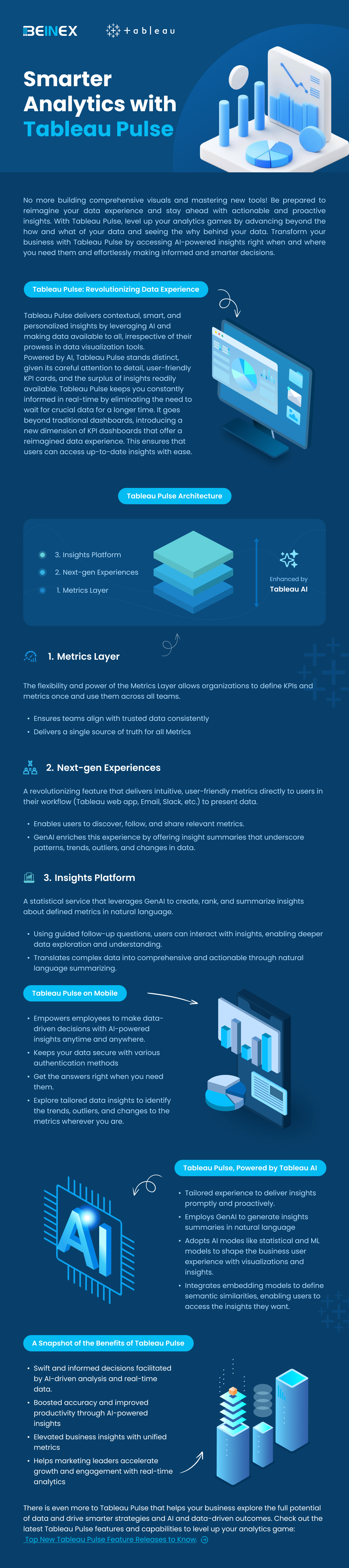
No more building comprehensive visuals and mastering new tools! Be prepared to reimagine your data experience and stay ahead with actionable and proactive insights. With Tableau Pulse, level up your analytics games by advancing beyond the how and what of your data and seeing the why behind your data. Transform your business with Tableau Pulse by accessing AI-powered insights right when and where you need them and effortlessly making informed and smarter decisions.
Related Articles
Agriculture and the Internet of Things: The Present and the Future
. A farmer must be knowledgeable about soil, climate, and market. If something goes wrong with any of these areas the result will be devastating. This is where one of mankind’s biggest inventions, the Internet, offers the most reliable assistance. The Internet of Things has a plethora of devices that can make the work of a farmer far easier and more productive.
Smart Sensors
Smart sensors are the number one in a huge list of IoT devices being used in agriculture. These devices can be used to gather data about various aspects of agriculture like the humidity, acidity or mineral contents of the soil. Earlier these kinds of knowledge were something that farmers were supposed to gain after many years of experiences of both gain and loss. Or they had to depend on time taking and distant laboratories. But even a lab test had a limited chance of being hundred percent accurate as the soil’s quality could change in the blink of an eye. Smart sensors can provide the farmer with accurate data in real time. The data collected can precisely calculate and predict many changing or evolving aspects like the humidity content of the soil. These data can help decide:
- The crops to be planted
- The manures to be used
- The amount and timing of watering
- The market price for the final product
Drones
Next in the line is the use of drones. These can be used to:
- Observe vast areas and collect important information that can help decide the most efficient methods of cultivation.
- Provide the farmer with a bird’s eye view, thereby reducing the time and effort wasted in surveying the land personally.
- Assist in remote application of pesticides and herbicides.
- Track the cattle or scrutinize their health.
The data collected by sensors and drones can be used to create a plan through which the farmers can guarantee a good output with minimum input and loss. This will reduce a great percentage of both financial and manual investment. Besides, instead of depending on one’s gut feelings, a farmer can take a multitude of important decisions with scientifically backed technology. IoT devices can be easily operated by the farmers by connecting it to a laptop or mobile phone. There are various apps that are already very popular for providing agricultural data. There are also various government backed projects aimed at collection of data, providing online solutions and even arranging financial support for the smart framer.
Smart Greenhouses
Another IoT contribution is Smart Greenhouses. Greenhouses always contain plants which are out of their natural habitat and therefore need extra care. IoT enabled greenhouses can help:
- Monitor the procedures of watering
- Adjust the humidity inside
- Analyse and provide proper lighting
- Ensure proper balance in delicate matters like the level of carbon dioxide, temperature, etc.
- In disease control by providing a close watch on all the plants’ vitals.
Such precise and high level of attention makes sure that there is no contamination in the greenhouse environment that could lead to spread of diseases. It can also help in detection or prevention of theft, which is a big risk especially if the plants are of rare or protected species.
Livestock Management
IoT in livestock management is bringing about revolutionary changes. With the spread of COVID-19, it is now a very crucial requirement that the livestock are healthy throughout their life. Even a small disease in the animal could turn out to be dangerous for the human who finally consumes it. Also spread of diseases in small animals like poultry can lead to devastatingly large loss for the farmer. Smart devices can help:
- Track the vitals of each animal or bird through devices which are wearable.
- Alert the farmer of even slight variations in the vitals via SMS, notifications, etc.
- Administer medicines at the correct time, to any number of animals without having to keep manual tabs
All these crucial routines help in keeping diseases in check and thus reduce livestock loss.
There are many more IoT powered devices that are revolutionizing the field of livestock management like Geo-tagging and Geo-fencing.
- Geo-tagging: It is used to locate the cattle that has strayed away from the herd or gone missing. Geo-tags are especially useful in case of natural calamities like flood, tsunami, landslide, etc. For example, the farmers of Kerala in South India used geo-tags to locate their animals that had either gone missing or died in the flood of 2018.
- Geo-fencing: It is another popular method and it uses GPS to monitor and keep the cattle within a boundary without actual fencing. This can help in detecting cattle theft or even wild animal attacks on the livestock.
The Limitations and Solutions
IoT is already here to stay in the fields of agriculture, and there is more to come. But like anything else IoT in agriculture has certain cons. These limitations can thankfully be eliminated.
| Limitations | Solutions |
|---|---|
| The data that is being collected by the various devices is stored on cloud. So the farmers are required to have a basic know-how of data analyzing and even device maintenance. |
|
| IoT devices need a lot of investment and the farmers might find it difficult to find funds for them. |
|
| Another area that requires improvement is the availability of fast internet connectivity. Internet is still something expensive or even unavailable in many parts of the world. There are places too remote to have net access. | These limitations are being dealt with and hopefully can be improved with the help of technologies like space-based internet systems. |
The Future
The agriculture IoT market is estimated to grow from USD 11.4 billion in 2021 to USD 18.1 billion by 2026 at a CAGR of 9.8% during 2021-2026, as per ResearchAndMarkets.com.
A few insights can be:
- Precision Aquaculture: The agriculture IoT market for the precision aquaculture application segment is projected to register the higher CAGR during the forecast period, by application. Increasing demand for real-time tracking of fishing activity is the major reason behind the high growth of the agriculture IoT market in aquaculture farm monitoring applications.
- Production Planning: The production planning stage segment of the agriculture IoT market is estimated to register the largest market share in 2026, by the farm production planning stage.
- Small Farm Segment: The agriculture IoT market for small farm segment is projected to register the higher CAGR during the forecast period, by farm size. Small farms are expected to adopt automation and other advanced technologies at the highest rate in the coming years due to the reducing cost of farm automation equipment and advancements in technology that make it more feasible to deploy automation tools even on smaller farms to achieve high returns on investments.
- Automation & Control Systems: The automation and control systems for the precision farming hardware segment of the agriculture IoT market is estimated to register the largest market share in 2026, by hardware type. The increasing demand for drones/unmanned aerial vehicles (UAVs) is a major reason behind the high growth of the market for automation and control systems.
APAC is likely to be the fastest-growing agriculture IoT market during the forecast period. Agriculture IoT techniques are expected to be adopted at a high rate in the region. This region consists of emerging countries such as India, China, and countries in Southeast Asia. Rapidly growing population, availability of arable land, and strong government support for farmers through subsidies in these regions are the major factors driving the adoption of agriculture IoT technologies in APAC.
These projections show that IoT based agriculture is here to make a big splash and is a boon of science.

Thrive in Synergy: Leveraging the Confluence of Business Intelligence & Advanced Analytics
In this data-driven world, enterprises are dependent on humongous quantities of data that are subsequently analysed to uncover trends previously hidden and to carry out business functions. New tools, techniques, and technologies like those of Business Intelligence, Advanced Analytics, Machine Learning are used to analyse data and devise insights-informed strategies.
Also, they help entrepreneurs by guiding them to plan day-to-day operations, ensure fast and accurate reporting, increase revenue, identify new revenue streams, identify revenue leakage…the list is virtually endless.
Advanced Analytics
Gartner explains Advanced Analytics as an autonomous or semi-autonomous examination of data or content using sophisticated techniques and tools to discover deeper insights, make predictions, or generate recommendations. It uses Machine Learning, Artificial Intelligence, Predictive Analytics, Data Visualisations, and Text Mining to examine large data sets.
In fact, Advanced Analytics is generally comprised of two divisions:
- Predictive Analytics
- Prescriptive Analytics
Predictive Analytics: What might happen in the future
Predictive Analysis is the third and most critical process of Advanced Analytics. It uses techniques like artificial intelligence, data mining, machine learning, modelling, and statistics to make predictions. Predictive modelling helps businesses like healthcare, marketing, sales, supply chain etc. to optimize operations, improve customer satisfaction, manage budgets, identify new markets, anticipate the impact of external events, develop new products and set business, marketing and pricing strategies.
Prescriptive Analytics: What should be done
Prescriptive analytics is a vital tool used in creating data-driven decisions. optimizing operations, growing sales, managing risks formulating strategies, and reaching organizational goals. It uses statistics and modelling to recommend future actions by applying data to the decision-making process.
Advanced Analytics and Business Intelligence Market Size
The Advanced Analytics market is showing continual progress as enterprises embrace these tools to effectively manage complex business processes. Reportlinker.com predicts that the global Advanced Analytics market size may grow from USD 33.8 billion in 2021 to USD 89.8 billion by 2026, at a Compound Annual Growth Rate (CAGR) of 21.6%.
A similar trend can be noticed in the case of the Business Intelligence market too. To quote Fortune Business Insights, “the Business Intelligence market is set to reach USD 43.03 Billion by 2028 in connection with rapid digitisation and robust demand for data personalisation to foster market development”.
Business Intelligence
Advanced Analytics is all about predicting future strategies, whereas Business Intelligence is focused on past performance, relying on methods such as querying, reporting, and dashboards. It uncovers trends and presents findings through visualization tools. The results show that companies adopt new approaches to increase operational efficiency and improve sales and customer relations through real-time analysis.
Functions of Business Intelligence are listed below:
Data Mining
Data mining is the process of unearthing information and patterns from massive datasets to visualizing in dashboards to generate inferences to assist the decision-making process. By adopting various techniques and procedures, knowledge is extracted to solve business problems to promote sales and marketing.
Process Mining
Powered by Data Mining and Power Analytics, Process Mining extracts insights from the existing data and helps to find the bottlenecks that hinder efficiency and compliance. It ensures a better customer experience, loT process improvement, identifies and analyses supply chain management weak links, optimises procurement and speed-up payment collection.
Complex Event Processing
CEP employs a set of techniques to analyse Big Data for real-time benefits. Opportunities and threats in business operations are identified and monitored to pave the way to success. Companies adopt CEP for fraud prevention and detection, real-time marketing, stock market trading and allied areas.
Business Performance Management
Widely known as Corporate Performance Management (CPM), BPM implies all processes or methodologies that optimise business performance. It also initiates the achievement of business goals like budgeting, planning, and forecasting and helps to improve employee performance. It identifies risks, selection of goals for progressive development, and streamlines financial processes.
Benchmarking
Benchmarking process is evaluating the management practices of one company with its best counterpart. Comparing the organisational processes in relation to the best performances allows companies to evolve by developing plans to improve their tactics.
Top 5 Advanced Analytics Tools
Alteryx: A self-service platform that can help users extract, clean and analyse data through an automated process.
Anaconda: It is an open-source Python and R-focussed platform to analyse and visualise data.
Google Cloud Platform: Known to be one of the enormous machine learning stacks, Google Cloud AI offers many products to analyse and manage data in real-time.
Knime: An open-source software that visualises data flows and helps discover new insights with minimal or no programming.
MS Azure: It is a platform (PaaS) that combines data from various sources, then stores and finally transforms it for different purposes.
Top 5 Business Intelligence Tools
Tableau: Tableau supports multiple data sources to easily analyse and visualise data in handy dashboards.
Power BI: This business analytics tool which can be accessed from anywhere helps in identifying real-time trends and delivering reports via real-time dashboards.
Qlik sense: It is a popular and complete Business Intelligence tool with its unique search and conversational analytics platform that discover new observations using natural language.
Micro strategy: It offers high speed and powerful dashboarding, cloud solutions and hyper-intelligence that can be accessed from a laptop or mobile.
IBM Cognos Analytics: Designed to discover even hidden patterns, Cognos Analytics interprets and presents data in a visualised pattern.
Conclusion
Business Intelligence and Advanced Analytics go hand in hand, from assisting business operations to improving customer satisfaction. Yet they are distinct from each other in their own ways. The amalgamation of these two technologies – Advanced Analytics and BI – improves the efficiency of business operations, delivering predictions based on historical and present data and enhancing performance in sales, maintenance, and customer satisfaction.

Top Cloud Computing Trends 2025: Driving Organizational Success
What is Cloud Computing?
Cloud computing delivers computing resources, servers, storage, databases, and applications, over the internet, replacing traditional local infrastructure. These resources can be accessed anytime, anywhere, and on any device with an internet connection, providing businesses flexibility and agility.Types of Cloud Services
1. Software as a Service (SaaS): SaaS providers host software applications and make them accessible to users via web browsers on a subscription basis. Popular examples include email services, CRM tools, and project management platforms. 2. Infrastructure as a Service (IaaS): IaaS offers virtualised computing resources like servers, storage, and networking. Businesses can build, deploy, and manage their applications on this infrastructure while maintaining control over the software. 3. Platform as a Service (PaaS): PaaS provides a platform for developers to create, test, and deploy applications without worrying about managing the underlying infrastructure. It offers more control than SaaS and requires less maintenance than IaaS.Top Cloud Computing Trends for 2025
1. Rise of the Citizen Developer The concept of the citizen developer is reshaping how applications are built. Non-technical users can now create apps using drag-and-drop tools, eliminating the need for extensive coding knowledge. Tools like Microsoft’s Power Platform and AWS’s HoneyCode are leading the way, enabling businesses to streamline workflows and innovate faster. 2. Enhanced AI and Machine Learning Capabilities Cloud providers embed advanced AI and ML features into their services, making intelligent applications accessible to businesses without requiring in-house expertise. Companies like AWS, Google, and IBM are pioneering this space. For instance: • AWS’s DeepLens camera supports machine learning integrations. • Google Lens uses AI to provide real-time information from images. • IBM continues to invest in enterprise AI solutions to revolutionise computing processes. 3. Increased Focus on Automation From enhancing team efficiency to reducing downtime, automation tools are becoming more intuitive and robust. Investments in AI and citizen developer tools further simplify automation, allowing businesses to achieve greater operational efficiency. 4. Continued Investment in Data The need for large-scale data analysis continues to grow, with a shift toward distributed computing environments powered by GPUs. This architecture allows businesses to run real-time analyses on vast datasets, revolutionising how data is processed, stored, and utilised. 5. Heightened Competition The battle between AWS, Microsoft Azure, and Google Cloud Platform is intensifying, driven by competitive pricing, enhanced reliability, and innovative offerings. Expect these giants to continuously improve cost transparency and introduce new features to capture market share. 6. Kubernetes and Docker for Cloud Deployment Kubernetes and Docker are transforming cloud application management. Automating deployment, scaling, and containerised application management enables developers to streamline workflows and quickly deploy scalable solutions. 7. Cloud Security and Resilience As more businesses migrate to the cloud, providers heavily invest in security features like encryption, access controls, and disaster recovery solutions to ensure robust data protection and operational resilience. 8. Multi and Hybrid Cloud Solutions The adoption of multi-cloud and hybrid cloud strategies is growing, allowing businesses to leverage the strengths of multiple providers while maintaining control over their data and applications. These solutions provide flexibility and minimise the risks associated with vendor lock-in. 9. Cloud Cost Optimization Managing cloud costs is a top priority for businesses. Providers are developing tools for cost monitoring, budgeting, and optimisation, helping users make the most of their investments through reserved instance options and sizing recommendations. 10. Edge Computing Edge computing minimises latency and bandwidth requirements by processing data closer to its source. This trend is crucial for real-time applications, enabling faster and more efficient data processing. 11. Disaster Recovery With the rise in natural disasters and cyberattacks, disaster recovery solutions have become a vital focus. Cloud providers offer robust solutions that enable businesses to recover operations quickly and minimise downtime. 12. Innovation and Consolidation in Cloud Gaming Cloud gaming is a booming market, with major players acquiring smaller companies to expand their portfolios. This trend is reshaping the gaming industry, offering more accessible, high-quality gaming experiences. 13. Serverless Computing Serverless computing allows developers to focus on writing code without worrying about infrastructure management. This approach reduces operational costs, increases scalability, and accelerates development cycles.Summing Up
As these trends demonstrate, cloud computing is transforming dynamically, unlocking new opportunities and redefining how businesses operate. Staying ahead of these trends will be crucial for organisations aiming to harness the full potential of the cloud in 2025 and beyond.

Tableau Accelerators: Expert-Built Dashboards at Your Fingertips
Tableau Exchange: A One-stop Destination
You can access Tableau Accelerators through Tableau Exchange. Tableau Exchange is a platform where the Developer Community can showcase and offer a wide range of dashboard extensions, connectors, and accelerators. It is your all-in-one destination for offerings that accelerate your data analysis, providing prompt insights and actionable data. This platform offers a wide range of trusted solutions created by Tableau and our partner network, enabling faster time to value, catering to various use cases, and maximising your Tableau investment returns.
What exactly are Tableau Accelerators?
Tableau Accelerators are pre-built dashboards and workbooks created by industry and functional experts, allowing you to leverage analytics tailored to your specific line of business, vertical, or sector. Instead of starting from scratch, you can begin with these expert-built dashboards for various industry and departmental use cases, accelerating your data-driven insights. These pre-built assets are designed to monitor and enhance key performance indicators (KPIs) across your entire organisation.
For instance, Tableau’s healthcare offerings have introduced Accelerators that delve into metrics such as patient wait times, admission rate seasonality, readmission rates, and more. In addition to industry-specific dashboards, Tableau offers a multitude of Accelerators for various lines of business functions like marketing, sales, and corporate finance. Tableau also provides Accelerators that seamlessly integrate with critical enterprise applications and cloud services such as Salesforce, Marketo, LinkedIn, and Service Now.
How to use Tableau Accelerators? Steps
To begin utilising Tableau Accelerators, follow these steps:
- Visit exchange.tableau.com/accelerators.
- Once on the website, you can easily browse and filter the available Accelerators based on your specific requirements. You have the option to filter by Tableau version, connection type, language, industry, or job function.
- Each Accelerator listing provides detailed information about how to use the dashboard effectively. It includes insights on the business questions the dashboard can address, the necessary attributes for optimal performance, demo scenarios, and even potential partners who can assist in customising the Accelerator to suit your specific requirements.
Types of Tableau Accelerators
Tableau accelerators offer valuable solutions in various fields, addressing specific industry needs and challenges. With their versatility and industry-specific capabilities, Tableau accelerators provide valuable insights and empower data-driven decision-making in various fields like corporate finance, healthcare, ESG, insurance, marketing, public sector, retail, telecommunications, supply chain and manufacturing etc.
1. Corporate Finance
The Corporate Finance Accelerator by Tableau offers finance professionals a range of powerful tools. It enables in-depth financial analysis, facilitates budgeting and forecasting, and streamlines the generation of financial reports. With this accelerator, finance teams can gain valuable insights, make informed decisions, and effectively manage the financial aspects of their organisation.
Examples of corporate finance accelerators:
a. Budget Controlling Accelerator
Budget Controlling Tableau Accelerator provides the capability to:
- • Evaluate and manage your budget expenditure effectively.
- • Analyse budget consumption from various viewpoints, including Month-to-Date, Year-to-Date, and Actual figures, and compare against the budget and the previous year, all presented in a tabular format.
b. Budget Allocation Accelerator
Using Budget Allocation Accelerator by Beinex, you can:
- • Offers a clear comparison of revenue and expenses against the budget.
- • Enables you to track the trends of revenue and expenses over time.
- • Analyses revenue and expenses by vendor, economic sector, account group, and geography.
- • Allows you to drill down into individual customer details for a more detailed understanding.
- • Makes actionable decisions based on the insights gained from the accelerator.
2. ESG (Environmental, Social, and Governance)
In the realm of ESG, Tableau accelerators enable organisations to visualise and analyse environmental, social, and governance metrics, track performance, and benchmark against industry standards.
An example of an ESG accelerator is given below:
a. ESG by TableauWith this Tableau Accelerator, you can:
- • Evaluate global efforts in Environment, Social, and Governance (ESG) areas.
- • Analyze detailed environmental indicators.
- • Assess leading industries in terms of ESG performance.
- • Deep-dive into specific companies and benchmark their performance against competitors.
3. Healthcare
Tableau accelerators in healthcare help analyse patient data, optimise resource allocation, and enhance decision-making for improved healthcare delivery in healthcare.
An example of a healthcare accelerator is provided:
a. Budget ControllingWith this Tableau Accelerator, you can:
- • Evaluate and manage your budget consumption effectively.
- • Analyze budget consumption from various perspectives, including Month-to-Date, Year-to-Date, Actual figures, and comparisons to the Budget and Last Year.
- • View budget consumption in a tabular format for detailed analysis and insights.
4. Insurance
Insurance companies can leverage Tableau accelerators to analyse claims data, detect fraud, and monitor policy performance.
An example of an insurance accelerator is provided below:
a. Insurance ClaimsWith this Tableau Accelerator, you can:
- • Assess your performance in handling claims.
- • Identify the most impactful open claims for targeted action.
- • Identify the most effective agents in claims management.
- • Improve the effectiveness of your claims process.
- • Drill down to the specific claim level within your Claim Application and take immediate actions for enhanced efficiency and resolution.
5. Marketing
In the marketing sector, these accelerators assist in analysing trends, identifying growth opportunities, and optimising pricing and product strategies.
An example of an Marketing Accelerator:
a. Email Marketing CampaignsWith this Tableau Accelerator, you can:
- • Assess and enhance the efficiency of your email marketing campaigns.
- • Identify the most impactful campaigns based on key metrics and performance indicators.
- • Conduct an audit of campaign optimisation results over time, enabling data-driven improvements and informed decision-making.
6. Public Sector
Public sector organisations can use Tableau accelerators to monitor government initiatives, improve public service delivery, and track budget allocation. Retail businesses can benefit from analysing sales data, optimising inventory management, and enhancing customer experience.
An example of an Public Sector Accelerator:
a. Emergency CellsWith this Tableau Accelerator, you can:
- • Assess and improve the efficiency of handling emergency calls.
- • Enhance citizen service across different areas.
- • Optimise resource allocation to areas with the greatest need.
- • Adapt staffing levels to accommodate activity peaks and ensure an effective emergency response.
7. Retail
Retail businesses can benefit from Tableau accelerators to analyse sales data, optimise inventory management, and enhance customer experience.
An example of a retail accelerator:
a. Salesforce Data Cloud - Retail Sales by TableauThis Tableau Accelerator enables you to:
- • Assess network performance and drive sales growth.
- • Predict sales evolution and optimise product mix.
- • Identify emerging/declining products and pinpoint stores in need of assistance.
- • Learn from top-performing stores and identify sales drivers.
- • Dive into detailed insights at the store, product line, and product levels. Watch the demo video to see it in action.
8. Telecommunications
Telecommunications companies can leverage accelerators to analyse network performance and improve customer satisfaction. Supply chain and manufacturing organisations can optimize operations, track production data, and streamline inventory management.
Game Analytics is an example of a telecommunications accelerator:
a. Gaming Analytics by LovelyticsThe Gaming Analytics Accelerator offers performance metrics for your game, integrating game telemetry, usage stats, marketplace data, platform data, and external sources like social media. It provides insights into game-playing patterns, consumption, and revenue. This Accelerator aims to help gaming by:
- • Facilitating the quick and easy acquisition of new customers.
- • Enhancing the gamer experience.
- • Tracking revenue and spending patterns within the game.
9. Supply Chain and Manufacturing
Supply chain and manufacturing organisations can optimise operations, track production data, and streamline inventory management.
a. Occupational Health and Safety by Tableau
With this Tableau Accelerator, you can:
- • Assess and improve employee health in the workplace.
- • Identify safety hazards, risks, and areas of concern.
- • Reduce and prevent injuries, sickness, and accidents.
- • Strive towards the goal of achieving Zero Harm and compliance with industry standards.
10. Energy
Accelerators help monitor energy consumption, optimise resource usage, and track environmental impact in the energy sector.
Two examples of accelerators of the energy sector are given below:
a. Power Grid Connections by TableauWith this Tableau Accelerator, you can:
- • Assess and enhance your ability to handle Power Grid connection requests.
- • Evaluate the level of service you deliver to customers.
- • Identify priority requests to handle first for efficient resource allocation.
- • Focus your efforts on areas that require immediate attention and improvement.
b. Risk Register Accelerator
The Risk Register Accelerator by Tableau enables you to:
- • Assess your current exposure to risks.
- • Monitor and prioritise risks, focusing on key areas.
- • Evaluate the effectiveness of your risk mitigation and elimination efforts.
Beinex+ Tableau Partnership
Beinex, a premier Tableau partner, provide sustainable analytics solutions to organisations and help to build superior data visual analytics capabilities internally through our bespoke training programs. Our team of Tableau-certified consultants are real-life Tableau business users passionate about Tableau and delivering a world-class experience. Connect with us for a Tableau free trial.

Bias Mitigation, Transparency, and Trust: The Three Foundations of Responsible Enterprise AI
AI is rapidly progressing from experimentation to core enterprise operations. From customer service automation to predictive analytics, organizations are embedding AI into decision-making processes that directly impact customers, employees, and business outcomes.