How AI Decision-Making is Improving Enterprise Outcomes
Blog
Share 
إجراءات المعيار + إجراءات الصفحة
 23 September 2019
  Team Beinex
 إجراءات المعايير + إجراءات الصفحة: القدرة التفاعلية الممتدة لـ تابلو
فى أحدث إصدارات تابلو 2019.2 Tableau تضمن الكثير من الخصائص المطلوبة مسبقا من قبل المستخدمين. إذا كنت تتطلع إلى تجربة الإصدار الأحدث من تابلو بالإضافة إلى إجراءات المعيار بخصائصها الجديدة فإن وقت الإنتظار قد مضى!
فى المدونة السابقة استعرضنا بعض من الخصائص الأساسية للإصدار الجديد من تابلو و فى هذه المدونة سوف نتعمق أكثر فى إجراءات المعايير و الإندماج العملى بين إجراء المعيار و إجراء الصفحة عن طريق مثال بسيط بإستخدام الـ Sample-Superstore dataset.
ماهى إجراءات المعيار ؟
هى قيمة ثابتة يحددها المستخدم للقيام بعمليات محددة فى تابلو يمكن استخدامها فى العمليات الحسابية أو خطوط المراجعة أو المواقف التحليلية يمكن أن يكون المعيار هو مجموعة من الأحرف أو الكلمات أو الأرقام .. إلخ. عن طريق المعيار يستطيع المستخدم تحديد قيمة واحدة فقط فى الوقت الحالى.
عن طريق استخدام إجراءات المعيار يمكن للمستخدم تحديد قيمة المعيار عن طريق الضغط أو أن يحوم فوق عناصر محددة كما يمكن أن يتم استخدام المعيار فى اوراق العمل أو لوحات المعلومات مما يزيد القدرة التفاعلية لـ تابلو
و يتيح ذلك للمستخدمين تغيير قيمة المعيار بصريًا من خلال عدد قليل من التفاعلات، وهو أمر رائع. إجراء المعيار يمكن أن يطلق العنان لإمكانيات المصممين للوصول إلى مستويات جديدة من التفاعل مع لوحات المعلومات.
خطوات تحقيق إجراءات المعيار + إجراءات الصفحة
١. أولا قم بإنشاء الملفات المطلوبة
;لقد قمنا بإنشاء أربع ملفات
- المبيعات المتداولة
- عدد العملاء
- المبيعات ( حسب الفئة )
- الكمية مقابل المبيعات


٢. قم بإنشاء حساب للسنة من خانة “تاريخ الطلب”.

٣. قم بإنشاء معيار بإستخدام المحسوب لخانة السنة (يستخدم هذا المعيار فى تطبيق إجراءات المعيار )

٤. قم بإنشاء المعيار CALC’ والذى يستخدم لتغيير لون/تظليل السنة التى ترغب بإختيارها

٥. قم بسحب المعيار لإختيار اللون و الحجم من رف العلامات

٦. فى حال تطبيق المعيار للصفحة التى تم إنشاءها سيقوم المعيار
بتحديد السنة المختارة باللون و الحجم المختارين

٧. الأن نحتاج إلى زر للتنقل بين السنين لذلك يجب أن نقوم بإنشاء صفحة مماثلة ( كما هو موضح أدناه )
كما فى السابق قم بسحب المعيار CALC’
لإختيار اللون و الحجم من رف العلامات

٨. قم بترتيب الصفحات فى لوحة معلومات. قم بإدخال عنوان للصفحة و إختيار تنسيق للنصوص و الخطوط و الألوان إذا لزم الأمر.

٩. كيفية إنشاء إجراء المعيار
- إختر لوحة المعلومات > الإجراءات
- من خلال صندوق محادثة الإجراءات إضغط ( إجراء ) ثم قم بتغيير المعيار.

- قم بإختيار تبديل السنة كمصدر للصفحة ثم إختار تحديد فى تشغيل الإجراء عن طريق:
- إختار معيار السنة كهدف للمعيار

- الآن إذا قمت بإختيار السنة سيتم تمييز الأجزاء المطابقة للسنة بالألوان بينما يتم تظليل الأجزاء الأخرى
١٠. كيفية إنشاء إجراء للصفحة
- قم بإختيار لوحة المعلومات > إجراءات
- فى صندوق إعدادات الإجراءات إضغط أضف إجراء ثم قم بإختيار المصفى
- ثم قم بإختيار تبديل السنة كصفحة المصدر وقم بتحديد كل الصفحات فى لوحة المعلومات كأهداف للمصدر
- قم بإختيار “اختار” تشغيل الإجراء ثم إختار “إظهار كل القيم”

قم بإختيار “اختار” تشغيل الإجراء ثم إختار “إظهار كل القيم”
بنقرة ذر واحدة نستطيع تمييز إجراء المعيار للسنة بطول لوحة المعلومات و إذا قمنا بنقرتين على السنة سوف تقوم بتحديد إجراء الصفحة لهذه السنة المحددة بطول لوحة المعلومات.

بينيكس هى مؤسسة تحويل رقمي جذورها ممتدة في مجالي الأفكار والابتكار وتشهد صحيفتنا بخدمة عملاء لا مثيل لها. مهمتنا هي تطوير طريقة عمل الأفراد والمنظمات مع البيانات من خلال الابتكار والخبرة.
إذا كنت مهتماً بمعرفة المزيد عن أحدث إجراءات المعايير الخاصة بـ تابلو وحالات الاستخدام، يرجى التواصل معنا على training@beinex.com/ info@beinex.com
و سيسعدنا أن نقوم بترتيب نسخة تجريبية من تابلو وتدريب لك ولطاقم شركتك.


-
Related Articles

10 Tableau Data Dashboard Design Hacks for Clear Insights & Faster Decisions
1. Understand Your Audience
The best dashboards are built with a specific audience in mind. Consider who will be using your dashboard and what their goals are. Are they busy executives who need to quickly grasp key performance indicators (KPIs), or are they analysts who need to drill down into details? Once you know your audience, you can tailor your dashboard design to their needs.
 Source: https://www.tableau.com/learn/whitepapers/10-best-practices-building-effective-dashboards?utm_medium=blog
2. Optimize Layout
In today's mobile-first world, it's important to design dashboards that look good and function well on a variety of devices. When designing your dashboard, consider how your audience will be consuming the information. If they're primarily using mobile phones, you'll need to prioritize the most important KPIs and optimize the layout for a small screen.
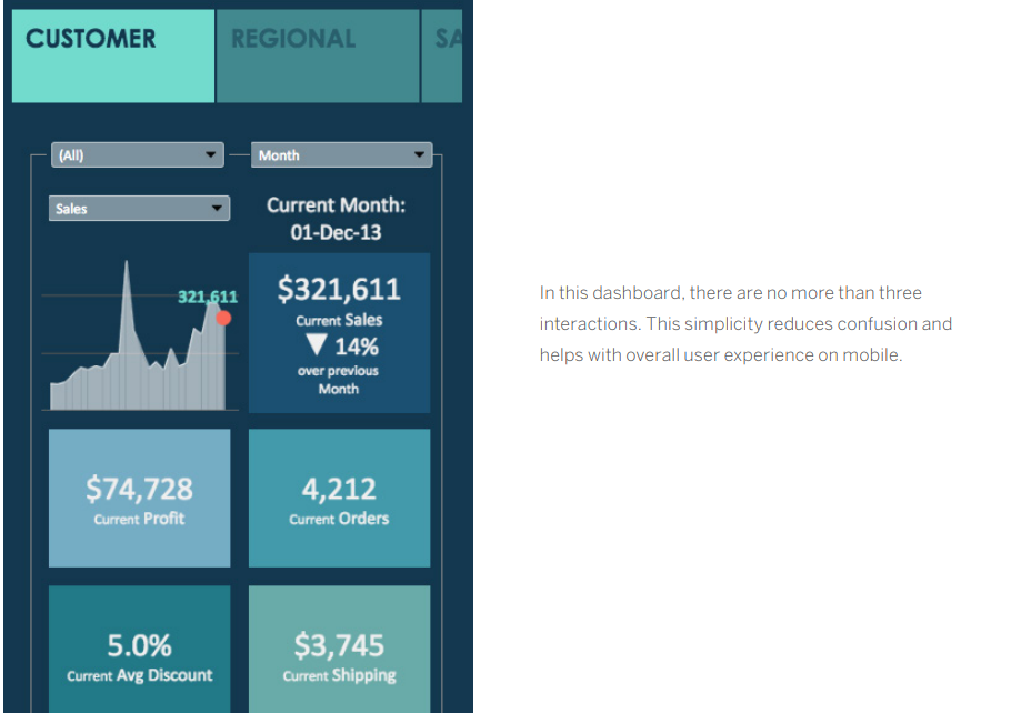
3. Minimize Page Load Times
No one wants to wait for a dashboard to load. Slow load times can be caused by a variety of factors, including the size of your data set and the complexity of your visualizations. To improve load times, you can optimize your data queries, use extracts, and leverage Tableau's built-in performance optimization features.
4. Insights-Based Design
When designing your dashboard layout, consider how your audience will naturally "read" the information. Group related pieces of information together and use visual cues like shading, lines, and white space to guide the eye. The most important information should be placed in the upper left corner of the dashboard, as this is where most viewers will start looking.
5. Minimize Views and Colors
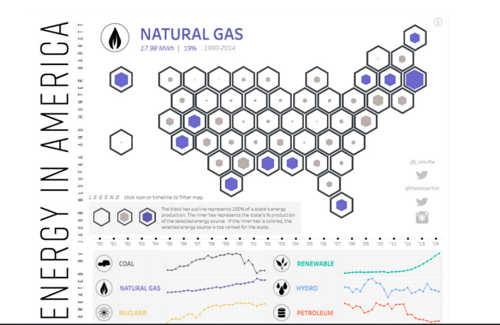
It's tempting to include every relevant piece of data in your dashboard, but this can lead to information overload. Stick to two or three key views, and use color strategically to highlight important trends or patterns. Avoid using too many colors, as this can make your dashboard visually overwhelming.
6. Incorporate Interactive Features
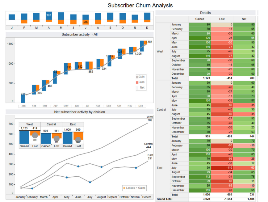
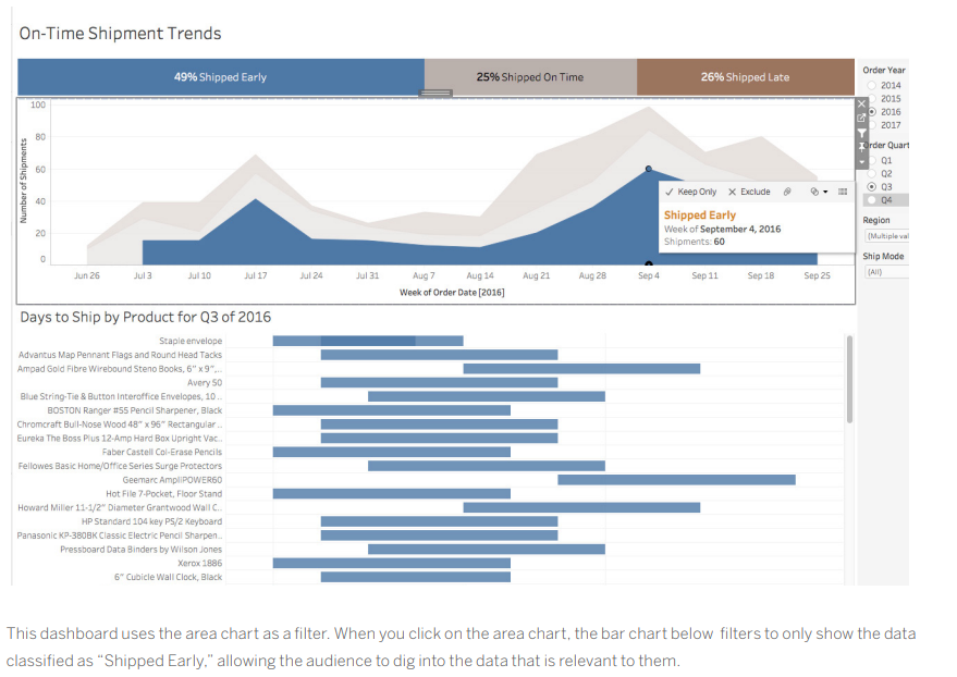
Dashboards are most powerful when they allow users to interact with the data. Use filters, highlights, and actions to let users explore the data in different ways. This will help them to gain a deeper understanding of the information and answer their own questions.
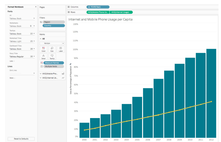
7. Arrange by Hierarchy
When formatting your dashboard, it's best to start with the largest elements and work your way down to the smallest. This will help you to avoid accidentally overwriting your changes. The hierarchy of dashboard formatting typically follows this order: theme, workbook, and worksheet.
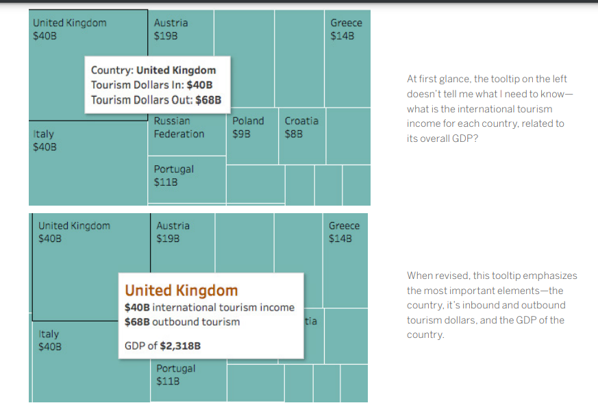
8. Utilize Tooltips and Whitespace for Effective Design
Tooltips are a great way to provide additional information without cluttering up your dashboard. Use tooltips to display detailed data points or to link to external resources. White space is also essential for good dashboard design. It helps to improve readability and make your dashboard less visually overwhelming.
9. Prioritize Clarity
Every element on your dashboard should serve a purpose. If a title, legend, or axis label isn't necessary, get rid of it. Consider using a floating layout to create more white space and improve readability.

10. Ensure Dashboard Effectiveness
Once you've built your dashboard, it's important to test it with your target audience. Ask them how they're using the dashboard and if it helps them answer their questions. Use their feedback to iterate on your design and create dashboards that are truly effective.
By following these best practices, you can create dashboards that are clear, concise, and actionable. Effective dashboards will help your audience understand your data and make better decisions.
How Beinex Can Assist You
Beinex, a premier Tableau partner, provides sustainable analytics solutions to organizations and helps to build superior data visual analytics capabilities internally through our bespoke training programs. Our team of Tableau-certified consultants are real-life Tableau business users who are passionate about Tableau and delivering a world-class experience. Connect with us for a Tableau free trial: www.beinex.com/free-tableau-software
Image source: https://www.tableau.com/learn/whitepapers/10-best-practices-building-effective-dashboards?utm_medium=blog

How Nissan Middle East FZE standardized interactive data visualization by implementing the “PowerBI Report Server” platform on AWS that drove faster and smarter decisions leading to 21% increment in net profit
Challenge
- The IT infrastructure of Nissan Middle East FZE where the PowerBI Report Server platform was hosted was in an on-premise datacenter which was designed to be scalable and robust with multi node physical clusters including the server, storage and network components. However, most of the physical hardware was quite old and not equipped with the latest generation of physical servers.
- Frequent hardware crashes and portal downtime kept troubling the availability of the PowerBI Report Server application. Assigning a touch hand support person to power on the hardware that was down seemed quite impossible due the restrictions during covid period. Hence, Nissan Middle East FZE wanted to look for another viable solution.
- Though the hardware setup at Nissan Middle East FZE was well equipped to meet the occasional spikes in the traffic, it was observed that over a course of 6-month time, most of the IT infra was underutilized than predicted. It was realized that spending huge amount of money on an old hardware plus software maintenance, license costs, internet bandwidth, datacenter cooling and maintenance, touch support personnel and electricity costs – were keeping the business operations challenging.
- There was an attempt by Nissan Middle East FZE to select a cost-effective solution that can host PowerBI Report Server application servers, web servers and archival data. This way IT infra can be re-provisioned to host sensitive data on-premise and the rest on the cloud, thereby reducing the overall physical hardware costs spent on a yearly basis.
Why AWS
- Nissan Middle East FZE decided to migrate PowerBI Report Server, database servers and archival data to AWS.
- The PowerBI Report Server’s AWS architecture includes Amazon Elastic Compute Cloud (Amazon EC2), that provides complete control of its computing resources, updates to tables in Amazon Relational Database Service (Amazon RDS) and AWS Elastic Load Balancer was used to distribute the traffic to the underlying EC2 instances based on the load.
Benefits

From Insights to Actions: Leveraging BI Applications for Your Competitive Advantage
Business intelligence (BI) software solutions are designed to analyse data that is input by users or fed from various data sources. The software then organises this data based on patterns or trends it identifies. Finally, the software presents these patterns and trends through visualisations, making the information easy to understand even for users without any statistical analysis experience.
Organisations can develop informed and current strategies by using the insights and trends revealed by these visualisations. With the advancements in technology and innovations, a wide range of BI applications are available for diverse types of data analysis.
Therefore, it is imperative for forward-thinking organisations to recognise the BI tools that market leaders offer and how these tools can impact their own operations positively. Here are four significant business intelligence applications that can enhance your organisation’s operations.
List of Four Business Intelligence Applications
- Sales Intelligence
- Visualisation
- Reporting
- Performance Management
Let’s take a deep dive into the four noteworthy Business Intelligence applications:
1. Sales Intelligence
One crucial application of BI is to improve customer engagement and sales performance. The sales department of any organisation should prioritise building solid relationships with customers. However, converting leads and convincing potential clients to purchase a product or service can be challenging. BI tools can make this process smoother and more predictable.
BI collects data on specific key performance indicators (KPIs) such as customer demographics, conversion rates, and sales metrics. It then presents this data in structured visualisations like graphs, pie charts, and scatterplots. This data lets users identify trends and insights into customer behaviour and business operations. Understanding the customer allows organisations to provide better service and improve sales performance.
Moreover, the reports and dashboards generated by BI are valuable in providing easy-to-interpret data to potential clients and supporting claims with solid evidence. Managers can use the insights from BI analysis to make data-driven decisions based on complex data and forecasting.
BI applications provide an excellent means of optimising an organisation’s sales operations. Sales and marketing teams can leverage BI to identify trends in client preferences, enabling the organisation to maximise sales within their ideal client base. This allows them to concentrate on targeting highly qualified leads, improving conversion rates and overall profit margins.
2. Visualisation
Furthermore, when used alongside customer relationship management (CRM) software, BI offers businesses a sophisticated method for understanding their customers and making informed sales decisions. By integrating CRM data with BI analysis, organisations can better understand their customers' needs and behaviours, enabling them to provide personalized products and services, strengthen relationships, and increase customer loyalty.
Another critical application of BI is data visualisation. Business intelligence software employs various data analytic tools designed to analyse and manage data related to an organisation’s operations. The resulting data is then presented in the form of visualizations, enabling the organization to monitor logistics, sales, productivity, and more. Some BI platforms offer custom reporting capabilities, allowing users to specify their own parameters, while others offer pre-designed reporting templates that include industry-standard metrics.
By presenting data in intuitive and easy-to-understand formats, BI systems enable inexperienced employees to draw insights from data. Rather than relying on trained data scientists to analyze data, employees can analyze and present their own data to shareholders, other departments, or teams.
3. Reporting
Reporting is a way of summarising data to keep track of business performance, while analysis is a way of exploring data to gain insights that can improve business practices. Business intelligence tools play a crucial role in reporting by collecting and analysing data and generating various types of reports related to staffing, expenses, sales, customer service, and other processes. While reporting and data analysis are related, they differ in purpose, delivery, tasks, and value.
Simply put, reporting takes raw data and transforms it into easily understandable information, while analysis takes data and extracts valuable insights to enhance business practices. Although both processes can incorporate visualisations, their approaches are distinct. Reporting reveals what's happening, whereas analysis explains why it's happening. Traditionally, data visualisations were static, requiring the creation of a new one for every variable change. However, contemporary BI software provides interactive dashboards that can update in real-time, resulting in enhanced usability and flexibility in data analysis.
4. Performance Management
BI tools can help with performance management by allowing organisations to set and track performance goals using data-driven insights. This can include goals related to project completion, delivery time, or sales targets, among others. For example, a BI system can analyze past sales data and recommend a realistic sales goal for the future based on previous performance. This helps organisations stay on track with their goals and make data-driven decisions to improve performance.
With BI applications, organisations can closely track their progress towards pre-defined or customisable goals within specific timeframes. The data-driven plans could include meeting project completion deadlines, target delivery times, or sales targets. For instance, if an organisation wants to achieve a specific sales target, the BI system can analyse previous data and suggest a reasonable goal based on past performance.
By monitoring goal progress in real-time, businesses can stay informed of any remaining gaps and take timely action to bridge them. Users can also set alerts to notify them when they are nearing their target or when the time limit is approaching, and they haven't achieved their goal. This helps managers and employees stay on track and focused on achieving their goals.
Moreover, users can also assess the overall productivity of an organisation by monitoring the fulfilment of goals and tracking progress data. Since the information is readily accessible, there is no time wasted in tracking down urgently needed data, thus saving businesses time and money.
Three Steps to Choose Right Business Intelligence Tools
To choose the right Business Intelligence software for your organisation, it's crucial to identify the features and capabilities that your organisation requires. Follow the three steps below to find out which Business Intelligence tool suits you the best:
- Selection
- Compare Applications
- Shortlist and Trials
Now, let's explore in detail the three steps to choose the right Business Intelligence tool:
1. Selection
It's recommended to select only the modules you will use rather than opting for a solution with a long list of features you don't need. Overbuying can increase the cost and lower the chances of a successful implementation, so it's better to start small and upgrade as your company expands.
2. Compare Applications
You should compare various options based on your specific requirements to choose the right BI software for your organisation. Each vendor may have different strengths and specialities within the BI field, so it's essential to prioritise your needs and preferences. Instead of a one-size-fits-all approach, it's better to focus on the most critical features and evaluate solutions based on how well they meet those requirements. It's also important to remember that the most expensive solution is not always the best one, and sometimes paying a higher price can result in better quality and long-term benefits.
3. Shortlist and Trials
Once you have a shortlist of vendors, it's time to narrow it down further by considering factors such as pricing, demos, and trials. Many vendors offer free trials or demos so that potential users can get a feel for the system's user interface. Make sure to choose a system that most users can use and keep your budget flexible. Consider the type of user support each vendor offers, determine whether you need any integrations with other business software, and confidently make your final decision.
Summing Up
Business Intelligence applications can benefit organisations, from improved decision-making to enhanced performance management. By gathering and analysing data, businesses can gain valuable insights into their operations and customers and use this information to drive growth and success. When selecting a BI tool, it's essential to identify your specific requirements and carefully compare different vendors based on their features, pricing, and support.
Business Intelligence services extended by Beinex deliver solutions to all your business questions. At-a-glance analysis facilitated by cutting-edge BI tools does wonders for every industry. With BI tools, analysing enormous and complex data couldn’t be mind-boggling for you anymore. With Beinex, you can interact with an agile and intuitive system to validate your data, navigate your vision, and execute it data-driven to tap into the potent entrepreneurial potential.

Tableau for Financial Analytics: Transforming Data into Insights
Financial Analytics and Its Importance
Financial analytics offers actionable insights into an organization's monetary health and performance by utilizing data analysis tools and techniques for analyzing financial data. It involves assessing financial data from diverse sources, like income statements, market data, etc., to identify trends, make strategic, data-driven decisions, and optimize financial operations. Fundamental finance analytics is critical to businesses as they deliver data-driven insights that equip enterprises to make smarter decisions, optimize operations, and boost profitability. The following aspects imply the significance of financial analytics for businesses. • Analyzing financial performance • Creating accurate budgets and plans by forecasting based on market trends and historical data • Identifying and mitigating financial risks • Assessing potential investments to make informed decisions • Analyzing a company's cost structure for optimization • Harnessing big data to develop strategies for addressing challenges and making informed decisions • Facilitating continuous visibility into financial operation and performance • Detecting data gaps and analyzing historical data to improve business performance • Preventing fraud and eliminating manual, redundant tasks to enhance efficiency
Tableau for Financial Analytics
Businesses must utilize financial analytics tools and software to improve financial management, comply with regulations, identify cost-efficient prospects, optimize operations, and make informed decisions. These tools automate the analysis and interpretation of financial data, delivering valuable insights into budgeting, forecasting, and performance. Tableau makes financial analytics seamless with powerful, intuitive dashboards that facilitate data-driven decisions. With Tableau, users can easily visualize, analyze, and share data faster and detect patterns and trends that offer actionable insights. Tableau equips enterprises with an in-depth understanding of their spending, enabling effective optimization of resources. Be it tracking capital expenditures or assessing expense spending, Tableau transforms financial data into actionable insights that drive improved business outcomes. As financial analytics continues to evolve, the future of Tableau in financial analysis looks promising. Amidst the rising intricacies of financial fraud, there is a need for a robust, intuitive platform like Tableau, which is essential to detect fraud faster and reduce the impact of losses. As a popular data visualization and interaction tool in the finance domain, Tableau simplifies raw data, making it interactive and visually intelligible. Tableau uses financial analytics to improve efficiency in the following ways: • Acquiring insights from the financial data collected from diverse sources • Predicting accurately by utilizing analytics to get a detailed picture of financial perspectives • Lowering risk and saving time by tracking accounts to locate inactive or low-activity accounts
Financial Analytics Made Seamless: Tableau's Robust Capabilities
Tableau empowers financial analysts with deeper insights into financial data, enabling data-driven decisions. Let's take a look at the distinctive uses of Tableau in finance: • Automating Data Updates: Unlike traditional data reporting software like Excel, Tableau automates the process of updating data, formulas, and data reports in line with the changes, enabling faster and more efficient financial reporting and allowing users to save significant time. • Data Visualization: With Tableau's powerful data visualization capabilities, business giants can easily handle the intricacies of big data through graphical representations, real-time dashboards, and analytical data breakdowns. • Data Insights: Tableau's smarter data analytics and insight tools automatically analyze financial data and offer insights into it, allowing effortless analysis of bigger financial datasets for making important financial decisions. • Financial Reporting: Tableau offers distinctive financial reporting capabilities, transforming traditional reports like P&L statements, balance sheets, and cash flow statements into dynamic and automated experiences. Besides, Tableau delivers insightful recommendations based on the analyzed financial data, empowering users to make informed decisions. • Data Trends and Patterns: With features like data drill-down and data blending, Tableau helps acquire applicable data and identify variations, patterns, or trends within the enterprise.Tableau in Finance: Key Implementations
As a robust tool for smarter financial analytics, Tableau equips enterprises with the capability to visualize intricate data, enhance operations, and improve the decision-making process. Here are some of the key implementations in Tableau that enhance financial analysis, resulting in insightful scenario analysis and accurate forecasting. • Developing Interactive Tableau Financial Analysis Dashboards: Tableau dashboards offer a comprehensive view of the financial status of your organization, blending interactive features like action buttons, color schemes, drop-and-down filters, and intuitive layouts. Building engaging dashboards in Tableau converts the static financial data into a visual story, often incorporating various visualizations like dual-axis charts for comparison and bullet graphs for performance metrics. The interactive elements of Tableau dashboards allow for seamless manipulation of data views, enabling users to analyze deeper without switching from the primary dashboard. Example: Tableau financial analysis dashboards allow tracking key financial metrics like expenses, loan performance, and customer deposits while providing real-time updates. • Forecasting and Trend Analysis: For businesses to make strategic financial decisions, it is important to foresee future performance. The future of financial forecasting is enhanced by Tableau, which enables the creation of predictive models based on historical data patterns and the integration of statistical forecasting methods to project future trends. It helps businesses understand possible business trajectories. Example: Tableau creates visualizations comparing past performance against future projections based on historical sales data, seasonal trends, and customer purchase behaviors. • Scenario Analysis: Tableau facilitates the creation of multiple financial scenarios to assess how various factors affect financial outcomes. Analysts can use Tableau's flexibility to create different scenarios by modifying input variables to visualize the impacts on financial metrics. It helps stakeholders to have a sound idea of potential risks and opportunities. Example: Using Tableau to simulate economic conditions helps businesses assess profitability and the impact on non-performing loans (NPLs) and craft mitigation strategies. • Fraud Detection: Using Tableau for financial analytics helps organizations detect anomalies and suspicious patterns that may imply fraudulent activities. Tableau's powerful visualization capabilities help detect anomalies in financial transactions, and predictive modeling helps understand potential risks, reduce financial losses, and ensure compliance with security regulations. Example: Tableau visualizes transaction patterns and anomalies like unusually high spending across different locations. • Compliance and Risk Management: Tableau helps track financial compliance metrics and identify areas where a business may be at risk of non-compliance with regulations. For instance, it can help visualize tax liabilities, monitor debt covenants, or track audit results. Tableau also provides automated reports that track transactions and regulatory compliance. Example: A compliance dashboard might track specific ratios indicating whether a company adheres to legal financial limits. • Expense & Cost Analysis: Organizations can harness Tableau to track and analyze operational costs across departments, locations, or projects. By visualizing cost breakdowns and spending trends, finance teams can identify inefficiencies, optimize budgets, and implement cost-saving strategies. Example: Tableau visualizes spending trends, helping analyze expenses and detect cost-saving possibilities. The finance landscape is evolving rapidly, pushing modern businesses to adopt advanced BI solutions like Tableau rather than traditional spreadsheets. It is no longer the era of manual data preparation and analysis. Therefore, most organizations now rely on Tableau to create financial dashboards to track and report KPIs. Being a powerful data visualization platform with advanced analytics and interactive capabilities, Tableau helps build dynamic dashboards and redefine financial analytics. Adopting Tableau for financial services helps organizations harness its innovative features to upgrade their financial data management and reporting processes.

GCP's Vertex AI Agent Builder: Build, Scale, and Govern Reliable AI Agents
Many teams can build AI agents as experiments, but turning them into something that works reliably, safely, and at scale for real business use is much harder. To solve this, the Vertex AI Agent Builder from Google Cloud helps organizations build, run, monitor, and secure AI agents from start to finish. In short, Google is making it easier to go from "we built a demo agent" to "we run trusted AI agents in production."