How AI Decision-Making is Improving Enterprise Outcomes
Blog
Share 
ميزات تابلو 2020.2 الجديدة (الإصدار التجريبي)
بعد فترة وجيزة من إطلاق تابلو لإصدار 2019.4، أصدروا عدد من الميزات الرائعة كجزء من خطتهم إلى 2020. على الرغم من كونه في المرحلة التجريبية، إلا أننا تمكنا من تجربة بعض هذه الأشياء والتي بدورها غيرت مفهومنا عن التصورات وطريقة تعاملنا معها.
لنلق نظرة على بعض هذه الميزات الرائعة، والتي لطالما بحث عنها الكثير في عالم ذكاء الأعمال.

1. المعلمات الديناميكية
1. أصبحت هذه الميزة والتي تعتبر الأكثر طلبًا حقيقة واقعية. فقد كانت الشكاوى تتمحور حول أنه إذا تم تحديث البيانات، فإن القيم المحدثة لا ينعكس أثرها على حقول المعلمات. كان يتعين سابقًا على المستخدم الانتقال إلى التحديث وإضافة الحقول الجديدة في المُعلمة. لذلك لاقت هذه الميزة استحسان المستخدمين. 2. ولكن مع تحديث تابلو الأخير. الآن يمكن تحديث المعلمات تلقائيًا بمجرد تحديث البيانات سوف تنعكس على القيم الجديدة! يوفر هذا الكثير من الوقت والجهد اللازمين لمراقبة لوحة المعلومات التي تم إنشاؤها! 3. سيكون هذا التحديث بالنسبة لنا أحد أهم التحديثات وأكثرها طلبًا.
2. الرسوم المتحركة VIZ
اعتدنا في هذه الآونة على تسهيل عرض أي شيء نعمل عليه (من تطبيق على الهاتف إلى طرق استشعار السيارات الكهربائية على الطريق). قدم لنا تابلو هذا المفهوم في إمكانيات الرسوم المتحركة الجديدة. تتمتع حاليًا جميع مخططاتنا بسلاسة السير كلما تم تغييرها بواسطة مرشح ما، بحيث يتمكن المستخدم من تعيين سبب التغير المحدد في الرسم البياني ويظهره بشكل واضح. عند النقر فوق إجراء ما، يمكننا معرفة مقدار الوقت الذي سيستغرقه التغيير في المخططات الأخرى (ويتم تحريك هذا التغيير بسلاسة). يمكن شرح هذه الميزة بوضوح باستخدام التصورات بدلاً من الكلمات. لنلق نظرة ..
مشغل الفيديو
تبدو رائعة كما ترون. سيكون المبدعون محظوظين بهذه الميزة لأنها ستجعل عرض التصورات أكثر جاذبية للمستخدم النهائي.
00:00
00:30
3. التحسينات في شرح البيانات
لأولئك الذين ليسوا على دراية بهذه الميزة، تعد شرح البيانات أداة ذكية في تابلو، حيث تعطي استنتاجًا إحصائيًا لأي نقطة بيانات فردية على الرسم البياني. وتعطي فكرة عن السبب والاتجاه العام لكيفية القيمة. يَعد إصدار 2020.1 بأن يكون أكثر ذكاءً مع أداة شرح البيانات التي تتعمق أكثر باستخدام نماذج إحصائية عالية الدقة. هذه الميزة تذهل المستخدم الجديد دائمًا، ويَعد تابلو بمواصلة التحسينات باستمرار.
4. تصدير لوحة المعلومات إلى التنسيقات المطلوبة
هذه ميزة بسيطة إذا قورنت بالميزات الأخرى، ومع ذلك فقد تثبت أنها إضافة مهمة لتجربة المستخدم النهائي. يمكننا الآن تصدير لوحة المعلومات مباشرة بأي تنسيق. يمكنك أن تأخذ نص أو صورة وتضعها كجزء من لوحة المعلومات فقط بقرة زر. بكل بساطة انقر فوق خيار تنزيل في أسفل الشاشة ثم تصدير، نستطيع القيام بذلك مباشرة بنقرة زر واحدة! يمكننا التصدير إلى تنسيقات مثل PDF و PowerPoint وغيرهم، وهو أمر غاية في الروعة.5. الحسابات العازلة
تعزز الحسابات العازلة عملية التفاعل عندما يتعلق الأمر بالسيناريوهات المكانية. فهي حدود تم إنشائها للنقاط على الخريطة أو الموقع. يجب أن تحتوي الحسابات العازلة على ثلاث معلمات مثل الموقع، المسافة ووحدة قياس مثل “كيلومتر” و “ميل“. في شرح مبسط، عندما تريد معرفة عدد المطاعم الموجودة بالقرب من فندقي، حوالي كيلومتر واحد على سبيل المثال، فإن الحسابات العازلة تسلط الضوء على عدد المطاعم بالقرب من موقع معين. إليكم كيفية عمل الحسابات العازلة…. [video width="1296" height="1080" mp4="https://www.beinex.com/wp-content/uploads/Video-2-Buffer-Calculation.mp4"][/video] لذا، نتوقع أن ينال إصدار تابلو ديسكتوب إعجاب عشاق viz. على الرغم من أن هذه الميزات ليست سوى جزء من الإصدار التجريبي وقد لا يتم إصدارها جميعًا في التحديث التالي، إلا أنه من الجيد التطلع إليها.-
Related Articles
THE KEY FEATURES OF TABLEAU 2019.1
The Key Features of Tableau 2019.1
I’ve always been a huge Tableau fan and one of the biggest reasons why is that I can always count on Tableau for bringing out new exciting features in every release. With new quarter, Tableau has yet again released a new version after a thorough research based on people’s experience, thoughts and comments.
As a result, Tableau 2019.1 has plenty of new and insightful features amongst which is a feature called Ask Data which will make our life so much easier! There are so many other new features which everyone will appreciate, such as Prep Conductor, Automatic Dashboard Phone Layout, URL Action improvements, Nested Sorting improvements, connector for Microsoft Azure SQL data warehouse and many more!
Here are my top picks from the list.
Ask Data
Are you not a data analyst but still love to play with data? You have a question in mind but don’t know how to get to the answer from all the data? Just Ask Data! Ask or type the question in your natural language and Tableau will not only give you the answer but also visualize it in a stunning way! We thought this one deserves its own blog with detailed information and so we decided to share one with you, keep your eyes open as it is coming soon to our blog!
Prep Conductor
Keep your data fresh with Prep Conductor. Tableau Prep is helping organizations with preparing and sorting their data easily. This new addition allows you to automate this process on Tableau Server or Online. You can schedule and manage your data flows created on Prep. It can be seamlessly integrated to your existing schedules of Server or Online. You can manage the permissions to your flow regarding who should run, edit, download and so much more.
Nested Sorting
Thinking that sorting a hierarchical field would make your work easier? It is the most talked about and wanted feature and Tableau 2019.1 has got you covered! With this feature, you can visually define how you want to sort within multiple dimensions helping to capture the trends in categorical data bringing out wonderful insights.
Mobile View
Everybody is using smart phones. For everything. Everywhere. Period. Tableau knows it and continues to create more phone friendly features.
Now you can create customized mobile layouts for your dashboards even if it’s not listed in default options. This comes in handy when your phone is not listed in the model. Tableau 2019.1 brings to its users customized phone layout for specific uses including interactive offline previews and automatically adding phone layouts to new dash board. Now, others can view your visually stunning creative dashboards via their phone in a sophisticated way.
URL Improvements
Decide how you want the URL action to work with the new URL improvements in Tableau 2019.1. Target specific URL actions enable the user to control the view of any external information linking to your dataset. Develop intuitive, integrated and innovative dashboards by connecting to all the necessary information outside your data source.
Microsoft Azure SQL Data Warehouse Connector
Be it on cloud or on premises, Tableau keeps on adding more data connections to make it easy for users to leverage the native way of connecting. This came up with the connector to Microsoft Azure cloud service in the current release. This helps in avoiding ODBC in making connections to the data stored in Microsoft Azure Data warehouse.
I’m very excited about all these new features, what about you?
Are you interested in learning more about Tableau’s new features or the features that are yet to come in the next versions? Are you a Tableau user and would like to become a Tableau Champion? Or are you new to Tableau and it just seems like something you could use to work with your data?
Please contact us at training@beinex.com/ info@beinex.com and we would be happy to schedule a Tableau demo or training for you and your company.

Beinex Gets an Upgrade to Snowflake Services Partner Premier Tier
This significant milestone reflects our unwavering commitment to delivering the best solutions to our customers' data challenges. With this enhanced partnership, we are poised to offer our customers unparalleled opportunities to leverage Snowflake's unique architecture and revolutionise their data-driven strategies.
Beinex: The First Snowflake Premier Partner in the Middle East
Beinex is the first Data & Analytics firm in UAE to enter Snowflake Services Partner Premier Tier. Beinex's exceptional service quality and the expertise of its consultants, scientists, and engineers have been demonstrated through years of unparalleled dedication to clients. The partnership between Beinex and Snowflake is set to revolutionise how businesses unlock the true power of their data.
The New Status Helps Us Serve You Even Better!
Snowflake's cutting-edge cloud data platform has garnered widespread recognition for its ability to deliver unmatched performance, scalability, and ease of use.
By attaining the Premier Tier Partner status:
- Beinex can further leverage Snowflake's advanced capabilities and integrate them seamlessly into your solutions.
- Enable and empower Digital Transformation at an accelerated pace for our clients with experience and competency of the right kind in accompaniment.
- Aid our customers with the tools they need to extract maximum value from their data, propelling them towards success in an increasingly data-centric world.
Snowflake's architecture utilises a cloud-native approach, separating storage and compute, which results in unparalleled flexibility and scalability. This means that businesses can dynamically scale their computing resources as needed without the limitations of traditional on-premises solutions.
By embracing this architecture, our customers can say goodbye to lengthy and resource-intensive data processing times, paving the way for faster time-to-insights and improved operational efficiency.
Beinex+ Snowflake
The collaboration between Beinex and Snowflake has opened a new realm of possibilities for our mutual customers. The clients are further assured of the superior knowledge and competence possessed by Beinex’s league of Data Engineers, Data Scientists and Consultants in all matters Snowflake.
Now, organisations can experience a quantum leap in their data processing capabilities by harnessing the power of Snowflake's unique architecture. The ability to process vast amounts of data with lightning speed enables businesses to derive real-time insights and confidently make critical decisions.
Our partnership with Snowflake enables us to offer you advanced features like automated tuning and elastic compute, along with analytics modernisation services, to help your organisation realise exponential Return on Investment.
A Major Milestone for Beinex
The attainment of Snowflake Services Partner Premium Tier marks an exciting milestone for Beinex. This partnership underscores our dedication to delivering exceptional data solutions and reinforces our commitment to staying at the forefront of industry advancements. Together, Beinex and Snowflake are primed to transform how businesses harness their data's true potential, driving innovation and success in the digital era.

Snowflake's Evolution: A Look at the New Features in 2024
1. Snowpark Container Services:
This innovative feature allows you to deploy and manage containers directly within Snowflake. Imagine leveraging secure and scalable infrastructure, similar to Kubernetes, without leaving the Snowflake environment. Use containers to build and run data products like large language models and full-stack applications. You can even utilize containers from the Snowflake marketplace or create custom ones for sharing.
Getting started is simple. Create a Docker image with your code and dependencies, push it to a Snowflake registry, and then create a service, job, or function using the Snowpark API. Snowflake handles the rest, including provisioning, scaling, and monitoring your containers.
2. Snowpark Model Registry:
Data scientists and ML engineers require a secure and efficient way to manage and deploy machine learning models. Snowpark Model Registry, currently in public preview, addresses this need by providing a native solution within Snowflake. This integrated registry allows you to register, manage, and use models and their metadata directly in the platform.
The benefits of the Snowpark Model Registry are numerous:
3. Streamlit in Snowflake for Azure:
Snowflake's commitment to platform flexibility is evident in its expansion to Azure. The general availability of Streamlit in Snowflake for Azure empowers Python developers to create data applications directly within the Snowflake environment. Streamlit simplifies the creation of interactive dashboards and data visualizations, bridging the gap between data and actionable insights for business teams.Here's how Streamlit in Snowflake for Azure benefits users:
4. Security Enhancements in Snowflake Horizon:
Security is paramount for any data platform. Snowflake Horizon takes data security to the next level with a range of enhancements:
These security enhancements within Snowflake Horizon empower organizations to meet stringent compliance requirements and safeguard their valuable data assets.
5. Snowflake Unistore:
Snowflake Unistore is a game-changer for working with both transactional and analytical data within a single platform, often referred to as Hybrid Transactional/Analytical Processing (HTAP). This feature introduces the 'hybrid' table type, supporting fast single-row operations.
Hybrid tables utilize a new row-oriented store within Snowflake, enabling functionalities typically associated with transactional data stores:
Snowflake's global services layer and query engine seamlessly manage the underlying row and column stores, allowing you to join hybrid and standard tables natively.
6. Snowflake Iceberg:
The Apache Iceberg format acts as a metadata layer for data files stored in open formats like Parquet and ORC. It enables querying this data using SQL, regardless of the specific query engine (Spark, Hive, Impala).
'Snowflake Iceberg' leverages this open format, allowing you to directly query data files stored in cloud storage services like S3 buckets. This eliminates the need to move or copy data into Snowflake while maintaining interoperability for users already working with that data location.
Snowflake Iceberg offers significant advantages over the existing external table type:
7. Document AI:
Typically, data systems struggle with unstructured data formats like PDFs. Snowflake's answer to this challenge is Document AI, a tool currently in private preview. It allows you to process any document and answer questions using natural language without requiring machine learning expertise.
Document AI draws power from Snowflake's first-party large language model (LLM) built on Applica's generative AI technology. This, combined with Snowflake's support for unstructured data (announced in June 2023), empowers you to store, query, and analyze all data types within the platform.
Document AI represents just one facet of Snowflake's vision for generative AI and LLMs, a dominant trend in 2023 that is poised to continue its dominance in 2024.
Looking Ahead
Snowflake started strongly in 2024 with exciting releases like Snowpark Model Registry, Streamlit in Snowflake for Azure, and security enhancements in Snowflake Horizon. These anticipated features position Snowflake as a frontrunner in the data cloud landscape, offering a comprehensive data management, analytics, and application development platform.
Beinex + Snowflake Partnership
Beinex is a Snowflake Services Partner Premier Tier, and the partnership reaffirms Beinex’s commitment to delivering exceptional data solutions and positions the company at the forefront of industry advancements. Harnessing the true potential of the data, partnership drives innovation and success in the digital era. Belonging to Snowflake Services Partner Premier Tier, Beinex leverages Snowflake’s advanced capabilities and seamlessly integrates them into its comprehensive data solutions.

Top 4 Enterprise Data Visualization Tools: A Complete Guide
What is Data Visualization?
Data visualization is the process of representing data in a graphical or spatial format, allowing for easy visual analysis without technical jargon. Unlike raw numerical data, visual representations like charts, graphs, and maps help quickly identify patterns, trends, and anomalies, facilitating faster and more accurate insights.
Benefits of Data Visualization
Understanding raw data can be challenging due to its complexity. Data visualization addresses this by:
- Simplify Data Interpretation: Converting raw data into charts and graphs makes it easier to understand underlying patterns and relationships.
- Identify Trends and Anomalies: Visual formats highlight trends and anomalies that might be missed in numerical data.
- Improve Accessibility: Data visualization makes information accessible to a broader audience, including those without strong analytical skills, thus improving data-driven decision-making across departments.
- Advanced Data Storytelling: Effective visualization techniques turn data into compelling stories that facilitate better communication and understanding.
What Are Data Visualization Tools?
Data visualization tools provide designers with an efficient way to create visual representations of large data sets. When dealing with data sets that include hundreds of thousands or millions of data points, automating the visualization process simplifies the designer's job considerably.
Key Benefits of Data Visualisation Tools
- Dashboards: To monitor and analyze key performance indicators (KPIs) and metrics in real-time.
- Annual Reports: To present data-driven insights to stakeholders in a clear and engaging manner.
- Sales and Marketing Materials: To showcase trends, performance, and forecasts to potential clients and customers.
- Investor Slide Decks: To communicate financial health and growth prospects effectively.
- General Information Interpretation: To make complex data understandable for decision-making processes in virtually any context where quick interpretation of information is necessary.
A Compact List of Top Data Visualization Tools
Here are the top enterprise data visualization tools for creating compelling visualizations:
- Tableau
- Google Charts
- Zoho Analytics
- Data Wrapper
Tableau
Tableau is a top-tier platform recognized for its user-friendly interface. It adeptly integrates data from multiple sources to create dynamic and visualisations.
Its comprehensive suite of products spans desktop applications, robust server solutions, and flexible web-hosted environments, empowering organizations to drive informed decision-making and achieve actionable insights across their operations.
Connect with us for a free demo: https://www.beinex.com/free-tableau-software
Who Should Use Tableau?
Data scientists and analysts who need to create custom dashboards and advanced visualizations will benefit from Tableau.Key Features of Tableau
• User-Friendly Interface: Easy to learn and navigate, making it accessible for all skill levels. • Mobile-Friendly: Create reports and dashboards optimised for mobile devices, allowing you to access and analyse data on the go. • High Performance: Efficiently handles large datasets, ensuring seamless analysis without performance issues. • Interactive Visualizations: Build interactive and dynamic visualisations, allowing deeper data exploration. • Integration Capabilities: Integrates well with various data sources and other business applications, enhancing data connectivity. • Real-Time Data Updates: Provides real-time data updates, ensuring you have the most current insights. • Collaboration Tools: Facilitates easy sharing and collaboration on reports and dashboards within teams. • Customizable Dashboards: Offers highly customisable dashboards to meet specific business needs and preferences. • Advanced Analytics: Supports advanced analytics features, including trend analysis, forecasting, and statistical summaries. • Security: Ensures data security with robust access controls and permissions.
Learn more: https://www.beinex.com/tableau-partnership-and-consulting-services/Google Charts
Google Charts is a free tool for creating interactive data visualisations, accessible through most web browsers. It supports various data sources, including spreadsheets and databases.
Who Should Use Google Charts?
Students, universities, and businesses needing fundamental charts will find Google Charts useful.Key Features of Google Charts
• User-Friendly Interface: Easy to use with a straightforward setup process. • Wide Range of Chart Types: Supports various chart types, including line, bar, pie, scatter, and more. • Customizable: Offers extensive customization options to tailor charts to specific needs, including colors, fonts, and annotations. • Interactive Charts: Allows for interactive elements such as tooltips, zooming, and panning. • Cross-Platform Compatibility: Ensures charts work seamlessly across different browsers and devices. • Dynamic Data Updates: Supports real-time data updates, keeping charts current with live data feeds. • Integration with Google Services: Easily integrates with other Google services such as Google Sheets and Google Analytics. • Embedding Capabilities: Simple embedding in websites and applications with a few lines of code. • Data Export Options: Provides options to export charts in various formats, including PNG, SVG, and PDF. • Open Source: Free and open source, allowing for extensive customization and community support. • Support for Multiple Data Formats: Works with various data formats, including JSON, CSV, and Google Spreadsheets. • Accessibility Features: These include features to make charts accessible to all users, including screen reader support. • Responsive Design: Ensures charts are responsive and adapt to different screen sizes and resolutions. • Powerful API: Provides a robust API for developers to create complex visualisations and integrate them into applications.
Zoho Analytics
Zoho Analytics combines business intelligence and reporting services, allowing for swift data visualisation. It is user-friendly and integrates well with other Zoho products.Who Should Use Zoho Analytics?
Analytics and sales teams, marketing teams, project managers, and more can benefit from Zoho Analytics.Key Features of Zoho Analytics
• User-Friendly Interface: Intuitive design that simplifies data analysis and visualisation. • Wide Range of Data Sources: Connects to various data sources, including databases, cloud storage, spreadsheets, and other business applications. • Advanced Analytics: Offers features such as predictive analytics, AI-powered insights, and what-if analysis. • Interactive Dashboards: Create and customise interactive dashboards with drag-and-drop ease. • Collaboration Tools: Facilitate sharing and collaboration on reports and dashboards within teams. • Embedded Analytics: Embed reports and dashboards into websites, applications, and portals. • Automated Data Sync: Schedule data imports and synchronise data regularly. • Customizable Visualizations: Provides a variety of chart types and extensive customisation options for data visualisations. • Data Blending: Combine data from multiple sources for comprehensive analysis. • AI-Driven Insights: Leverages AI to offer advanced analytical insights and pattern detection. • Real-Time Data Access: Supports real-time data integration and live dashboards. • Mobile Access: Access and interact with reports and dashboards on mobile devices. • Data Security: Ensures robust security features, including role-based access control, encryption, and compliance with industry standards. • Report Scheduling: Automate the distribution of reports through scheduled emails. • Integrations with Other Zoho Apps: Seamlessly integrate with other Zoho applications for enhanced functionality. • API Support: Provides APIs for developers to integrate analytics capabilities into custom applications. • Data Preparation Tools: These include tools for data cleaning, transformation, and enrichment.
Data Wrapper
Data Wrapper is ideal for media enterprises and allows for the quick creation of charts, maps, and plots. It is completely web-based and easy to use.Who Should Use Data Wrapper?
Data Wrapper can benefit media, news publications, government institutions and finance companies. It is especially useful for creating visually appealing and easily understandable visualisations.Key Features of Data Wrapper
• User-Friendly Interface: Intuitive and easy to use, requiring no coding skills to create professional charts and maps. • Wide Range of Chart Types: Supports a variety of chart types, including bar, line, pie, scatter plots, and maps. • Customisable Visualizations: Offers extensive customisation options for colors, labels, and annotations to match branding and presentation needs. • Responsive Design: Ensures charts and maps are responsive and adapt to different screen sizes and devices. • Interactive Elements: Allows for adding interactive elements like tooltips, hover effects, and clickable legends. • Real-Time Data Integration: Supports live data updates, enabling real-time visualisation. • Embedding Capabilities: Easily embed charts and maps into websites and blogs with simple code snippets. • Export Options: This option lets users download visualisations in various formats, including PNG, PDF, and SVG. • Accessibility: Committed to creating accessible visualisations with features that support screen readers and keyboard navigation. • Data Security: Ensures data security with robust privacy policies and compliance with industry standards. • Collaboration Tools: Allows for team collaboration with shared projects and editing capabilities. • Support for Multiple Languages: Offers multi-language support for creating visualisations in different languages. • Easy Data Import: Supports importing data from various sources, including CSV files, spreadsheets, and web links. • API Integration: Provides APIs for integrating Data wrapper with other applications and services. • Customizable Templates: Use and modify templates to maintain consistency in visualisations. • Annotation Features: Add rich text annotations directly to charts and maps to provide additional context and information.
Always Go for the Best Tool
By choosing the right data visualisation tool, organizations can discover the full potential of their data, making complex information accessible and actionable for everyone. This empowers businesses to make data-driven decisions that drive growth and innovation.

Alteryx and Generative AI: The Alteryx Approach
1. Generative AI Features in Existing Products
Alteryx is proactively identifying areas where GenAI can improve the productivity and efficiency of its customers. These innovations are integrated into existing tools, such as Alteryx Designer, to streamline processes, automate routine tasks, and enhance the overall analytics experience. For example: OpenAI Connector: Users can now integrate GenAI directly into Alteryx Designer workflows to streamline communication and share data more effectively. AI-Generated Workflow Summaries: These summaries automate documentation processes, helping users enhance governance and auditability.
2. Enterprise-Ready Generative AI Platform
Alteryx’s GenAI platform enables businesses to create, train, and deploy custom AI models that operate securely within their organizational firewall. This approach ensures that data privacy and security are maintained while offering organizations the flexibility to tailor AI models to specific business needs. Alteryx also provides an environment for creating proprietary models that are customized to fit each organization’s workflows, making it easier to integrate AI-driven analytics into everyday operations.
3. New GenAI Applications and Interfaces
Data analytics is a collaborative process that involves various stakeholders, including analysts, data scientists, engineers, and knowledge workers. With Alteryx, these roles can now collaborate in real time through multi-modal analytics powered by GenAI. The flexibility to use different analytical tools—like SQL, Python, notebooks, or Alteryx workflows—opens doors for more seamless collaboration across different teams. GenAI applications like Magic Documents allow Alteryx users to automatically generate insight-rich reports in just a few clicks, drastically reducing time-to-insights and increasing productivity across business functions.
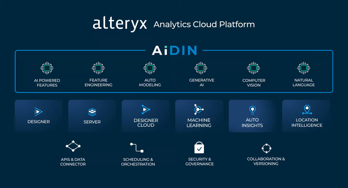
Introducing Alteryx AiDIN
AiDIN is Alteryx's umbrella for all AI-related capabilities, combining existing AI features with cutting-edge GenAI innovations. Alteryx AiDIN enables users to leverage advanced AI models for analytics, whether it's extracting insights, automating tasks, or generating complex reports. Some of the key benefits include:
• Improved Time-to-Value: AiDIN accelerates the time it takes to derive insights from data, enabling quick decision-making for critical business tasks.
• Increased Operational Efficiency: By automating repetitive tasks, AiDIN frees up time for users to focus on higher-value activities.
• Enhanced Governance: Alteryx AiDIN ensures that AI capabilities meet stringent enterprise-grade governance and security standards.
 Source: https://www.alteryx.com/blog/alteryx-announces-generative-ai-capabilities
Data Security and Trust: The Alteryx AiDIN Commitment
A key concern in any AI-driven platform is data security and the integrity of AI-generated outputs. Alteryx AiDIN prioritizes these through: 1. Mitigating Hallucinations In generative AI, "hallucinations" refer to scenarios where AI models produce plausible but incorrect information. Alteryx has implemented stringent quality checks and continuous feedback mechanisms to minimize these errors. This ensures that businesses can rely on the outputs generated by AiDIN for decision-making. 2. Fact-Checking Mechanisms Alteryx AiDIN integrates fact-checking tools to verify AI-generated insights against actual source data. This added layer of validation helps organizations maintain the accuracy and reliability of their analyses. 3. Data Privacy and Security Alteryx ensures that data privacy is maintained at all stages of the AI process. AiDIN offers two key deployment options: Private Data Handling and SaaS. Both options provide robust encryption and ensure that sensitive data is securely managed within a customer’s ecosystem, giving businesses peace of mind as they adopt AI.
The Future of AI-Driven Analytics
The integration of GenAI into the Alteryx platform paves the way for smarter, more accessible analytics. With capabilities like OpenAI integration, Magic Documents, and enterprise-level model customization, Alteryx is enabling organizations to maximize the value of their data, improve efficiency, and foster a more collaborative analytics environment. By combining GenAI’s potential with trusted, secure analytics, Alteryx is redefining how enterprises interact with data—delivering faster insights and more impactful results across industries. Get in touch with us for a free demo: https://www.alteryx.com/designer-trial/free-30-days?