How AI Decision-Making is Improving Enterprise Outcomes
Blog
Share 
Know Your Options Before You Become One da Vinci of Tableau
 11 May 2022
  Sumi S
 The Primary Means to Narrate Stories in Tableau
We can represent the visuals using the following three formats on Tableau:
1. Sheets: Spaces where we can build individual visuals are called sheets. A worksheet has a single view in its sidebar, as well as shelves, cards, legends, and the Data and Analytics panes. A workbook is a sheet file structure along the lines of Microsoft Excel. It includes sheets that can function as a worksheet, a dashboard, or even a story
 Source: https://help.tableau.com/current/pro/desktop/en-us/inspectdata_describe.htm
2. Dashboards: Most commonly used reporting format, a dashboard is a layout where sheets are arranged in a meaningful manner. It is a collection of views that helps you to compare a variety of data at the same time. If you have a set of views that should be reviewed every day, then you can create a dashboard that displays all of the views at once rather than navigating to separate worksheets. Think of the efficiency gains that this can bring about.
 Source: https://www.tableau.com/about/blog/2020/5/6-dashboards-tableau-partners-help-you-mitigate-covid-19
3. Story:Sheets or dashboards arranged in a sequence to convey information. A story is a collection of visuals that work together to convey information. Stories can be created to tell a data narrative, provide context, show how decisions affect outcomes, or simply make a compelling case.
 Source: https://help.tableau.com/current/pro/desktop/en-us/stories
Default Charts in Tableau
Through a set of default charts created with Tableau, data sets can be displayed in a comprehensible way. Let's have a look at a few types of charts:
1. Area Chart:An area chart is a line chart with a colour shaded area between the line and the axis. These charts constitute the most common approach to illustrate stacked lines and are often used to represent accumulated totals over time.
 Source: https://help.tableau.com/current/pro/desktop/en-us/qs_area_charts.htm
2. Bar Chart:Place a dimension on the Rows shelf and a measure on the Columns shelf to make a bar chart or vice versa. We may compare numerical data such as integers and percentages using bar charts. Each variable's value is represented by the length of each bar. Bar charts, for example, might demonstrate how much money a small business spends on various expenses.
 Source: https://www.tableau.com/data-insights/reference-library/visual-analytics/charts/bar-charts
3. Box-and-whisker Plots:When demonstrating the distribution of data points across a specified metric, box-and-whisker plots, also known as box plots, are an excellent chart to employ. The ranges within the variables measured are represented in these graphs. These graphics are useful for comparing the distributions of multiple variables.
 Source: https://help.tableau.com/current/pro/desktop/en-us/buildexamples_boxplot.htm
4. Bubble cloud: In bubble clouds, data is displayed in a cluster of circles. Individual bubbles are defined by dimensions, while individual circles are defined by measures. A bubble chart's design allows it to display multiple variables. Individual bubbles represent dimension field values, while measure field values define the size and colour of the bubble. As a result, we can examine a plot with at least three variables, one dimension and two measure fields.
 Source: https://help.tableau.com/current/pro/desktop/en-us/buildexamples_bubbles.htm
5. Bullet Graph:Bullet graphs are a type of bar graph that was created to replace dashboard gauges and metres. When comparing the performance of a major metric to one or more other measures, a bullet graph is beneficial. A bullet graph can help you visualise your objective, the current data set, and past data sets; all in one visualisation if you have a target goal that you need to meet on a regular basis
 Source: https://www.tableau.com/data-insights/reference-library/visual-analytics/charts/bullet-graph
6. Cartogram:Choropleth Maps, also known as Filled Maps, are a powerful tool for studying geographic data, especially for maps with a lot of detail (e.g., US by counties or ZIP codes). They make it simple to detect geographical hotspots and then drill down into these areas using several visualisation options.
 Source: https://www.pluralsight.com/guides/build-filled-maps-in-tableau
7. Click View:The circle view is a useful representation for comparative analysis. It's the same as using the circle marker on a scatter plot. Every mark is in the shape of a circle and can be used for subsequent actions.
 Source:https://interworks.com/blog/ccapitula/2014/10/17/tableau-essentials-chart-types-circle-view/
8. Gantt Chart:Gantt charts are used in project management to depict the length of time between events or activities. As a project management tool, it highlights the interdependencies between activities and illuminates the workflow timeline.
 Source:https://help.tableau.com/current/pro/desktop/en-us/buildexamples_gantt.htm
9. Heat Map:In a heat map, data is displayed along with colours. Using one or more Dimensions members and the Measure value, a heat map can be created. Heat Map helps to compare data by colour. For example, how many products have failed to meet the company's expectations, and how many products have exceeded expectations, and so on.
 Source:https://help.tableau.com/current/pro/desktop/en-us/buildexamples_highlight.htm
10. Histogram:A histogram is a graph that depicts a distribution's form. It divides values for a continuous metric into bins and segregates a set of data points into user-specified ranges. The histogram, which resembles a bar graph in appearance, condenses a data series into an easily interpreted visual by grouping many data points into logical ranges or bins.
 Source: https://help.tableau.com/current/pro/desktop/en-us/buildexamples_histogram.htm
11. Scatter Plot (2D or 3D):Scatter plots are a type of graph that is used to show the correlations between numerical data. They are used to depict the link between three variables by plotting data points on three axes. Each column on the X, Y, and Z axes is represented by a marker, whose position is determined by the values in the columns.
 Source: https://www.dataplusscience.com/TabCharts/scatterplotsize.html
12. Streamgraph:Streamgraph shows how a number value (Y-axis) changes in response to another numeric value (X-axis). It is a sort of stacked area chart. The relative proportions of the entire can be studied using a stream chart.
 Source: https://greatified.com/2018/09/17/how-to-build-a-stream-graph-in-tableau-software/
13. Text Tables:Text tables (also called cross-tabs or pivot tables) are created by placing one dimension on the Rows shelf and another dimension on the Columns shelf. Then, on the Marks card, slide one or more measures to Text to complete the view.
 Source: https://help.tableau.com/current/pro/desktop/en-us/buildexamples_text.htm#:~:text
14. Treemap:Treemaps are used to show data in the form of nested rectangles. Dimensions define the structure of the treemap, while measures define the size or colour of the individual rectangles. It is a simple data visualisation that can provide information in a visually appealing format.
 Source: https://help.tableau.com/current/pro/desktop/en-us/buildexamples_treemap.htm
15. Word Cloud:The word cloud is an excellent visual for representing the frequency of words in a given volume of Text. In a word cloud, the most important or unique words from the data are arranged in groups. The main goal of making a word cloud is to provide the viewer with a quick understanding of the important and unique words in the data.
 Source: https://www.edupristine.com/blog/creating-word-cloud-tableau
Custom Visuals in Tableau
Tableau also provides a range of custom visuals. Creating them is just a question of one's expertise in Tableau.
1. Dot Distribution Map: Maps that help to spot visual clusters are known as point or dot distribution maps. Dot distribution maps are excellent for displaying how data points are dispersed.
 Source: https://help.tableau.com/current/pro/desktop/en-us/maps_howto_pointdistribution.htm
2. Network:Nodes and edges make up a network graph. By connecting nodes with similar features, network visualisations show relationships between items. A network graph is a type of data visualisation that allows consumers to quickly grasp data relationships. Nodes are single data points with edges connecting them to other nodes. The relationship between two or more nodes is represented by edges. This enables the user to easily visualise clusters and establish linkages.
 Source: https://ladataviz.com/2019/12/15/build-a-network-graph-in-tableau-in-three-steps/
3. Polar Area:The Polar Area Chart, also known as the Coxcomb chart, resembles a pie chart except that all of the slices have the same angle and the length of the slice that extends spirally from the centre represents quantity.
 Source: https://tableau.toanhoang.com/creating-a-polar-chart-in-tableau/
4. Radial Tree:A radial bar chart is a type of pie chart. Like a pie chart, it depicts the relationship of parts to the whole, but it can also include subcategories for each part of the total. Each category in the data series plotted in a radial bar chart is assigned a different colour, whereas all subcategories are assigned the same colour.
 Source:https://boraberan.wordpress.com/2014/12/31/radial-treemaps-bar-charts-in-tableau/
5. Timeline:The timeline chart, as the name implies, depicts the significant events that occur in the month, year, or even day. The timeline can also be used as a calendar to display forthcoming events.
 Source: https://playfairdata.com/how-to-make-a-timeline-in-tableau/
From pros to amateurs to Iron Viz finalists, Tableau is a name to reckon with in the field of Data Visualisation. For those who are new to Tableau, it is a data visualisation software or application with potent potential being explored by millions of data visualisation personnel belonging to a wide spectrum of grades.
By default, Tableau supports a variety of built-in charts such as bar charts, line charts, area charts, scatter plots, maps and much more. Additionally, one can build custom visuals as well.
Related Articles

Agentic AI and Enterprise Intelligence: Leading Trends, Challenges, and Opportunities in 2026 and Beyond
For a long time, enterprise intelligence relied on dashboards, reports, and predictive systems. These tools helped leaders see what happened and predict what could happen next. However, the users still had to interpret the results and act on them themselves.
Now, that approach is changing with the adoption of Agentic AI. According to Gartner research, 40% of enterprise applications are expected to include task-specific AI agents by 2026, up from less than 5% in 2025.

Reining in the Horses is So Simple! Leverage the Sales Growth with Intent Data(Infographic)
ALTERYX RELEASES 2018.3
Visualytics at every step
The Interactive Chart tool replaces the existing Charting tool, which has been deprecated. Now, the interactive charting tool instantly creates and customizes popular chart types and output in both static and interactive formats.
The Insight Tool brings your insights to life through interactive dashboards you can share across your organization via the Alteryx Gallery to gain deeper insights into your data. You can create and arrange multiple charts and text elements on the dashboard, create filters for viewing specific data, and create drilldowns to let you change the detail level of data displayed.
Deliver answers faster
Caching feature in Alteryx Designer allows for a workflow process to be stopped and then restarted from the caching point without starting over which can drastically reduce processing time.
Alteryx Server becomes more enterprise-friendly with job prioritization and worker node assignment that enables admins and users to prioritize the most critical jobs to the top of the queue.
Alteryx Connect gets smarter by recommending related assets to help you discover other available analytic assets to use in your analysis.
Next level analytics
The new Python tool with Jupyter Notebook integration is an embedded IDE that allows you to run Python code directly in Alteryx Designer.
Adding the big data capabilities – Apache Spark Code tool support – Spark Direct for Databricks on Azure and HDInsight – which allows you to quickly leverage the power of Spark right within a workflow.
We encourage you to experience the new capabilities in Alteryx Analytic 2018.3 during our live webinar on September 18th

How Mywhoosh Standardized Collaborative Workflow Creation by Implementing the “Alteryx Server” Platform on AWS that Paved the Way for 20% Better Business Predictions
Once a workflow is built, users want to share, secure, schedule, and monitor the assets that have been built. Alteryx Server allows users to publish their workflows to a central location where the workflows can be stored, shared, and controlled in a safe and “enterprise-grade” solution.
Challenge
- The IT infrastructure of MyWhoosh where the Alteryx Server platform was hosted was in an on-premise datacenter which was designed to be scalable and robust with multi node physical clusters including the server, storage and network components. However, most of the physical hardware was quite old and not equipped with the latest generation of physical servers.
- Frequent hardware crashes and portal downtime kept troubling the availability of the Alteryx Server application. Assigning a touch hand support person to power on the hardware that was down seemed quite impossible due the restrictions during covid period. Hence, MyWhoosh wanted to look for another viable solution.
- Though the hardware setup at MyWhoosh was well equipped to meet the occasional spikes in the traffic, it was observed that over a course of 6-month time, most of the IT infra was underutilized than predicted. It was realized that spending huge amount of money on an old hardware plus software maintenance, license costs, internet bandwidth, datacenter cooling and maintenance, touch support personnel and electricity costs – were keeping the business operations challenging.
- There was an attempt by MyWhoosh to select a cost-effective solution that can host Alteryx Server application servers, web servers and archival data. This way IT infra can be re-provisioned to host sensitive data on-premise and the rest on the cloud, thereby reducing the overall physical hardware costs spent on a yearly basis.
Why AWS
- MyWhoosh decided to migrate Alteryx Server, database servers and archival data to AWS.
- The Alteryx Server’s AWS architecture includes Amazon Elastic Compute Cloud (Amazon EC2), that provides complete control of its computing resources, updates to tables in Amazon Relational Database Service (Amazon RDS) and AWS Elastic Load Balancer was used to distribute the traffic to the underlying EC2 instances based on the load.
Benefits
- MyWhoosh uses AWS services to provision infrastructure and deploy the Alteryx Server platform to other departments within it. In addition, the Alteryx Server resources that are no longer required to be run all the time are made to auto shutdown thus saving cost. MyWhoosh reported a 30% cost reduction after implementation of AWS for the Alteryx Server platform.
- The implementation of Alteryx Server on AWS made MyWhoosh confident in the security of its data, and its accreditation team is enthusiastic about the monitoring and auditing capabilities provided by AWS tools. With the implementation of IAM roles, MyWhoosh IT team was able to isolate systems and tightly control user accesses. These capabilities were harder to achieve within the existing infra but were available out of the box with AWS
- By adopting AWS to host the Alteryx Server platform, MyWhoosh has been able to innovate and experiment to a degree previously impossible. For example, MyWhoosh compared the performance and cost-effectiveness of three different cloud solutions. Without moving to the AWS, the costs associated with running an outdated on-premise hardware would have creeped up and the alternative way of upgrading the existing on-prem infrastructure to the latest hardware models and then hosting the Alteryx Server application on top of it would have taken months.
PARAMETER ACTION + SHEET ACTION
Parameter Action + Sheet Action: Extended Tableau Interactivity
Tableau has included lots of sought-after features into its latest release, Tableau 2019.2. If you’ve been eagerly looking forward to the release of the latest Tableau version to try out the whole new Parameter Actions, well – the wait is over!
In our previous blog post about Tableau 2019.2, we had already covered some of the major features of the release. In this blog, we will be diving deep into ‘parameter action’ and the combination of Parameter Action + Sheet Action with a simple example using Sample-Superstore dataset.
What are Parameter Actions?
Parameters are constant values created by a user to perform certain functions in Tableau and can be used in calculations, reference lines and some other analytic scenarios. A parameter can be a set of strings, numbers, etc. With parameter, the user can able to select only one value at a time.
With parameter actions, users have the option to control the parameter values dynamically when clicking or hovering on certain elements on a viz. We can use parameter actions in a worksheet or a dashboard which extends the interactive ability of Tableau. This enables the users to visually change the parameter value with few interactions, which is cool. Parameter action can unleash the possibilities for designers to come up with new levels of interactivity to the dashboards.
Steps to achieve Parameter Action + Sheet Action:
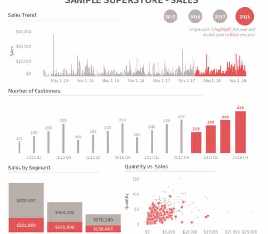
1. First, create the sheets of required KPIs. We have created 4 sheets;
- Sales Trend
- Number of Customers
- Sales by Segment
- Quantity Vs. Sales


2. Create a Year calc from ‘Order Date’ field.

3. Create a parameter using ‘Year’ calculated field. (This parameter is used in Parameter Action)

4. Create a calculated field ‘Parameter Calc’ which is used to color/highlight the selected year.

5. Drag the ‘Parameter Calc’ to Color and Size in marks shelf.

6. If you apply ‘Parameter Calc’ to the created sheet, it will look something like this. The selected year in ‘Year Parameter’ will be highlighted with the color and size.

7. Now, we need a toggle to switch between years. So, we have to create a sheet like below,
(Like before, drag the ‘Parameter Calc’ to color and size in marks shelf)

8. Arrange the sheets in a dashboard. Give a header and format the texts, fonts, colors if required.

9. How to create ‘Parameter Action’
- Select Dashboard > Actions.
- In the Actions dialog box, click Add Action and then select Change Parameter.

- Select ‘Year Toggle’ as Source sheet and choose ‘Select’ in Run action on:
- Select ‘Year Parameter’ as Target Parameter.

- Now, if you select a year, the parts in the sheet corresponding to the selected year will get highlighted in color and other parts are grayed out.
10. How to create ‘Sheet Action’
- Select Dashboard > Actions.
- In the Actions dialog box, click Add Action and then select Filter.
- Select ‘Year Toggle’ as Source sheet and all the sheets in the dashboard as Target Sheets
- Choose ‘Select’ in Run action on and choose ‘Show all values’ in Clearing the selection will

Now, we have set both Parameter Action and Sheet Action for ‘Year Toggle’ sheet.
If we single click on the year, it will highlight (Parameter Action) the year throughout the dashboard and if we double click on the year, it will filter out (Sheet Action) that particular year throughout the dashboard.

Beinex is a digital transformation organization en-rooted with ideas, innovation and unparalleled customer service. Our mission is to transform the way individuals and the organizations work with the data through innovation and experience.
If you are interested in learning more about the latest Tableau parameter actions and use cases, please contact us at training@beinex.com/ info@beinex.com
and we would be happy to schedule a Tableau demo or training for you and your company.


