How AI Decision-Making is Improving Enterprise Outcomes
Blog
Share 
Going Further, Together with AI-driven Sentiment Analysis (Infographics)
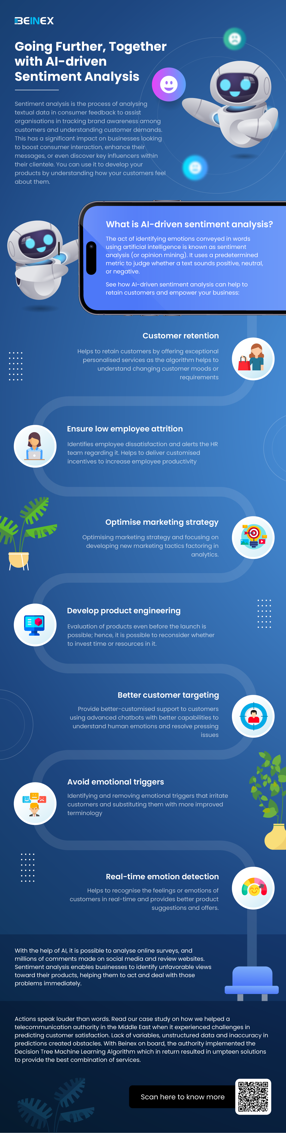
Sentiment analysis is the process of analysing textual data in consumer feedback to assist organisations in tracking brand awareness among customers and understanding customer demands. This has a significant impact on businesses looking to boost consumer interaction, enhance their messages, or even discover key influencers within their clientele. You can use it to develop your products by understanding how your customers feel about them.
Related Articles

Time-series Analysis in Tableau and 6 Real-world Success Stories
What is Time Series Analysis?
Time series analysis involves examining data that changes over time or where time is a variable in the outcomes. Time isn't just a data point; it's the primary axis on which the data is based.
The main difference with time series analysis is that data is collected at regular time intervals. This helps identify patterns in the data, forming trends, cycles, or seasonal variations. With a consistent time frame of historical data, time series forecasting becomes a valuable tool for predicting future data. Time's crucial role as a variable in data across industries makes time series analysis widely applicable. Explore a few examples outlined below.
6 Real-world Examples of Time Series Analysis in Various Industries
Example 1: Health Authority Enhances Patient Care
Problem: Inefficient resource use and rising costs of care and operations over time.
Solution: Utilizing data analytics, a prominent health authority conducted a comprehensive analysis of patient data. Examining historical data on patient stays, treatments, and conditions, they identified optimal times for administering medication, resulting in reduced average length of stay and cost savings for both patients and the system.
Insight: Time series analysis in healthcare extends beyond patient care to chronic disease research and epidemic-scale studies. Tracking chronic diseases over time and analyzing patient data using time series methods contribute to advancements in the field.
Example 2: Retail Giant Identifies Sales Opportunities
Problem: Slow data analysis affecting decision-making days before events.
Solution: A leading retail giant's front-office team integrated all data sources to gain a comprehensive view. Implementing time series analysis dashboards, they swiftly identified sales opportunities by forecasting against seasonal trends. Proactive measures were taken to increase ticket sales for upcoming events based on real-time insights.
Insight: Time series analysis aids retail giants in making data-driven decisions, predicting consumer trends, and strategizing marketing efforts, ensuring maximum impact.
Example 3: Manufacturing Company Improves Forecasting Accuracy
Problem: Inaccurate and time-consuming operations, manufacturing, and sales forecasting.
Solution: A manufacturing company revamped its forecasting process using time series analysis and modeling. By leveraging better data and faster analysis, they reduced analysis time from one day to one hour. Accurate forecasts in supply chain and manufacturing processes led to significant cost reductions in inventory, supply chain, labor, and capital equipment.
Insight: Time series analysis proves invaluable in optimizing forecasting models, enhancing accuracy, and streamlining operations in manufacturing.
Example 4: Marketing Analytics Scaling for Media Clients
Problem: Evolving marketing technologies making it challenging to quickly analyze information for media clients.
Solution: An analytics firm centralizes over 100 data sources using Tableau, allowing quick data retrieval and the creation of custom dashboards. Time series analysis aids in media forecasting, enabling the firm to develop insightful "what if" analyses. This empowers clients to make informed decisions about marketing investments.
Insight: Time series analysis combined with data centralization is crucial for scaling marketing analytics, providing clients with actionable insights.
Example 5: Streamlining IT Costs Through Self-Service Analytics
Problem: Business decisions based on static reports, consuming time and resources.
Solution: A retail group enables department staff with self-service analytics in Tableau, reducing IT costs by 20%. Time series analysis is applied for accurate forecasting of retail and IT trends, optimizing product orders and resource allocation.
Insight: Time series analysis aids in accurate forecasting for retail and IT trends, optimizing resource allocation, and reducing IT costs.
Example 6: Innovative Use of Data Analytics in Auditing Processes
Problem: Traditional audits were time-consuming and lacked value addition.
Solution: An organization in the energy sector used Tableau to analyze a year's worth of data, uncovering trends in financial processes. This data-driven approach revolutionized their auditing processes, providing deeper insights into the financial health of the organization.
Insight: Time series analysis proves instrumental in data-driven audits, providing a comprehensive view of historical data and uncovering trends for better decision-making.
These real-world examples showcase the versatility and impact of time series analysis across different industries, emphasizing its crucial role in data-driven decision-making and business optimization.
Snowflake: Handling Semi-structured Data with Variant and Flatten
Semi-structured Formats with Snowflake Support
The number of sources that produce semi-structured data has increased exponentially in recent years. The arrival of Snowflake Data Cloud has made it effortless to process complex datasets. Snowflake supports storing and processing semi-structured data. It supports semi-structured formats enlisted below:- • JSON
- • Avro
- • ORC
- • Parquet
- • XML
- • Variant
- • Flatten
Variant
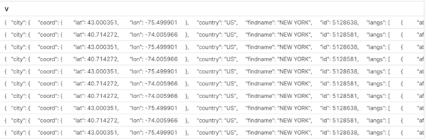
A variant is a datatype which can hold semi-structured data in a single field. Snowflake stores semi-structured data in the column format when semi-structured data is loaded into a VARIANT column. A single row can contain other underlying data. Let’s demonstrate with the help of examples:
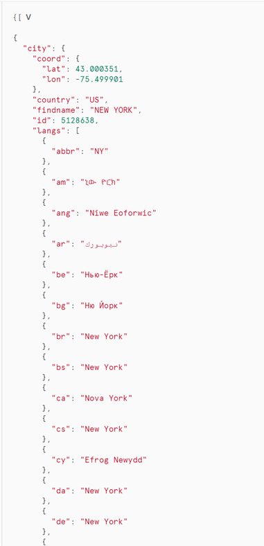

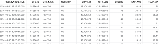
The stored data can be easily retrieved and structured from the above table by a simple query as below:
select
v:time::timestamp as observation_time,
v:city.id::int as city_id,
v:city.name::string as city_name,
v:city.country::string as country,
v:city.coord.lat::float as city_lat,
v:city.coord.lon::float as city_lon,
v:clouds.all::int as clouds,
(v:main.temp::float)-273.15 as temp_avg,
(v:main.temp_min::float)-273.15 as temp_min,
(v:main.temp_max::float)-273.15 as temp_max,
v:weather[0].main::string as weather,
v:weather[0].description::string as weather_desc,
v:weather[0].icon::string as weather_icon,
v:wind.deg::float as wind_dir,
v:wind.speed::float as wind_speed
from json_weather_data
Note: ‘v’ is the Field (Column) name, and the JSON tags are arranged alongside to retrieve datasets.
Flatten
Compound values are flattened into multiple rows with the use of the Snowflake Flatten Command. A tool called Snowflake FLATTEN is used to transform semi-structured data into a relational structure. Relatively complex JSON structures such as nested JSON structures can be structured with FLATTEN function in Snowflake. Here is an example of the same:
 The above JSON file stores a single set of conversations between two texters in a single row. If the requirement is to get every individual message as a separate row a FLATTEN function can be used to produce the following result:
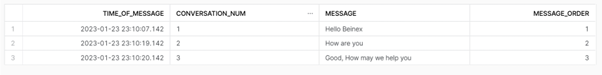
Here is the query to generate the above table from semi-structured data:
(SELECTb.value:message_date::TIMESTAMP AS Time_Of_Message,
b.value:conversation_number::STRING AS Conversation_num,
b.value:message:message_text:msg_txt::STRING AS Message,
ROW_NUMBER() OVER ( PARTITION BY b.value:dialogId::STRING ORDER BY
b.value:message_date::TIMESTAMP ASC) as Message_order
FROM customer_messages t,LATERAL FLATTEN(input => t.v) b);
Summing Up
The ability of Snowflake’s assistance is undeniable. It aids you to make better decisions and offers a better overall experience when attempting to get the most out of your data, through features like Flatten and Variant. If you want to be a part of Snowflake’s incredible platform, let us help you. Beinex’s partnership with Snowflake enables us to offer you advanced features like automated tuning and elastic computing, along with analytics modernization services, to help your organisation realise exponential Return on Investment.

Beinex Achieves Platinum Status Among Top Business Intelligence Consulting Firms in the Middle East 2024
About Consultancy-me
Consultancy-me.com is a leading platform for staying updated on the advisory and consulting industry. Their website is dedicated to delivering the latest news and trends across 60+ industries and functional areas within the consultancy sector. As part of the Consultancy.org family, their international network of consulting platforms draws in 4 million visitors per year. Globally, they partner with over 150 leading consulting firms and select companies. The platform serves as a comprehensive resource for professionals interested in consultancy careers, offering insights into job opportunities, graduate schemes, apprenticeships, and internships within the consulting industry.
About Beinex
Beinex is a global firm with businesses on 5 continents specializing in Data, AI, and Digital Transformation. A pioneering enterprise, Beinex has established a powerful presence in the regions it serves by delivering comprehensive solutions to address diverse business challenges in the spheres of Advisory, Technology & Software Development, and Systems Integration. Beinex Consulting caters to a broad spectrum of industries and departments, offering tailored solutions to meet their specific requirements. Beinex excels in a multitude of domains, including Enterprise Data Ecosystem Installation, Data Strategy, Data Roadmap Creation, Technology Roadmap Generation, Data Governance, Data Science Consulting, Data Engineering, Analytics Transformation, Data Monetisation, GRC, as well as other government and business enablement solutions. Feel free to schedule a call with us to explore more about our BI services: https://www.beinex.com/business-intelligence
Five Ways to Overcome Data Trust Challenges (Infographics)


Alteryx and Generative AI: The Alteryx Approach
1. Generative AI Features in Existing Products
Alteryx is proactively identifying areas where GenAI can improve the productivity and efficiency of its customers. These innovations are integrated into existing tools, such as Alteryx Designer, to streamline processes, automate routine tasks, and enhance the overall analytics experience. For example: OpenAI Connector: Users can now integrate GenAI directly into Alteryx Designer workflows to streamline communication and share data more effectively. AI-Generated Workflow Summaries: These summaries automate documentation processes, helping users enhance governance and auditability.
2. Enterprise-Ready Generative AI Platform
Alteryx’s GenAI platform enables businesses to create, train, and deploy custom AI models that operate securely within their organizational firewall. This approach ensures that data privacy and security are maintained while offering organizations the flexibility to tailor AI models to specific business needs. Alteryx also provides an environment for creating proprietary models that are customized to fit each organization’s workflows, making it easier to integrate AI-driven analytics into everyday operations.
3. New GenAI Applications and Interfaces
Data analytics is a collaborative process that involves various stakeholders, including analysts, data scientists, engineers, and knowledge workers. With Alteryx, these roles can now collaborate in real time through multi-modal analytics powered by GenAI. The flexibility to use different analytical tools—like SQL, Python, notebooks, or Alteryx workflows—opens doors for more seamless collaboration across different teams. GenAI applications like Magic Documents allow Alteryx users to automatically generate insight-rich reports in just a few clicks, drastically reducing time-to-insights and increasing productivity across business functions.
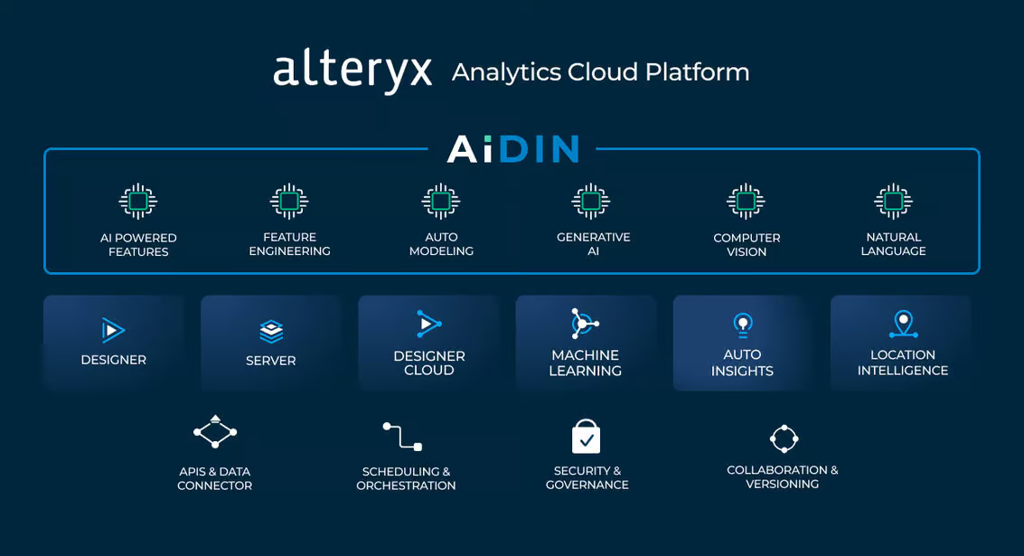
Introducing Alteryx AiDIN
AiDIN is Alteryx's umbrella for all AI-related capabilities, combining existing AI features with cutting-edge GenAI innovations. Alteryx AiDIN enables users to leverage advanced AI models for analytics, whether it's extracting insights, automating tasks, or generating complex reports. Some of the key benefits include:
• Improved Time-to-Value: AiDIN accelerates the time it takes to derive insights from data, enabling quick decision-making for critical business tasks.
• Increased Operational Efficiency: By automating repetitive tasks, AiDIN frees up time for users to focus on higher-value activities.
• Enhanced Governance: Alteryx AiDIN ensures that AI capabilities meet stringent enterprise-grade governance and security standards.
 Source: https://www.alteryx.com/blog/alteryx-announces-generative-ai-capabilities
Data Security and Trust: The Alteryx AiDIN Commitment
A key concern in any AI-driven platform is data security and the integrity of AI-generated outputs. Alteryx AiDIN prioritizes these through: 1. Mitigating Hallucinations In generative AI, "hallucinations" refer to scenarios where AI models produce plausible but incorrect information. Alteryx has implemented stringent quality checks and continuous feedback mechanisms to minimize these errors. This ensures that businesses can rely on the outputs generated by AiDIN for decision-making. 2. Fact-Checking Mechanisms Alteryx AiDIN integrates fact-checking tools to verify AI-generated insights against actual source data. This added layer of validation helps organizations maintain the accuracy and reliability of their analyses. 3. Data Privacy and Security Alteryx ensures that data privacy is maintained at all stages of the AI process. AiDIN offers two key deployment options: Private Data Handling and SaaS. Both options provide robust encryption and ensure that sensitive data is securely managed within a customer’s ecosystem, giving businesses peace of mind as they adopt AI.
The Future of AI-Driven Analytics
The integration of GenAI into the Alteryx platform paves the way for smarter, more accessible analytics. With capabilities like OpenAI integration, Magic Documents, and enterprise-level model customization, Alteryx is enabling organizations to maximize the value of their data, improve efficiency, and foster a more collaborative analytics environment. By combining GenAI’s potential with trusted, secure analytics, Alteryx is redefining how enterprises interact with data—delivering faster insights and more impactful results across industries. Get in touch with us for a free demo: https://www.alteryx.com/designer-trial/free-30-days?