How AI Decision-Making is Improving Enterprise Outcomes
Blog
Share 
Five Ways to Overcome Data Trust Challenges (Infographics)
 7 November 2022
  Sumi S
How to tackle the vast amounts of data that your enterprise accumulate and still come to the point of trusting it to make business-critical decisions? How to bank on your data and transform your enterprise? Answers are here:
Related Articles

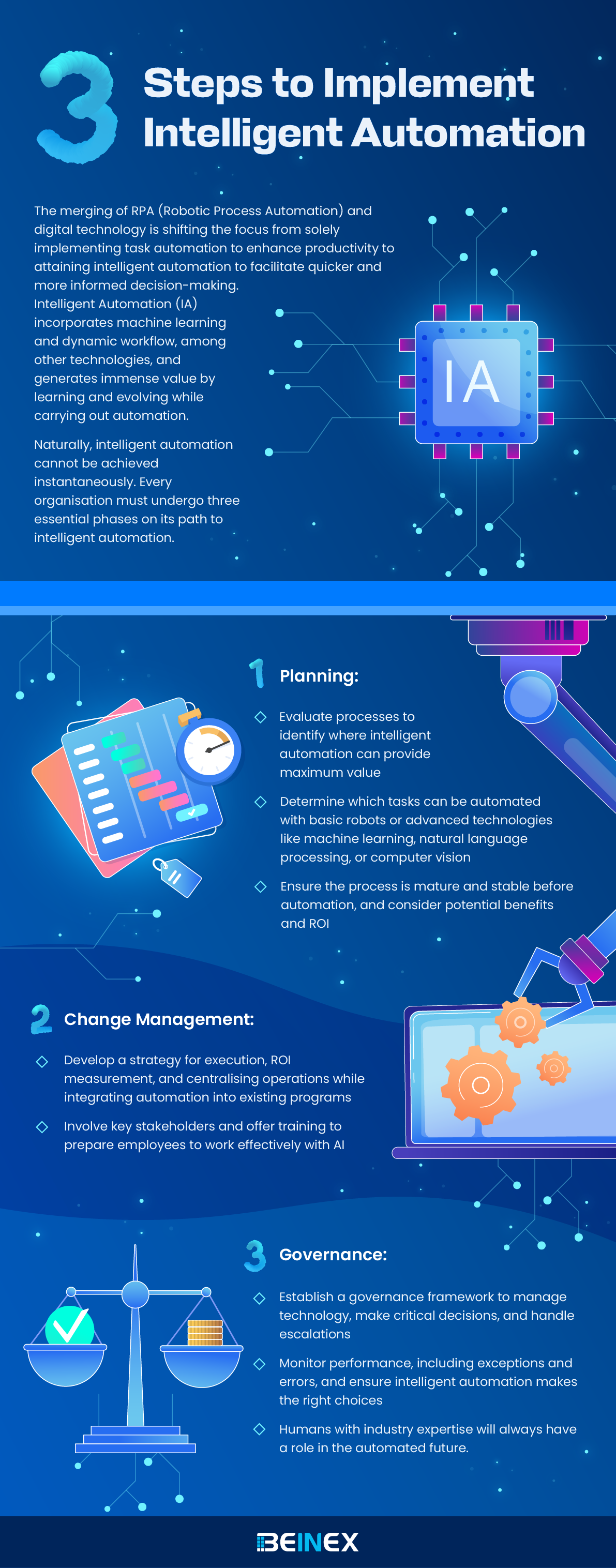
Three Steps to Implement Intelligent Automation(Infographic)

BI Tools: Decision-making is Now at Your Fingertips!
Here is a list of a few popular business intelligence tools companies use to gain insights:
1.Sisense: Leading Cloud Analytics Platform
Sisense is one of those data analytics and business intelligence tools known for its efficiency and easy-to-use quality. It enables anyone within an organisation to manage massive and intricate datasets and analyse and visualise data without any outsourcing. It also combines data from various sources, such as Adwords, Google Analytics, and Salesforce. The in-chip technology helps it to process data faster than any other tool. Gartner, G2, and Dresner have recognised Sisense as a leading cloud analytics platform.
2.SAP Business Intelligence: Price to the Upside
SAP Business Intelligence offers advanced analytics solutions such as machine learning, BI predictive analytics, and planning and analysis. This enterprise-level client/ server system application provides data visualisation and analytics applications, reporting and analysis, mobile analytics, and office integration.
The platform focuses heavily on Customer Experience (CX) and CRM, digital supply chain, ERP, etc. What's particularly appealing about this platform is the self-service, role-based dashboards, which allow users to create unique dashboards and applications. SAP is a robust software designed for all roles that provide many functionalities on a single platform. However, the product's complexity raises the price, so be equipped for it.
3.Datapine: Accessible to non-technical users
Datapine is a comprehensive business intelligence platform that makes the intricate process of data analytics accessible to non-technical users. Datapine's solution allows data analysts and business users to blend different data sources, perform advanced data analysis, build interactive business dashboards, and create actionable business insights by adopting a comprehensive self-service analytics approach.
4.Dundas BI: Access Multiple Data Sources in Real Time
Dundas BI is a browser-based business intelligence tool that enables users to access multiple data sources in real-time. It offers excellent visualisations in the form of tables, graphs, and charts that can be personalised and viewed on mobile devices and desktop computers. Users can easily create reports and extract specific performance metrics for analysis. Dundas aids all types of businesses and industries.
5.MicroStrategy: Fast Dashboarding in Action
MicroStrategy is a business intelligence tool for enterprises that provides powerful and fast dashboarding and data analytics, cloud solutions, and hyperintelligence. Users can use this solution to identify trends, and new possibilities, increase productivity, etc. It can be accessed via desktop or mobile and can be connected to one or more sources.
6.Yellowfin BI: No-co-Low-co Approach
Yellowfin BI is a business intelligence and analytics platform that combines visualisation, machine learning, and collaboration. It can quickly sort through massive amounts of data using intuitive filtering, and it is accessible from anywhere. This BI tool takes dashboards and visualisations to the next level by utilising a no-code/low code development environment.
7.Qlik Sense: Search & Conversational Analytics
A product of Qlik, QlikSense is a complete data analytics platform and business intelligence tool. QlikSense can be accessed from any device at any time. The user interface of QlikSense is optimised for touchscreen, which makes it a prevalent BI tool. It offers a one-of-a-kind associative analytics engine, sophisticated AI and a high-performance cloud platform, making it more attractive. An exciting feature of this platform is its Search & Conversational Analytics, enabling a faster and easier way to ask questions and discover new insights through natural language.
8.Zoho Analytics: Blend and Merge Data
Zoho Analytics is an excellent BI tool for detailed reporting and data analysis. It supports automatic data syncing and can be scheduled regularly. It quickly creates a connector and formulates meaningful reports by blending and merging data from various sources using the integration APIs. It helps to quickly identify the essential details by creating ersonalized reports and dashboards with an easy editor. It also includes a distinct commenting section in the sharing options, ideal for collaboration.
9.Microsoft Power BI: Identify Trends in Real Time
Microsoft Power BI is a web-based tool that is one of the best for data visualisation. It enables users to identify trends in real-time and includes brand new connectors that allow businesses to step up marketing campaigns. Microsoft Power BI is accessible virtually from any location as it is web-based. This tool is designed to integrate apps and deliver reports in real-time dashboards.
10.Looker: Ideal for SMEs
Looker, a data discovery app, is another business intelligence tool to watch for! This unique platform is now part of Google Cloud and integrates with any SQL database or warehouse and is ideal for startups, midsize businesses, and enterprise-grade businesses. This tool's advantages include its ease of use, useful visualisations, powerful collaboration features such as easy integration with apps, flexible sharing of data and reports via email or USL, and a dependable support system.
11.Clear Analytics: Just Need Essential Excel Skills to Use
Clear Analytics is an easy-to-use Excel-based software that can be utilised even by employees with just the essential Excel skills. It is a self-service Business Intelligence system with BI features like data creation, automation, analysis, and visualisation. Clear Analytics also functions with Microsoft Power BI, cleaning and modelling various datasets with Power Query and Power Pivot.
12.Tableau: Needs No Introduction
Tableau is a powerful BI tool that specialises in data discovery and visualisation. The software allows to quickly analyse, visualise, and share data without IT intervention. Tableau works with various data sources, including Microsoft Excel, Oracle, MS SQL, Google Analytics, and SalesForce. Users will have access to well-designed, user-friendly dashboards. Tableau also provides several products, such as Tableau Desktop (for anyone) and Tableau Server (analytics for organisations), both of which can be run locally, as well as Tableau Online (hosted analytics for organisations) and others.
13.Oracle BI: Proactive Intelligence Power
Oracle BI is a business intelligence technology and application portfolio for enterprises. This technology provides nearly all business intelligence capabilities, including dashboards, proactive intelligence, ad hoc reporting, etc. Oracle is a reliable choice ideal for businesses that need to analyse large amounts of data from Oracle and non-Oracle sources. Data archiving, versioning, a self-service portal, and alerts/notifications are also essential features.
14.Domo: Predictive Analysis on the Go
Domo is a fully cloud-based business intelligence platform that integrates spreadsheets, databases, and social media data. The platform provides visibility and analysis at the micro and macro levels, including predictive analysis powered by Mr Roboto, their AI engine. From cash balances and lists of your best-selling products by region to marketing ROI calculations for each channel, Domo has got you covered.
15.IBM Cognos Analytics: Hidden Patterns in Data Discovered
Cognos Analytics is a business intelligence platform powered by AI that supports the entire analytics cycle. It helps to visualise, analyse, and share actionable insights, from data discovery to data operationalisation. The data is interpreted and presented in a visually appealing report, and AI allows the discovery of hidden patterns in the data.
The use of advanced business intelligence reporting tools makes tasks simple and manageable. Business intelligence platforms are subject to change based on business needs and the advancement of technologies. Still, they have proven to be a great way to accomplish strategic goals effectively and efficiently.

Prepping the data on Tableau: Five aspects that matter
Data preparation is purging imperfectly formed data, reorganising unclean data, and merging various data sets for analysis. Rows and columns in the data structure must be changed, and data types and values must be cleaned up. The amount of time it takes to find insights directly depends on how quickly and well you prepare your data. The entire process can be sped up by being aware of the extent of the data you're studying and observing the modifications you make to the data.
With the help of Tableau Prep Builder, data can be combined, shaped, and cleaned more quickly and easily for analysis within Tableau. You can swiftly obtain high-quality data using the linear and visual approach when preparing your data.
When ushering in data into a data prep tool, it is always better to know what you're working with and whether you're looking at the complete data set or just a subset. Before you begin cleaning, you might also need to undertake some data research. Five crucial steps are to be taken care of for prepping the data.
Let's have a look:



 One technique to get beyond this obstacle is visualising the data pane in Tableau Desktop as to how it should appear. Do you have columns with the same value in several places? Should each product be in a single field with the sales transactions stated below, or should each product have its column with the sales transactions listed underneath? The latter is more likely, and a pivot is necessary for this situation.
You will be joining the data if you need to combine two tables. By using a join, you can increase the number of fields in your data source that you can investigate. Although a join can be added at any point during the data preparation process, the sooner you use it, the sooner you will comprehend the data set and identify areas that require immediate attention.
One technique to get beyond this obstacle is visualising the data pane in Tableau Desktop as to how it should appear. Do you have columns with the same value in several places? Should each product be in a single field with the sales transactions stated below, or should each product have its column with the sales transactions listed underneath? The latter is more likely, and a pivot is necessary for this situation.
You will be joining the data if you need to combine two tables. By using a join, you can increase the number of fields in your data source that you can investigate. Although a join can be added at any point during the data preparation process, the sooner you use it, the sooner you will comprehend the data set and identify areas that require immediate attention.
 Like appending two data sets together, a union enables you to do so. For instance, you might have an Excel file where each sheet displays transactions from different years. You may maintain the same structure with extra rows by using a union rather than joining the tables.
After your data has been organised, processed, and filtered, it's time to interpret what it is trying to tell you. Tableau Prep connects with your entire business intelligence platform like many other data preparation products. To allow others to begin their analysis, publish the extract to Tableau Server or Tableau Cloud. Bring it into Tableau Desktop to start posing and investigating more in-depth queries. The hardest part of the data analysis process is now complete. It's time to share the breakthroughs that resulted from your hard work.
Like appending two data sets together, a union enables you to do so. For instance, you might have an Excel file where each sheet displays transactions from different years. You may maintain the same structure with extra rows by using a union rather than joining the tables.
After your data has been organised, processed, and filtered, it's time to interpret what it is trying to tell you. Tableau Prep connects with your entire business intelligence platform like many other data preparation products. To allow others to begin their analysis, publish the extract to Tableau Server or Tableau Cloud. Bring it into Tableau Desktop to start posing and investigating more in-depth queries. The hardest part of the data analysis process is now complete. It's time to share the breakthroughs that resulted from your hard work.
1. Adjust the data sample size
To speed up your data preparation process and improve performance, you should generally only connect to a small portion of a vast data set. You might occasionally prefer to view the entire data set, and Tableau Prep enables you to do so. If a sample doesn't help you complete your data preparation task, you can try the following:
- a. Boost the size of your data sample: Adjust the sample's row count by returning to the input stage. You can add more rows or include all the data but remember that doing so might make the performance slower. Another word of caution is that utilising a specified number of rows will only return the fastest method the underlying database can find to replace the given rows.
- b. Take random sampling: Tableau Prep automatically chooses the optimal number of rows to return based on the total number of fields in the collection and the data types of those columns. The database level random sampling occurs and returns the specified number of rows. The database returns a sample after inspecting each entry. Not all data sources provide this option, which could also affect performance.
- c. Add a step filter at the input stage: You may ensure that the information pulled into your data set is pertinent to your research by including a filter at the input stage. This improves performance while providing you with a more representative sample.
2.Evaluate the data
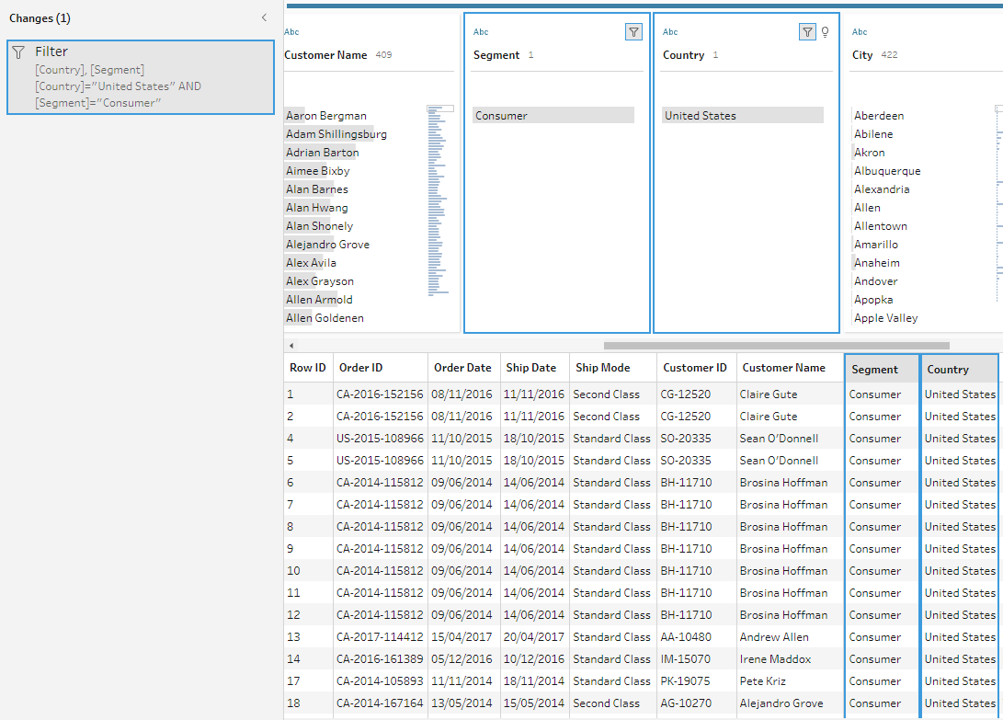
You'll probably want to start by counting the number of distinct values in each field. A simple check at the column header at the top reveals how many states are represented in the data set. You'll also want to understand how various values connect to identify data outliers or problems. You can utilise highlighting in Tableau Prep to find correlations between different fields. The data grid view is condensed to only display the records with the selected value in the chosen field when you click on a value in the profile pane. Tableau Prep highlights the corresponding values in blue, and the values span areas.
3.Filter the data
Limit the fields you import into Tableau Prep to those you'll need for your analysis to maximise the overall effectiveness of your data preparation process. By filtering your data, you can verify that you're performing the proper analysis while saving time. For instance, if you need to look at sales data from the previous two years, you may use the range or relative date filters to limit the date field to that period. You might want to eliminate any incorrect or irrelevant data. A value in the data pane can be excluded with a single click. You can do this at any time during your flow.
4.Assess and tidy up the data
Tableau's data types will have an impact on your analysis. Therefore, it's critical to correctly identify each field before beginning. Even though Tableau allows you to update aliases, alter data types, split lots, and create calculations, it is far simpler to carry out these tasks beforehand, particularly when preparing the data set for someone else. Tableau Prep includes built-in capabilities to aggregate and replace recurring characters or pronunciation, saving you from having to edit each one individually so that you don't have to; these solutions use algorithms to make cleaning easier. Or, if you foresee a missing value, you may manually add it so that it will be included when the flow processes the complete data set. You can apply a computation if you know that a field must be cleaned or filtered, but it takes more than the user interface offers.
5.Understand the data results
Deciding about the final data set's appearance while you begin to prepare your data can be difficult. For Tableau to effectively analyse your data, you might need to merge numerous data sources or pivot your data from columns to rows.
One technique to get beyond this obstacle is visualising the data pane in Tableau Desktop as to how it should appear. Do you have columns with the same value in several places? Should each product be in a single field with the sales transactions stated below, or should each product have its column with the sales transactions listed underneath? The latter is more likely, and a pivot is necessary for this situation.
You will be joining the data if you need to combine two tables. By using a join, you can increase the number of fields in your data source that you can investigate. Although a join can be added at any point during the data preparation process, the sooner you use it, the sooner you will comprehend the data set and identify areas that require immediate attention.
Like appending two data sets together, a union enables you to do so. For instance, you might have an Excel file where each sheet displays transactions from different years. You may maintain the same structure with extra rows by using a union rather than joining the tables.
After your data has been organised, processed, and filtered, it's time to interpret what it is trying to tell you. Tableau Prep connects with your entire business intelligence platform like many other data preparation products. To allow others to begin their analysis, publish the extract to Tableau Server or Tableau Cloud. Bring it into Tableau Desktop to start posing and investigating more in-depth queries. The hardest part of the data analysis process is now complete. It's time to share the breakthroughs that resulted from your hard work.
How Alghanim standardized collaborative workflow creation by implementing the “Alteryx Sandbox Server” platform on AWS that paved the way for 20% better business predictions
Challenge
- The IT infrastructure of Alghanim where the Alteryx Sandbox Server platform was hosted was in an on-premise datacenter which was designed to be scalable and robust with multi node physical clusters including the server, storage and network components. However, most of the physical hardware was quite old and not equipped with the latest generation of physical servers.
- Frequent hardware crashes and portal downtime kept troubling the availability of the Alteryx Sandbox Server application. Assigning a touch hand support person to power on the hardware that was down seemed quite impossible due the restrictions during covid period. Hence, Alghanim wanted to look for another viable solution.
- Though the hardware setup at Alghanim was well equipped to meet the occasional spikes in the traffic, it was observed that over a course of 6-month time, most of the IT infra was underutilized than predicted. It was realized that spending huge amount of money on an old hardware plus software maintenance, license costs, internet bandwidth, datacenter cooling and maintenance, touch support personnel and electricity costs – were keeping the business operations challenging.
- There was an attempt by Alghanim to select a cost-effective solution that can host Alteryx Sandbox Server application servers, web servers and archival data. This way IT infra can be re-provisioned to host sensitive data on-premise and the rest on the cloud, thereby reducing the overall physical hardware costs spent on a yearly basis.
Why AWS
- Alghanim decided to migrate Alteryx Sandbox Server, database servers and archival data to AWS.
- The Alteryx Sandbox Server’s AWS architecture includes Amazon Elastic Compute Cloud (Amazon EC2), that provides complete control of its computing resources, updates to tables in Amazon Relational Database Service (Amazon RDS) and AWS Elastic Load Balancer was used to distribute the traffic to the underlying EC2 instances based on the load.
Benefits
- Alghanim uses AWS services to provision infrastructure and deploy the Alteryx Sandbox Server platform to other departments within it. In addition, the Alteryx Sandbox Server resources that are no longer required to be run all the time are made to auto shutdown thus saving cost. Alghanim reported a 30% cost reduction after implementation of AWS for the Alteryx Sandbox Server platform.
- The implementation of Alteryx Sandbox Server on AWS made Alghanim confident in the security of its data, and its accreditation team is enthusiastic about the monitoring and auditing capabilities provided by AWS tools. With the implementation of IAM roles, Alghanim IT team was able to isolate systems and tightly control user accesses. These capabilities were harder to achieve within the existing infra but were available out of the box with AWS
- By adopting AWS to host the Alteryx Sandbox Server platform, Alghanim has been able to innovate and experiment to a degree previously impossible. For example, Alghanim compared the performance and cost-effectiveness of three different cloud solutions. Without moving to the AWS, the costs associated with running an outdated on-premise hardware would have creeped up and the alternative way of upgrading the existing on-prem infrastructure to the latest hardware models and then hosting the Alteryx Sandbox Server application on top of it would have taken months.

What’s New in Tableau 2025.1: AI-Powered Insights, Multilingual Support, Private Connectivity, and More
Tableau 2025.1 at a Glance
- • Converse with Tableau Agent in six new languages using conversational AI.
- • Connect Tableau Cloud to AWS data securely with Private Connect.
- • Track KPIs on the go with a redesigned Pulse mobile homepage.
- • Programmatically access published data sources using VizQL Data Service.
- • Explore new features early with Tableau Cloud preview websites.
Let’s dive into the new updates in Tableau 2025.1:
1. Tableau Agent Multilingual Support
Perform multilingual data analysis. It is now possible for users to converse with Tableau Agent (and Tableau Pulse!) in French, Italian, German, Spanish, Japanese, and Portuguese. More people can now access conversational analytics in their native language.
With conversational AI, the Tableau Agent helps users navigate from data curation to exploration and accelerates all phases of analysis with generative AI. Additionally, because it is based on the Einstein Trust Layer, businesses can be assured that their data will remain safe, secure, and accessible only as intended.
2. Private Connect for Tableau Cloud
Use a dedicated, private connection to safely link Tableau Cloud to AWS data. Private Connect establishes a secure connection between Tableau Cloud and AWS data, ensuring your data remains private and is not made publicly available.
3. Revamped Tableau Pulse Homepage on Mobile
The redesigned Tableau Pulse mobile homepage enhances users' ability to engage with data on the go. With a side-by-side view of at least three key metrics, it allows for instant comparison and faster insight generation.
The clean, intuitive interface enables users to easily spot patterns, track trends over time, and take action quickly, without needing to dig through dashboards. Whether you're monitoring sales, operations, or customer engagement, Pulse ensures your most important KPIs are always within reach.
4. API for VizQL Data Services
VizQL Data Service is an innovative API that allows you to access published data sources in Tableau through programmatic queries rather than visualizations. Designed to maximize the versatility of your Tableau assets beyond traditional visualization, VizQL Data Service helps you tap into the analytic power of your data model anywhere.
It facilitates automating data processes by allowing you to run programmed queries directly on your data sources. By utilizing pre-existing Tableau connectivity and data models, you may more effectively design sophisticated, data-driven apps. You can now utilize your data models in any context, breaking free from the confines of visual tools.
5. Tableau Cloud Preview Websites
Tableau administrators can stay ahead of the curve by gaining early access to upcoming updates through release preview sites. This allows teams to test new features in advance, understand functional changes in a hands-on environment, and evaluate how updates will affect their organization’s unique dashboards and workflows—ensuring a smooth transition when the full release goes live.
In a Nutshell
The Tableau 2025.1 release brings a bunch of exciting updates to make working with data easier, smarter, and more secure. Now you can chat with Tableau Agent in multiple languages, get help with data prep and analysis using natural language, and connect securely to your AWS data using Private Connect. The refreshed Pulse homepage on mobile lets you track and compare key metrics at a glance, helping you make faster decisions wherever you are. Plus, with the new VizQL Data Service, developers can now access and use data directly, without relying on traditional dashboards. And if you're a Tableau admin, you get early access to test new features before they go live, so your team is always ready for what’s next.
Source: https://www.tableau.com/en-gb/2025-1-features