How AI Decision-Making is Improving Enterprise Outcomes
Blog
Share 
Eyes Wide Open: Defending Against Homograph Phishing Schemes
Understanding Homograph Phishing Attacks
Homograph phishing attacks rely on Internationalised Domain Names (IDNs), a feature designed to accommodate non-ASCII characters in domain names. While this capacity improves internet access for people of varied language backgrounds, it also allows for harmful exploitation. Cybercriminals can now register domain names that appear identical or almost equivalent to regular Latin characters but come from alternative Unicode character sets.
For example:- Legitimate Website: www.login.microsoft.com
- Homograph Phishing URL: www.login.micrsoft.com
In this example, the 'o' in the homograph URL is not the standard Latin 'o,' but rather the Latin Small Letter Sideways 'ᴑ', which visually appears identical. To unsuspecting users, the homograph URL looks indistinguishable from the legitimate one and consequently fall prey to it.
The Dangers of Homograph Phishing Attacks
Homograph phishing attacks pose significant risks, primarily due to their ability to deceive users successfully by means of:
- Credential Theft: Cybercriminals utilise homograph URLs to impersonate reputable websites and deceive users into entering their login credentials, collecting critical information.
- Financial Fraud: Attackers may imitate banking websites, payment portals, or e-commerce platforms to steal credit card information or banking information from unsuspecting consumers, resulting in financial losses.
- Malware Distribution: Homograph URLs can route users to fraudulent websites or start malware downloads, possibly infecting their devices and leading to data breaches.
- Business Email Compromise (BEC): Homograph phishing URLs help in BEC attacks, in which attackers imitate high-ranking officials to trick employees into making fraudulent money transfers or disclosing sensitive information.
Protecting Against Homograph Phishing Attacks
While homograph phishing attacks can be challenging to detect, several preventive measures can help enhance cybersecurity like those of:
- Domain Monitoring: Monitor domain registrations regularly for questionable or homograph URLs that mimic valid domains. Security professionals can also employ specialised tools to proactively identify potential risks.
- Using Web Browsers with IDN Support: Modern web browsers include features for detecting and displaying problematic homograph URLs. Check that your browser is up to date and that IDN support is enabled.
- URL Inspection: Hovering over links to show the actual domain before clicking on them encourages people to carefully analyse URLs. Homograph URLs may appear deceiving at first view, but they disclose their actual nature with closer inspection.
- Deploying Security Software: To detect and block fraudulent URLs and emails, use powerful security solutions such as anti-phishing software, firewalls, and email filters.
- Cybersecurity Awareness Training: Educate staff and users about the dangers of homograph phishing attempts and encourage them to be proactive in cybersecurity.
Defending against homograph phishing attacks necessitates a multi-pronged approach. Organisations and people must use domain monitoring services such as Amazon Route 53 and web browsers with IDN capability to identify fraudulent URLs. It is critical to educate clients about the risks through cybersecurity training.
Beinex+ AWS Offerings
AWS provides security services such as AWS Shield and AWS WAF to help protect against phishing attacks. Strengthen your defences by integrating robust security software from the AWS Marketplace and embracing Two-Factor Authentication (2FA). Safeguard against evolving threats like homograph phishing for a safer online experience.
Beinex is an AWS consulting partner, and we empower customers to host their BI solutions, provide security services and much more on the cloud. Our cloud migration experts bring in best-in-class stability and reliability by understanding your business strategy and working closely with you to deploy AWS infrastructure as a service.
Hackers constantly invent new ways to exploit flaws and trick unsuspecting people in the ever-changing realm of cybersecurity. Homograph phishing attempts belong to one of those complex approaches. These attacks use the visual similarity of characters from different writing systems to create false URLs, making it difficult for users to discern between authentic and counterfeit websites. This blog discusses homograph phishing attacks, including how they work, the hazards they offer, and how to fight against them.
Related Articles

Tableau AI and Tableau Pulse: Tableau's Dynamic Duo
Enter Tableau AI—the next evolutionary leap, simplifying data analysis to the point of asking a question. Powered by Einstein, Salesforce's AI, Tableau AI heralds a new frontier in effortless data exploration. Alongside this innovation comes Tableau Pulse, revolutionizing the data experience for all users within your organization, irrespective of their familiarity with data analytics.
Tableau AI
Tableau AI stands as a groundbreaking innovation, harnessing the advanced capabilities of generative AI to revolutionize and democratize the data analysis process. This next evolution of Tableau is grounded in the trusted and ethical foundations of Einstein, ensuring its reliability and safety for all users.
The true power of Tableau AI lies in its capacity to elevate every facet of the Tableau platform, driving performance, efficiency, and scalability to new heights.
Tableau AI empowers data analysts by automating analysis, preparation, and governance processes. It streamlines workflows, reduces technical barriers, and eliminates repetitive tasks. Using AI, it facilitates natural language calculations, suggests suitable visualizations, and generates data source descriptions.
Focused on aiding decision-making, Tableau AI distills meaningful insights from datasets, presenting them in plain language. It anticipates follow-up questions and helps break down data silos for effortless access to vital insights. Its conversational interface swiftly delivers essential insights, designed for both experts and non-experts in data analysis.
Tableau Pulse
Tableau Pulse introduces a transformative era in data interaction, making analytics accessible to everyone. Enabled by Tableau AI, this reimagined data experience is tailored for analytics consumers, delivering smart, personalized, and contextual insights seamlessly integrated into their workflow. It's a paradigm shift empowering every employee with the tools to make data-driven decisions effortlessly.
This evolution reshapes how individuals connect with data, fostering deeper, more meaningful engagements. Its goal? To elevate the entire organization, transcending the limitations of the 29% currently leveraging data for decision-making. Tableau Pulse is a game-changer, especially benefiting those pressed for time, seeking instant access to data for swift decisions, and desiring a deeper comprehension of the 'why' behind data, not just the 'how' and 'what.'
Experience the future of data interaction with Tableau Pulse, where insights become an inherent part of everyday workflows, empowering individuals across the organization to harness the full potential of their data effortlessly.
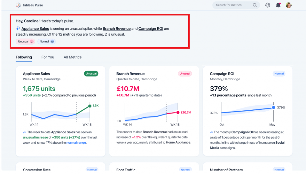
Streamline Your Focus with Metrics that Matter
Businesses grapple with vast volumes of information, often presenting reports in a standardized manner to accommodate entire teams. While this aids time-strapped analysts by minimizing the need for bespoke reports, it leaves end-users sifting through data to locate their relevant metrics—an arduous and time-consuming task.
Tableau Pulse revolutionizes this paradigm by seamlessly delivering personalized data summaries directly within your workflow. It introduces an intuitive, customized metrics homepage, allowing you to curate metrics aligned with your specific requirements. Say goodbye to the cumbersome process of filtering through multiple dashboards to find pertinent figures.
At the start of this example, Tableau Pulse presents a select set of metrics fitted to this specific user's focus.
These metrics are curated based on recent data trends identified by Tableau AI:
 Source: https://www.tableau.com/blog/tableau-pulse-and-tableau-ai
Towards the bottom of this example, Tableau Pulse showcases the KPIs that this user has actively tracked. Within this section, Tableau Pulse provides the most recent metric value, a brief visual representation of the trend, and an AI-generated insight specifically pertaining to that metric:
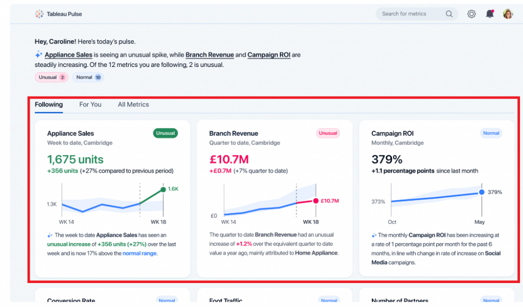 Source: https://www.tableau.com/blog/tableau-pulse-and-tableau-ai
Embed Relevant Data into Your Workflow
These days, professionals juggle various applications, which poses a challenge when tracking crucial KPIs. The continual shift between disparate tools not only consumes time but also disrupts workflow continuity.
Tableau Pulse heralds a transformative shift by integrating pertinent data directly into users' existing tools. This breakthrough ensures data detachment from specific dashboards, guaranteeing access to essential metrics without workflow interruptions. Insights are seamlessly captured within the tools where users spend the most time, eradicating the risk of missing critical information due to platform discrepancies. Additionally, this integration streamlines the scalability of insights across the organization, simplifying the process of visualizing, sharing, and collaborating on data by utilizing tools already familiar to everyone within the company.

Effortless Data Interpretation
Today's data interpretation can often entail a laborious and manual process. Users invest significant time analyzing data to unveil trends and insights while navigating the labyrinth of questions to pose to their datasets. This complexity invariably impedes decision-making speed and hampers overall productivity.
Tableau Pulse redefines data utilization by automating analysis and communicating insights in easily comprehensible, natural language formats. Initially, Tableau Pulse assumes the burden of uncovering the 'why' behind the 'what.' It autonomously identifies and generates insights, predicting the queries you might raise and even suggesting questions that may not have crossed your mind. Subsequently, Tableau AI succinctly summarizes these insights conversationally. This streamlined approach facilitates faster, informed decision-making, eliminating the need for extensive manual data analysis.
In the example below, Tableau Pulse extends its capabilities to address your data inquiries using natural language. Upon delving deeper into the "Appliance Sales" metric, Tableau Pulse was queried, "What is driving change in Appliance Sales?" In response, Tableau Pulse swiftly provided a concise answer along with a visual representation elucidating the factors influencing this change.

With the introduction of Tableau AI and Tableau Pulse, Tableau is set to revolutionize the industry once more, unveiling a fresh experience tailored for analytics consumers. This innovation aims to empower every individual to embrace a truly data-driven approach. Tableau AI and Pulse are reshaping how organizations engage with data, empowering decision-making, and fostering a more data-driven future.
NEW FEATURES OF TABLEAU 2020.1 (BETA)
Soon after Tableau launched the 2019.4 update, they have released a list of super interesting features as part of their path into 2020.1. Despite it being in Beta stage, we have been able to try out some of these and they do change the way we think about visualizations and the way we interact with them.
Let’s go through a sample of the most coveted features, which many of us in the world of BI have probably been dying to have (or at least would be great to have!)


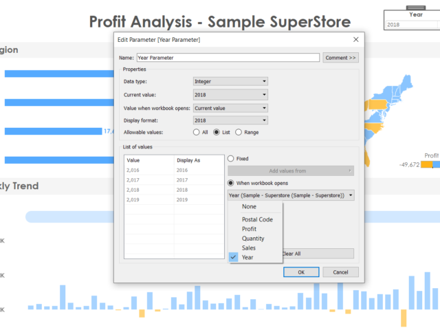
1. Dynamic Parameters
1. This one deserves a whole lot of excitement from the entire Tableau community since parameters are used in just about any viz and the biggest complaint (major pain!) was that if the data gets refreshed, the updated values in the parameter field do not get reflected. A user would have to manually go about refreshing and adding the new fields in the parameter. It was honestly astounding that such a simple thing would be the source of unnecessary emotions soaring. 2. But with the latest update, Tableau has provided. Now it can automatically update its parameters as soon as the data is refreshed and the new values will populate by itself! This saves a ton of time and effort and monitoring headaches for every dashboard created hereon! 3. To us, this would be among the most coveted and REQUIRED updates in this version
2. Viz Animations
In this new day and era, we are used to smooth rendering of just about anything we work on (from an app on our phone to the way an electric car feels on the road). This concept has now been delivered to us by Tableau in their new viz animation capability. Now all our charts can have a smooth flow whenever changed by another filter. This not only enables the user to spot the exact points of change in the chart, but also looks cool beyond measures. On click of an action, we can set up the amount of time it will take for the change to take place in the other charts (and this change is animated smoothly). This beautiful feature can be perfectly explained using an example visualization, rather than any more words. So here goes..
Video Player
As you can see, it looks beautiful. This is an exciting time for the creators, since this feature will definitely make the viz functionality immensely more appealing to an end user.
00:00
00:30
3. Improvements in Explain Data
For those unfamiliar to this feature, explain data is an intelligent tool built in tableau which gives a statistical inference to any singular data point on a chart. It gives us an idea of the why and the general direction of the how of the value. 2020.1 promises to be smarter with Explain Data digging deeper with more refined statistical models in the background. This is a feature which never fails to astonish a new user and Tableau promises to keep improving and building upon this as time goes by.
4. Export the dashboard to formats wanted
This is a simpler feature amidst all the fancy ones, however, may prove to a crucial addition for end user experience. Now we can directly export the dashboard in any format, on click of a button which can take the form of a text or an image and put as part of the dashboard. No more explaining to users to find click the tiny download option on the bottom of the screen and then export, now we can directly do it at the click of a button! We can export to formats like PDF, PowerPoint etc. which is honestly, great.
5. Buffer calculations
Buffer calculation enhances the interactivity when it comes it spatial scenarios. It is a boundary created with respect to any point on the map or location. A buffer calculation should contain three parameters such as location, distance, and a unit of measure like ‘kilometer’, and ‘miles’. Simple use case like, when you wanna know how many restaurants are present near my hotel, say around 1km, the buffer boundary highlights the number of restaurants near a specific location. Here is how the buffer calculation works….
[video width="1296" height="1080" mp4="https://www.beinex.com/wp-content/uploads/Video-2-Buffer-Calculation.mp4"][/video]
So restricting to only the Desktop version of Tableau, we can foresee happier times for all viz lovers. Though these features are just part of the BETA version and may not all be released in the very next update, but these are good to look ahead to.

From Insights to Actions: Leveraging BI Applications for Your Competitive Advantage
Business intelligence (BI) software solutions are designed to analyse data that is input by users or fed from various data sources. The software then organises this data based on patterns or trends it identifies. Finally, the software presents these patterns and trends through visualisations, making the information easy to understand even for users without any statistical analysis experience.
Organisations can develop informed and current strategies by using the insights and trends revealed by these visualisations. With the advancements in technology and innovations, a wide range of BI applications are available for diverse types of data analysis.
Therefore, it is imperative for forward-thinking organisations to recognise the BI tools that market leaders offer and how these tools can impact their own operations positively. Here are four significant business intelligence applications that can enhance your organisation’s operations.
List of Four Business Intelligence Applications
- Sales Intelligence
- Visualisation
- Reporting
- Performance Management
Let’s take a deep dive into the four noteworthy Business Intelligence applications:
1. Sales Intelligence
One crucial application of BI is to improve customer engagement and sales performance. The sales department of any organisation should prioritise building solid relationships with customers. However, converting leads and convincing potential clients to purchase a product or service can be challenging. BI tools can make this process smoother and more predictable.
BI collects data on specific key performance indicators (KPIs) such as customer demographics, conversion rates, and sales metrics. It then presents this data in structured visualisations like graphs, pie charts, and scatterplots. This data lets users identify trends and insights into customer behaviour and business operations. Understanding the customer allows organisations to provide better service and improve sales performance.
Moreover, the reports and dashboards generated by BI are valuable in providing easy-to-interpret data to potential clients and supporting claims with solid evidence. Managers can use the insights from BI analysis to make data-driven decisions based on complex data and forecasting.
BI applications provide an excellent means of optimising an organisation’s sales operations. Sales and marketing teams can leverage BI to identify trends in client preferences, enabling the organisation to maximise sales within their ideal client base. This allows them to concentrate on targeting highly qualified leads, improving conversion rates and overall profit margins.
2. Visualisation
Furthermore, when used alongside customer relationship management (CRM) software, BI offers businesses a sophisticated method for understanding their customers and making informed sales decisions. By integrating CRM data with BI analysis, organisations can better understand their customers' needs and behaviours, enabling them to provide personalized products and services, strengthen relationships, and increase customer loyalty.
Another critical application of BI is data visualisation. Business intelligence software employs various data analytic tools designed to analyse and manage data related to an organisation’s operations. The resulting data is then presented in the form of visualizations, enabling the organization to monitor logistics, sales, productivity, and more. Some BI platforms offer custom reporting capabilities, allowing users to specify their own parameters, while others offer pre-designed reporting templates that include industry-standard metrics.
By presenting data in intuitive and easy-to-understand formats, BI systems enable inexperienced employees to draw insights from data. Rather than relying on trained data scientists to analyze data, employees can analyze and present their own data to shareholders, other departments, or teams.
3. Reporting
Reporting is a way of summarising data to keep track of business performance, while analysis is a way of exploring data to gain insights that can improve business practices. Business intelligence tools play a crucial role in reporting by collecting and analysing data and generating various types of reports related to staffing, expenses, sales, customer service, and other processes. While reporting and data analysis are related, they differ in purpose, delivery, tasks, and value.
Simply put, reporting takes raw data and transforms it into easily understandable information, while analysis takes data and extracts valuable insights to enhance business practices. Although both processes can incorporate visualisations, their approaches are distinct. Reporting reveals what's happening, whereas analysis explains why it's happening. Traditionally, data visualisations were static, requiring the creation of a new one for every variable change. However, contemporary BI software provides interactive dashboards that can update in real-time, resulting in enhanced usability and flexibility in data analysis.
4. Performance Management
BI tools can help with performance management by allowing organisations to set and track performance goals using data-driven insights. This can include goals related to project completion, delivery time, or sales targets, among others. For example, a BI system can analyze past sales data and recommend a realistic sales goal for the future based on previous performance. This helps organisations stay on track with their goals and make data-driven decisions to improve performance.
With BI applications, organisations can closely track their progress towards pre-defined or customisable goals within specific timeframes. The data-driven plans could include meeting project completion deadlines, target delivery times, or sales targets. For instance, if an organisation wants to achieve a specific sales target, the BI system can analyse previous data and suggest a reasonable goal based on past performance.
By monitoring goal progress in real-time, businesses can stay informed of any remaining gaps and take timely action to bridge them. Users can also set alerts to notify them when they are nearing their target or when the time limit is approaching, and they haven't achieved their goal. This helps managers and employees stay on track and focused on achieving their goals.
Moreover, users can also assess the overall productivity of an organisation by monitoring the fulfilment of goals and tracking progress data. Since the information is readily accessible, there is no time wasted in tracking down urgently needed data, thus saving businesses time and money.
Three Steps to Choose Right Business Intelligence Tools
To choose the right Business Intelligence software for your organisation, it's crucial to identify the features and capabilities that your organisation requires. Follow the three steps below to find out which Business Intelligence tool suits you the best:
- Selection
- Compare Applications
- Shortlist and Trials
Now, let's explore in detail the three steps to choose the right Business Intelligence tool:
1. Selection
It's recommended to select only the modules you will use rather than opting for a solution with a long list of features you don't need. Overbuying can increase the cost and lower the chances of a successful implementation, so it's better to start small and upgrade as your company expands.
2. Compare Applications
You should compare various options based on your specific requirements to choose the right BI software for your organisation. Each vendor may have different strengths and specialities within the BI field, so it's essential to prioritise your needs and preferences. Instead of a one-size-fits-all approach, it's better to focus on the most critical features and evaluate solutions based on how well they meet those requirements. It's also important to remember that the most expensive solution is not always the best one, and sometimes paying a higher price can result in better quality and long-term benefits.
3. Shortlist and Trials
Once you have a shortlist of vendors, it's time to narrow it down further by considering factors such as pricing, demos, and trials. Many vendors offer free trials or demos so that potential users can get a feel for the system's user interface. Make sure to choose a system that most users can use and keep your budget flexible. Consider the type of user support each vendor offers, determine whether you need any integrations with other business software, and confidently make your final decision.
Summing Up
Business Intelligence applications can benefit organisations, from improved decision-making to enhanced performance management. By gathering and analysing data, businesses can gain valuable insights into their operations and customers and use this information to drive growth and success. When selecting a BI tool, it's essential to identify your specific requirements and carefully compare different vendors based on their features, pricing, and support.
Business Intelligence services extended by Beinex deliver solutions to all your business questions. At-a-glance analysis facilitated by cutting-edge BI tools does wonders for every industry. With BI tools, analysing enormous and complex data couldn’t be mind-boggling for you anymore. With Beinex, you can interact with an agile and intuitive system to validate your data, navigate your vision, and execute it data-driven to tap into the potent entrepreneurial potential.

Transform Your Snowflake Operations with Beinex: Achieve Cost Efficiency, Real-Time Insights, and Accelerated Innovation
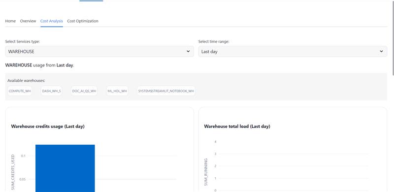
Cost Optimization
- • Real-time and Historical Cost Analysis: Leverage granular cost insights to identify and mitigate resource inefficiencies.
- • Precision Cost Attribution: Accurately pinpoint the root causes of cost deviations within your Snowflake environment.
- • Optimized Resource Utilization: Receive data-driven recommendations to optimize resource allocation and minimize unnecessary expenditures.
- • Proactive Cost Management: Implement preventative measures to avoid unexpected cost spikes and ensure adherence to budget constraints.
Learn more: https://app.snowflake.com/marketplace/listing/GZT8Z14W95T/beinex-consulting-llc-cost-optimizer
Beinex's strategic partnership with Snowflake empowers organizations to harness the full potential of their data. By leveraging Snowflake's powerful data cloud platform, Beinex offers comprehensive solutions for data management, analytics, and machine learning. This partnership enables organizations to accelerate their data-driven initiatives, reduce costs, and gain a competitive edge. Together, Beinex and Snowflake deliver innovative solutions that drive business growth and innovation.

Predictive Analytics in Tableau: A Crystal Ball for Business Success
What is Predictive Analytics?
Predictive analytics is a branch of advanced analytics that uses historical data, statistical algorithms, and machine learning techniques to identify the likelihood of future outcomes based on historical data. The primary goal is to go beyond knowing what has happened to provide the best assessment of what will happen in the future.
Benefits of Predictive Analytics
- Enhanced Decision Making: Make informed decisions based on data-driven insights rather than gut feelings.
- Cost Savings: Optimize resources and reduce waste by predicting demand and managing inventory effectively.
- Risk Management: Identify potential risks and take preventive measures to mitigate them.
- Improved Customer Satisfaction: Anticipate customer needs and preferences, leading to better products and services.
Predictive Analytics Techniques
Predictive analytics techniques offer a wide range of applications powered by various types of models that generate valuable insights. To determine the best predictive analytics techniques for your organization, start with a clearly defined objective. Once you know the specific question you want to answer, you can select the most suitable model.
List of Predictive Analytics Models
- Regression Models: Used to predict continuous outcomes.
- Classification Models: These models categorize data into predefined classes.
- Clustering Models: Group similar data points together based on defined criteria.
- Time Series Models: Analyze data points collected or recorded at specific time intervals to forecast future values.
1. Regression Models in Predictive Analytics
Regression models estimate the relationship between variables, tracking how independent variables impact dependent variables to predict future outcomes. These models range from simple (one independent and one dependent variable) to multiple linear regression (multiple independent variables). Various regression techniques can be applied based on the specific use case.
By defining variable relationships, organizations can conduct scenario or 'what-if' analysis, testing how changes in independent variables affect outcomes.
Application of Regression Models
For example, a company might use a regression model to analyze how product qualities influence purchase likelihood, such as identifying a correlation between blue shirts and higher sales. These insights help refine marketing strategies and product development, optimizing future performance.
2. Classification Models in Predictive Analytics
Classification models categorize data based on historical knowledge. Using a labeled training dataset, the classification algorithm learns correlations between data and labels and then categorizes new data. Popular techniques include decision trees, random forests, and text analytics.
These models are highly adaptable and can be retrained with new data, making them useful across various industries.
Application of Classification Models
For example, banks use classification models to detect fraudulent transactions. By analyzing millions of past transactions, the algorithm identifies patterns indicative of fraud and alerts customers to suspicious activity.
3. Clustering Models in Predictive Analytics
Clustering models group data based on similar attributes. Using a data matrix that associates items with relevant features, the algorithm clusters items with shared features, uncovering hidden patterns. Organizations use clustering models to group customers for personalized targeting strategies.
Application of Clustering Models
A restaurant might cluster customers by location and mail flyers only to those within a certain driving distance of a new location.
4. Time-series Models in Predictive Analytics
Time series models analyze data points in relation to time, making time one of the most common variables in predictive analytics. These models use historical data to predict future metrics. For example, analyzing data from the past year can help forecast the upcoming weeks.
Time series analyses are versatile, used for applications like seasonality analysis (predicting how assets are affected by certain times of the year) and trend analysis (determining asset movements over time).
Application of Time-series Models
Forecasting sales for the next quarter, predicting store visitor numbers, or even determining peak flu seasons.
Predictive Analytics with Tableau
Tableau empowers users to not only visualize their data but also to gain actionable insights through advanced predictive capabilities. Whether you're looking to forecast sales, predict customer behavior, or optimize business operations, Tableau is the right choice.
3 Ways to do Predictive Analytics in Tableau
1. Forecasting in Tableau Desktop
Tableau Desktop offers robust forecasting features that allow users to make data-driven predictions effortlessly. Using exponential smoothing models, Tableau enables you to forecast future data points based on historical trends. Here’s what you can do: Let’s explore the ways to forecast data in Tableau Desktop: • Creating a Forecast: Users can add a forecast to a view by simply dragging a time dimension to the Columns shelf and a measure to the Rows shelf. By right-clicking on the view and selecting "Show Forecast," Tableau generates a forecast based on the selected model. • Customizing Forecasts: Forecast settings can be customized to adjust the prediction length, forecast model, and season length. Users can access these settings through the "Forecast Options" dialog box. • Evaluating Forecasts: Tableau provides a forecast description that includes details about the model, prediction intervals, and underlying statistics. This helps users understand the reliability and accuracy of their forecasts. • Visualizing Forecasts: Forecasts are visualized as shaded areas or lines on the chart, making it easy to compare predicted values with actual data.
2. Bringing R/Python Calculations into Tableau
Integrating R and Python into Tableau Desktop enhances its analytical capabilities, allowing users to perform complex statistical analysis and machine learning tasks. Users can create calculated fields using MODEL calculations, or by using SCRIPT functions that include R or Python scripts to perform custom calculations. These scripts can be used for various purposes, such as regression analysis, clustering, and predictive modeling. Tableau connects to R using Rserve and to Python using TabPy.
3. How to Do Predictive Analytics with Tableau Prep
Tableau Prep enhances your data preparation process by integrating with Einstein Discovery, Salesforce's AI-powered analytics tool. This integration allows you to infuse your data workflows with advanced predictive capabilities. • Einstein Discovery in Tableau Einstein Discovery, part of Salesforce's suite of AI (Artificial Intelligence) tools, is integrated into Tableau to provide advanced predictive analytics capabilities. In Tableau Prep, Einstein Discovery can be used to build and integrate predictive models directly within the data preparation workflow. This feature is available in Tableau Desktop as well. • Generate predicted values by integrating R/Python in Tableau Prep Tableau Prep allows for the integration of R and Python to perform advanced data transformations and generate predicted values.
Here's how you can do it: • Script Steps:
- Tableau Prep includes a "Script" step that lets users run R or Python scripts as part of their data flow.
- This step can be used to perform complex transformations, calculations, and predictions.
- Similar to Tableau Desktop, Tableau Prep connects to R using Rserve and to Python using TabPy.
- Users need to set up these servers and connect them to Tableau Prep to execute scripts.
- Users can import trained models from R or Python into Tableau Prep.
- The "Script" step allows these models to be applied to the data, generating predicted values as part of the data preparation process.
- Using R and Python, users can create dynamic and flexible data preparation workflows that include predictive analytics.
- This enhances the overall data preparation process by integrating advanced analytical techniques.
Real-life Scenarios/ Use cases of Predictive Analytics
Predictive analytics can be applied in numerous business scenarios to enhance decision-making, efficiency, and customer satisfaction. Here are some real-life examples:
- Customer Churn Prediction: • Scenario: A telecom company wants to reduce the number of customers leaving for competitors. • Application: By analyzing customer usage patterns, support interactions, and billing history, the company can predict which customers are at risk of churning and take proactive measures, such as targeted promotions or personalized outreach.
- Fraud Detection: • Scenario: A financial institution wants to identify fraudulent transactions. • Application: By examining transaction histories, user behavior, and other data points, predictive models can flag suspicious activities in real-time, allowing for immediate investigation and action.
- Sales Forecasting: • Scenario: A manufacturing company needs to predict future sales to plan production and manage resources. • Application: Leveraging past sales data, market trends, and economic indicators, the company can generate accurate sales forecasts to inform production schedules and supply chain management.
- Marketing Campaign Optimization: • Scenario: A marketing team wants to improve the effectiveness of their campaigns. • Application: Predictive analytics can help segment customers based on their likelihood to respond to different types of campaigns, enabling more targeted and effective marketing efforts.
- Risk Management: • Scenario: An insurance company needs to assess risk for new policy applicants. • Application: By analyzing historical claims data and applicant information, the company can predict the likelihood of future claims and set premiums accordingly.
Tableau offers a powerful platform for integrating predictive analytics into your data strategy. With its robust forecasting capabilities, seamless integration with R and Python, and advanced features in both Tableau Desktop and Tableau Prep, you can transform raw data into actionable insights. Whether you are aiming to predict future trends, optimize operations, or make data-driven decisions, Tableau equips you with the tools needed to gain the full potential of your data. To know more, connect with us: https://www.beinex.com/tableau-beinex