How AI Decision-Making is Improving Enterprise Outcomes
Blog
Share 
بينيكس تفوز بجائزة الشريك الاستشاري لعام 2021 النجم الصاعد لأمازون ويب سيرفيسز الشرق الأوسط وشمال إفريقيا
 1 December 2021
  Rakesh Neelakandan
 تُمنح جوائز شركاء أمازون ويب سيرفيسز تقديرًا لمجموعة كبيرة من الشركاء الذين تبنت نماذج أعمالهم التخصص والتعاون خلال العام الماضي. تُمنح جوائز شركاء أمازون ويب سيرفيسز أيضًا لشركاء أمازون ويب سيرفيسز الذين تستمر نماذج أعمالهم في التطور والازدهار على سحابة أمازون ويب سيرفيسز أثناء عملهم مع العملاء لتصور وبناء وترحيل حلول السحابة الأصلية على أمازون ويب سيرفيسز.
صرح إندومون داس، المؤسس والعضو المنتدب لشركة بينيكس، عند حصوله على الجائزة، "إننا نستفيد من قدرات أمازون ويب سيرفيسز وندمج ذلك مع قوة استشارات بينيكس لتحقيق نجاح لا مثيل له لعملائنا. نتطلع إلى إطلاق مراكز بيانات أمازون ويب سيرفيسز في الإمارات العربية المتحدة في النصف الأول من عام 2022. وسيكون للإطلاق تأثير كبير على نمو وتسريع اعتماد السحابة في الشرق الأوسط، ونحن متحمسون لدعم المؤسسات للاستفادة من هذه الميزة. لما تقدمه ".

شبكة شركاء أمازون ويب سيرفيسز (APN) هي المجتمع العالمي للشركات التي تستخدم أمازون ويب سيرفيسز لبناء الحلول والخدمات للعملاء. تساعد أمازون ويب سيرفيسز الشركاء على بناء عروضهم وتسويقها وبيعها من خلال توفير أعمال قيمة وتسويق ودعم تقني بالإضافة إلى بنيتنا التحتية المؤكدة والعالمية والآمنة. يتمتع شركاء أمازون ويب سيرفيسز بموقع فريد لمساعدة العملاء على الاستفادة الكاملة من كل ما تقدمه أمازون ويب سيرفيسز وتسريع رحلتهم إلى السحابة. تمتلك أمازون ويب سيرفيسز الملايين من العملاء النشطين ومجتمعًا ديناميكيًا يضم أكثر من 100،000 شريك على مستوى العالم.
يضيف شركاء أمازون ويب سيرفيسز قيمة للعملاء عبر مجموعة واسعة من الصناعات حول العالم وهم مهمون لنجاحهم. يسعدنا تقدير مجموعة متنوعة من الشركاء من خلال جوائز شركاء APN في أوروبا والشرق الأوسط وإفريقيا 2021. قال أنطونيو ألونزو لوبيز، مدير نجاح شريك في أوروبا والشرق الأوسط وإفريقيا في أمازون ويب سيرفيسز "أتطلع إلى العمل معًا لتحقيق عام 2022 رائع، ". حول بينيكس بينيكس ، دبي ، هي شركة متعددة الجنسيات تستكشف الاحتمالات اللانهائية للبيانات الخاصة بالسحابة والتحليلات والذكاء الاصطناعي والتعلم الآلي والأتمتة.
حازت شركة للاستشارات على جائزة أفضل شريك استشاري لأمازون ويب سيرفيسز 2021 - في منطقة الشرق الأوسط وشمال إفريقيا. تكرم جوائز شركاء أمازون ويب سيرفيسز القادة الذين يلعبون دورًا رئيسيًا في مساعدة العملاء على دفع الابتكار وبناء الحلول على سحابة أمازون ويب سيرفيسز.
Related Articles

Three Steps to Implement Intelligent Automation(Infographic)
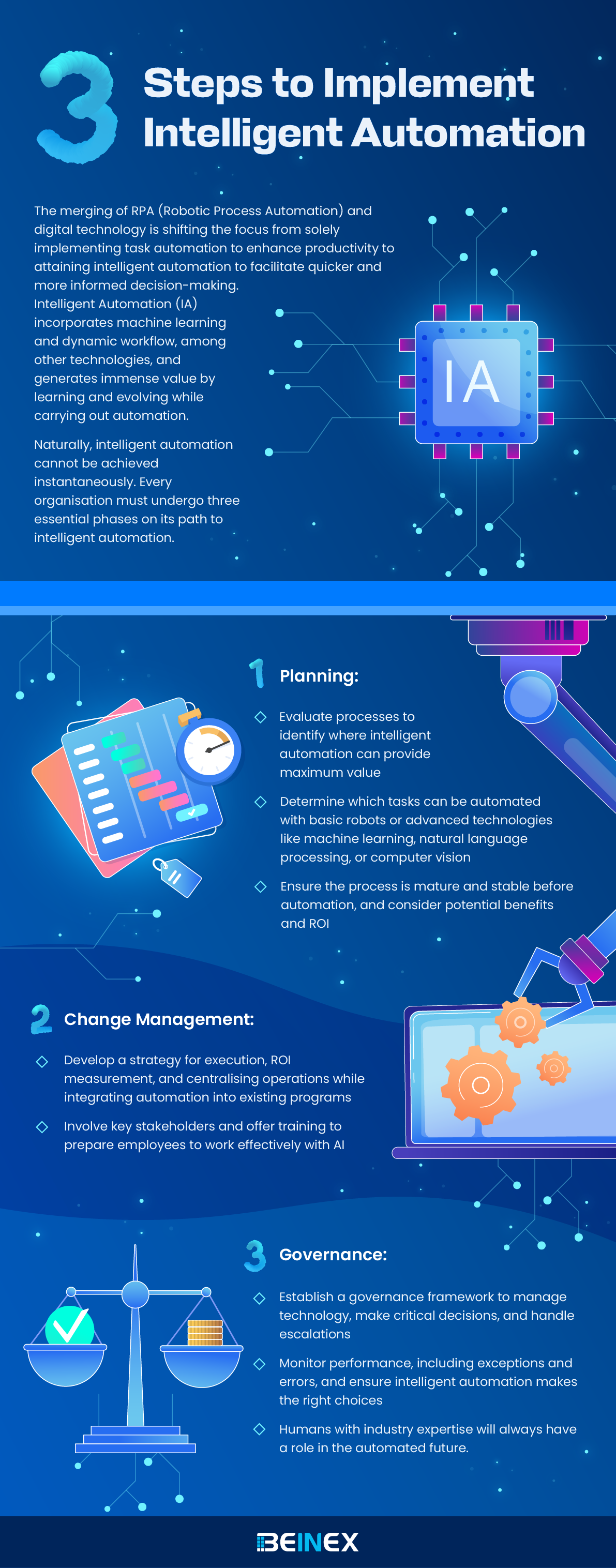

Tableau Server Health Check: Ensure Peak Performance for Your Tableau Environment
What is Tableau Server Health Check?
Tableau Server Health Check comprehensively evaluates the server's performance, configuration, and overall health. It aims to ensure that the server operates optimally, providing a seamless and efficient user experience. Regular health checks can prevent performance degradation, identify potential issues before they become critical, and ensure that the server environment is configured according to best practices.Critical Components of a Tableau Server Health Check • Server Performance • Server Configuration • Resource Utilization • Content and Workbook
When Should You Perform a Tableau Server Health Check?
- Regular Maintenance • Quarterly or Bi-Annually: Conducting a health check every three to six months helps identify potential issues early and maintain optimal performance over time.
- Performance Issues • Slow Load Times: If users experience slow load times for dashboards and reports, it clearly indicates that a health check is needed to diagnose and resolve performance bottlenecks. • Frequent Server Crashes: Regular crashes or downtime are signs of underlying issues that need immediate attention.
- Major Updates or Upgrades • Before and After Upgrades: Perform a health check before upgrading to a new version of Tableau Server to ensure the current environment is stable. Conduct another check after the upgrade to verify everything is working correctly and optimize new features.
- Changes in Usage Patterns • Increase in User Base: A health check ensures the server can handle the new load effectively if the number of users or the volume of data being processed significantly increases significantly.
- User Feedback • Negative User Feedback: If users report consistent issues with dashboard performance, accessibility, or other aspects of Tableau Server, it’s crucial to perform a health check to address these concerns.
- System Configuration Changes • Infrastructure Changes: Changes to the underlying infrastructure, such as hardware upgrades or network configuration changes, should be followed by a health check to ensure everything is configured optimally.
What are the Benefits of Tableau Server Health?
• Improved Performance • Better User Experience • Improving allocation of server resources and license management. • Increasing server stability, reliability, and uptime. • Scalability and Future Planning
How Does Beinex Conduct Tableau Health Check?
Our certified Tableau experts will evaluate your server environment and deliver a comprehensive report to help you identify and mitigate risks. Our process is structured into three main phases: Evaluation, Diagnosis, and Recommendation. Each phase focuses on different aspects of the server's operation to ensure that it meets your organization's needs and performs optimally. • Evaluation - We assess the size and configuration of your server, the performance of all data extracts and dashboards, server security, and more • Diagnose - We parse through server logs and review usage metrics to diagnose the root cause of any issues • Recommend - We present findings, best practices, and recommendations that you can act on immediately
Why Choose Beinex?
• Certified Team of Server Experts At Beinex, we pride ourselves on having a team of certified Tableau experts who bring extensive knowledge and experience to every project. Our specialists have the latest certifications and are continually updated with the newest Tableau features and best practices. • 300+ Tableau Deployments & Upgrades With over 300 successful Tableau deployments and upgrades under our belt, Beinex has a proven track record of delivering exceptional results. Our extensive experience spans various industries and business sizes, allowing us to understand and address the unique challenges different organizations face. • Tableau Premier Partner As a Tableau Premier Partner, Beinex stands among a select group of top-tier Tableau partners worldwide. This prestigious partnership recognizes our commitment to excellence and ability to deliver high-quality Tableau solutions.
How Beinex Can Assist You
Beinex, a premier Tableau partner, provides sustainable analytics solutions to organizations and helps to build superior data visual analytics capabilities internally through our bespoke training programs. Our team of Tableau-certified consultants are real-life Tableau business users passionate about Tableau and delivering a world-class experience. Connect with us: https://www.beinex.com/tableau-beinex/

How Nissan Middle East FZE standardized interactive data visualization by implementing the “PowerBI Report Server” platform on AWS that drove faster and smarter decisions leading to 21% increment in net profit
Challenge
- The IT infrastructure of Nissan Middle East FZE where the PowerBI Report Server platform was hosted was in an on-premise datacenter which was designed to be scalable and robust with multi node physical clusters including the server, storage and network components. However, most of the physical hardware was quite old and not equipped with the latest generation of physical servers.
- Frequent hardware crashes and portal downtime kept troubling the availability of the PowerBI Report Server application. Assigning a touch hand support person to power on the hardware that was down seemed quite impossible due the restrictions during covid period. Hence, Nissan Middle East FZE wanted to look for another viable solution.
- Though the hardware setup at Nissan Middle East FZE was well equipped to meet the occasional spikes in the traffic, it was observed that over a course of 6-month time, most of the IT infra was underutilized than predicted. It was realized that spending huge amount of money on an old hardware plus software maintenance, license costs, internet bandwidth, datacenter cooling and maintenance, touch support personnel and electricity costs – were keeping the business operations challenging.
- There was an attempt by Nissan Middle East FZE to select a cost-effective solution that can host PowerBI Report Server application servers, web servers and archival data. This way IT infra can be re-provisioned to host sensitive data on-premise and the rest on the cloud, thereby reducing the overall physical hardware costs spent on a yearly basis.
Why AWS
- Nissan Middle East FZE decided to migrate PowerBI Report Server, database servers and archival data to AWS.
- The PowerBI Report Server’s AWS architecture includes Amazon Elastic Compute Cloud (Amazon EC2), that provides complete control of its computing resources, updates to tables in Amazon Relational Database Service (Amazon RDS) and AWS Elastic Load Balancer was used to distribute the traffic to the underlying EC2 instances based on the load.
Benefits

GCP's Vertex AI Agent Builder: Build, Scale, and Govern Reliable AI Agents
Many teams can build AI agents as experiments, but turning them into something that works reliably, safely, and at scale for real business use is much harder. To solve this, the Vertex AI Agent Builder from Google Cloud helps organizations build, run, monitor, and secure AI agents from start to finish. In short, Google is making it easier to go from "we built a demo agent" to "we run trusted AI agents in production."

Know Your Options Before You Become One da Vinci of Tableau
The Primary Means to Narrate Stories in Tableau
We can represent the visuals using the following three formats on Tableau:
1. Sheets: Spaces where we can build individual visuals are called sheets. A worksheet has a single view in its sidebar, as well as shelves, cards, legends, and the Data and Analytics panes. A workbook is a sheet file structure along the lines of Microsoft Excel. It includes sheets that can function as a worksheet, a dashboard, or even a story
 Source: https://help.tableau.com/current/pro/desktop/en-us/inspectdata_describe.htm
2. Dashboards: Most commonly used reporting format, a dashboard is a layout where sheets are arranged in a meaningful manner. It is a collection of views that helps you to compare a variety of data at the same time. If you have a set of views that should be reviewed every day, then you can create a dashboard that displays all of the views at once rather than navigating to separate worksheets. Think of the efficiency gains that this can bring about.
 Source: https://www.tableau.com/about/blog/2020/5/6-dashboards-tableau-partners-help-you-mitigate-covid-19
3. Story:Sheets or dashboards arranged in a sequence to convey information. A story is a collection of visuals that work together to convey information. Stories can be created to tell a data narrative, provide context, show how decisions affect outcomes, or simply make a compelling case.
 Source: https://help.tableau.com/current/pro/desktop/en-us/stories
Default Charts in Tableau
Through a set of default charts created with Tableau, data sets can be displayed in a comprehensible way. Let's have a look at a few types of charts:
1. Area Chart:An area chart is a line chart with a colour shaded area between the line and the axis. These charts constitute the most common approach to illustrate stacked lines and are often used to represent accumulated totals over time.
 Source: https://help.tableau.com/current/pro/desktop/en-us/qs_area_charts.htm
2. Bar Chart:Place a dimension on the Rows shelf and a measure on the Columns shelf to make a bar chart or vice versa. We may compare numerical data such as integers and percentages using bar charts. Each variable's value is represented by the length of each bar. Bar charts, for example, might demonstrate how much money a small business spends on various expenses.
 Source: https://www.tableau.com/data-insights/reference-library/visual-analytics/charts/bar-charts
3. Box-and-whisker Plots:When demonstrating the distribution of data points across a specified metric, box-and-whisker plots, also known as box plots, are an excellent chart to employ. The ranges within the variables measured are represented in these graphs. These graphics are useful for comparing the distributions of multiple variables.
 Source: https://help.tableau.com/current/pro/desktop/en-us/buildexamples_boxplot.htm
4. Bubble cloud: In bubble clouds, data is displayed in a cluster of circles. Individual bubbles are defined by dimensions, while individual circles are defined by measures. A bubble chart's design allows it to display multiple variables. Individual bubbles represent dimension field values, while measure field values define the size and colour of the bubble. As a result, we can examine a plot with at least three variables, one dimension and two measure fields.
 Source: https://help.tableau.com/current/pro/desktop/en-us/buildexamples_bubbles.htm
5. Bullet Graph:Bullet graphs are a type of bar graph that was created to replace dashboard gauges and metres. When comparing the performance of a major metric to one or more other measures, a bullet graph is beneficial. A bullet graph can help you visualise your objective, the current data set, and past data sets; all in one visualisation if you have a target goal that you need to meet on a regular basis
 Source: https://www.tableau.com/data-insights/reference-library/visual-analytics/charts/bullet-graph
6. Cartogram:Choropleth Maps, also known as Filled Maps, are a powerful tool for studying geographic data, especially for maps with a lot of detail (e.g., US by counties or ZIP codes). They make it simple to detect geographical hotspots and then drill down into these areas using several visualisation options.
 Source: https://www.pluralsight.com/guides/build-filled-maps-in-tableau
7. Click View:The circle view is a useful representation for comparative analysis. It's the same as using the circle marker on a scatter plot. Every mark is in the shape of a circle and can be used for subsequent actions.
 Source:https://interworks.com/blog/ccapitula/2014/10/17/tableau-essentials-chart-types-circle-view/
8. Gantt Chart:Gantt charts are used in project management to depict the length of time between events or activities. As a project management tool, it highlights the interdependencies between activities and illuminates the workflow timeline.
 Source:https://help.tableau.com/current/pro/desktop/en-us/buildexamples_gantt.htm
9. Heat Map:In a heat map, data is displayed along with colours. Using one or more Dimensions members and the Measure value, a heat map can be created. Heat Map helps to compare data by colour. For example, how many products have failed to meet the company's expectations, and how many products have exceeded expectations, and so on.
 Source:https://help.tableau.com/current/pro/desktop/en-us/buildexamples_highlight.htm
10. Histogram:A histogram is a graph that depicts a distribution's form. It divides values for a continuous metric into bins and segregates a set of data points into user-specified ranges. The histogram, which resembles a bar graph in appearance, condenses a data series into an easily interpreted visual by grouping many data points into logical ranges or bins.
 Source: https://help.tableau.com/current/pro/desktop/en-us/buildexamples_histogram.htm
11. Scatter Plot (2D or 3D):Scatter plots are a type of graph that is used to show the correlations between numerical data. They are used to depict the link between three variables by plotting data points on three axes. Each column on the X, Y, and Z axes is represented by a marker, whose position is determined by the values in the columns.
 Source: https://www.dataplusscience.com/TabCharts/scatterplotsize.html
12. Streamgraph:Streamgraph shows how a number value (Y-axis) changes in response to another numeric value (X-axis). It is a sort of stacked area chart. The relative proportions of the entire can be studied using a stream chart.
 Source: https://greatified.com/2018/09/17/how-to-build-a-stream-graph-in-tableau-software/
13. Text Tables:Text tables (also called cross-tabs or pivot tables) are created by placing one dimension on the Rows shelf and another dimension on the Columns shelf. Then, on the Marks card, slide one or more measures to Text to complete the view.
 Source: https://help.tableau.com/current/pro/desktop/en-us/buildexamples_text.htm#:~:text
14. Treemap:Treemaps are used to show data in the form of nested rectangles. Dimensions define the structure of the treemap, while measures define the size or colour of the individual rectangles. It is a simple data visualisation that can provide information in a visually appealing format.
 Source: https://help.tableau.com/current/pro/desktop/en-us/buildexamples_treemap.htm
15. Word Cloud:The word cloud is an excellent visual for representing the frequency of words in a given volume of Text. In a word cloud, the most important or unique words from the data are arranged in groups. The main goal of making a word cloud is to provide the viewer with a quick understanding of the important and unique words in the data.
 Source: https://www.edupristine.com/blog/creating-word-cloud-tableau
Custom Visuals in Tableau
Tableau also provides a range of custom visuals. Creating them is just a question of one's expertise in Tableau.
1. Dot Distribution Map: Maps that help to spot visual clusters are known as point or dot distribution maps. Dot distribution maps are excellent for displaying how data points are dispersed.
 Source: https://help.tableau.com/current/pro/desktop/en-us/maps_howto_pointdistribution.htm
2. Network:Nodes and edges make up a network graph. By connecting nodes with similar features, network visualisations show relationships between items. A network graph is a type of data visualisation that allows consumers to quickly grasp data relationships. Nodes are single data points with edges connecting them to other nodes. The relationship between two or more nodes is represented by edges. This enables the user to easily visualise clusters and establish linkages.
 Source: https://ladataviz.com/2019/12/15/build-a-network-graph-in-tableau-in-three-steps/
3. Polar Area:The Polar Area Chart, also known as the Coxcomb chart, resembles a pie chart except that all of the slices have the same angle and the length of the slice that extends spirally from the centre represents quantity.
 Source: https://tableau.toanhoang.com/creating-a-polar-chart-in-tableau/
4. Radial Tree:A radial bar chart is a type of pie chart. Like a pie chart, it depicts the relationship of parts to the whole, but it can also include subcategories for each part of the total. Each category in the data series plotted in a radial bar chart is assigned a different colour, whereas all subcategories are assigned the same colour.
 Source:https://boraberan.wordpress.com/2014/12/31/radial-treemaps-bar-charts-in-tableau/
5. Timeline:The timeline chart, as the name implies, depicts the significant events that occur in the month, year, or even day. The timeline can also be used as a calendar to display forthcoming events.
 Source: https://playfairdata.com/how-to-make-a-timeline-in-tableau/