How AI Decision-Making is Improving Enterprise Outcomes
Blog
Share 
بينيكس يحظى بحالة الشريك المفضل لدى ألتريكس بنجاح
 12 April 2021
  Team Beinex
 -
يسعدنا أن نعلن أن بينيكس قد حققت حالة الشريك المفضل لدى ألتريكس لعام 2021. نحن فخورون بمشاركة سعادتنا الهائلة وامتناننا مع عملائنا ذوي السمعة الطيبة الذين ساعدونا في الوصول إلى هذه المكانة.
يسعدنا أنه تم تحقيق هذه الجائزة بتفانينا الدؤوب وخبراتنا التي لا مثيل لها على منصة ألتريكس. بفضل المعرفة الواسعة بالمنتج والخبرة الفنية والتركيز الكافي على رضا العملاء، تمكنا من إثبات القيمة التي نقدمها كشريك. ساعد تصميمنا وتفانينا في تزويد عملائنا بالقدرة على تقديم نتائج أعمال أسرع وأفضل من خلال اتخاذ قرارات ذكية باستخدام ألتريكس.
في العام الماضي ، كنا محظوظين بما يكفي لتحويل غالبية أعمال عملائنا بنجاح باستخدام أتمتة العمليات التحليلية عن طريق أتمتة التحليلات السريعة وعمليات الأعمال الكاملة التي تعتمد على البيانات ، مما أدى إلى مكاسب سريعة وعائد استثمار أسرع. كما حصلنا على جائزة شريك العام من ألتريكس 2020 في الشرق الأوسط.
مع جائزة الشريك المفضل، سنكون قادرين على إقامة تعاون أكبر مع فريق ألتريكس، مما سيساعدنا على دفع الإمكانيات إلى مستوى أعلى.
تعمل ألتريكس دائمًا على تطوير الحلول التقنية القائمة على البيانات لمشاكل الأعمال من خلال تمكين عملائها من الاكتفاء الذاتي في التعامل مع تحليلات البيانات والاستمرار في تقديم خدمات لا مثيل لها ، مثل:
جمع البيانات من مصادر متعددة لتحليل سريع وتوليد رؤى أسرع.
– استكشاف البيانات من قواعد البيانات المحلية، السحابة، مجموعات البيانات الكبيرة أو الصغيرة وغيرها.
– التحليل بالخرائط، وتحديد الحلول لفهم عملائك ومواقعك بعمق.
زيادة المخرجات التحليلية لفريقك لاكتساب رؤى باستخدام البيانات دون أي خبرة في الترميز أو التحليلات.
اعتماد الأتمتة للتواصل بشكل فعال مع أصحاب المصلحة وتمكين اتخاذ القرارات الذكية لتحقيق نتائج أعمال أفضل وأسرع.
نحن فخورون للغاية بالحصول على هذه الجائزة ، ونتطلع إلى شراكة مستمرة كشريك مفضل في عام 2021! شكرا ألتريكس!
عن بينيكس للاستشارات
بينيكس هي مؤسسة تحول رقمي مع مجموعة واسعة من خدمات تحديث التحليلات والتدريب. كشركة رائدة في التحليلات والتحول السحابي، تتمثل مهمة بينيكس في تحويل الطريقة التي يعمل بها الأفراد والمؤسسات مع البيانات من خلال الابتكار والخبرة. تقدم بينيكس مجموعة واسعة من خدمات تحليل الأعمال والتحليلات القوية والقابلة للتطوير لدفع عملية صنع القرار الفعال وخلق قيمة تجارية أكبر.
Related Articles
ALTERYX RELEASES 2018.3
Visualytics at every step
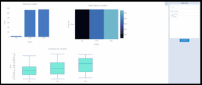
The Interactive Chart tool replaces the existing Charting tool, which has been deprecated. Now, the interactive charting tool instantly creates and customizes popular chart types and output in both static and interactive formats.
The Insight Tool brings your insights to life through interactive dashboards you can share across your organization via the Alteryx Gallery to gain deeper insights into your data. You can create and arrange multiple charts and text elements on the dashboard, create filters for viewing specific data, and create drilldowns to let you change the detail level of data displayed.
Deliver answers faster
Caching feature in Alteryx Designer allows for a workflow process to be stopped and then restarted from the caching point without starting over which can drastically reduce processing time.
Alteryx Server becomes more enterprise-friendly with job prioritization and worker node assignment that enables admins and users to prioritize the most critical jobs to the top of the queue.
Alteryx Connect gets smarter by recommending related assets to help you discover other available analytic assets to use in your analysis.
Next level analytics
The new Python tool with Jupyter Notebook integration is an embedded IDE that allows you to run Python code directly in Alteryx Designer.
Adding the big data capabilities – Apache Spark Code tool support – Spark Direct for Databricks on Azure and HDInsight – which allows you to quickly leverage the power of Spark right within a workflow.
We encourage you to experience the new capabilities in Alteryx Analytic 2018.3 during our live webinar on September 18th
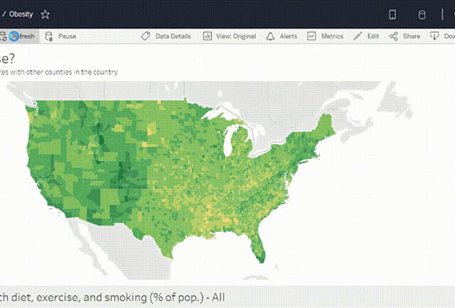
TABLEAU 2020.3 NEW FEATURES – TOP PICKS
I’ve always been a huge Tableau fan as they never fail to impress me by bringing out new exciting features in every release. Tableau has yet again released a new version after a thorough research based on people’s experience, thoughts, and comments.
As a result, Tableau 2020.3 has an exciting feature with respect to Predictive modelling functions, especially useful to advanced analytics geeks. There are so many other new features which everyone will appreciate – such as IN operator for calculations, Search improvements in data pane, Data quality warnings on Tableau Server and many more!
Here are my top picks from the list.
The IN Operator
The much-awaited feature for the SQL lovers. The IN operator is a shorthand replacement for multiple OR functions. By using IN operator, we will be able to create concise calculation fields instead of never-ending lines of ‘OR’.
Let’s look into a simple use case by assuming that I am interested to know the sales value of ‘Apple Products’ compared to all other products, then I can use IN operator to with IF statement to group the products to “Apple Product” and “Other Products”
IF [Product Name] IN (‘Apple iPhone 5′,’Apple iPhone 5C’,’Apple iPhone 5S’) THEN “Apple Products” ELSE “Other Products” END
Predictive Modelling Function
Now the predictive genes would be happy to see more features on the prediction module of Tableau. With the added advantages of the functions MODEL_QUANTILE and MODEL_PERCENTILE, now the prediction function goes beyond the existing trendline analysis. Both the functions will help to build a model that understands how your data is distributed around a best-fit line.
MODEL_QUANTILE is a table calculation that returns a target value at a specified percentile, based on other predictors MODEL_PERCENTILE is a table calculation that returns the probability of the expected value being less than or equal to the observed mark, based on other predictors
 Search improvements in Data pane
While developing business specific dashboards, we need to create several calculations and its needs to be adjusted or new calculations needs to be created from existing calculations as per the business unit’s requirements.
With the newly added Search improvement feature, our lives are made easy by searching or filtering specific filed based on field name, type, or comments.
Search improvements in Data pane
Write to external databases in Tableau Prep
Write to external databases in Tableau Prep
The wow moment for prep is here with the introduction of the ability to output to a database. In all previous versions of Prep, we have been able to write to an extract file or csv, and now from the latest 2020.3 introduces the ability to output to a database. Currently supported databases are SQL Server, MySQL, PostgreSQL, Amazon Redshift, Snowflake, Oracle, and Teradata.
As shown in the below example, result from the flow can be saved to a data base table from the output step by choosing “Database table” option, specify your server connection (with login credentials) , choose the data base and then the table.
And now, Write to database will power the analytics journey by helping to solve the issues related to, data sources, data security and data governance
Open or Upload Workbooks On The Web within Tableau Server
Sharing your work and exploring insights from others just got easier. You can now open a Tableau workbook or upload it straight to the web without having to use Tableau Desktop. Simply select the workbook (.twb or .twbx) you want to upload and publish directly to your site on Tableau Server or Online. Only users with the appropriate publishing permissions will have the ability to upload content.
Open or Upload Workbooks On The Web within Tableau Server
Three refresh options are available, they are
Earlier prep was used mainly for
Set Data Quality Warnings on Tableau Server
Data quality warnings make it possible to let users know when a data asset is flagged, whether because the data is under maintenance, it’s stale, or some other reason. With high visibility data quality warnings, not only let users know about the issue but make sure they do not miss it.
Are you interested in learning more about Tableau’s new features or the features? Are you a Tableau user and would like to become a Tableau Champion?
If the answer to the above questions is a big “YES”, Please contact us at training@beinex.com/ info@beinex.com and we would be happy to schedule a Tableau demo or training for you and your company.
Search improvements in Data pane
While developing business specific dashboards, we need to create several calculations and its needs to be adjusted or new calculations needs to be created from existing calculations as per the business unit’s requirements.
With the newly added Search improvement feature, our lives are made easy by searching or filtering specific filed based on field name, type, or comments.
Search improvements in Data pane
Write to external databases in Tableau Prep
Write to external databases in Tableau Prep
The wow moment for prep is here with the introduction of the ability to output to a database. In all previous versions of Prep, we have been able to write to an extract file or csv, and now from the latest 2020.3 introduces the ability to output to a database. Currently supported databases are SQL Server, MySQL, PostgreSQL, Amazon Redshift, Snowflake, Oracle, and Teradata.
As shown in the below example, result from the flow can be saved to a data base table from the output step by choosing “Database table” option, specify your server connection (with login credentials) , choose the data base and then the table.
And now, Write to database will power the analytics journey by helping to solve the issues related to, data sources, data security and data governance
Open or Upload Workbooks On The Web within Tableau Server
Sharing your work and exploring insights from others just got easier. You can now open a Tableau workbook or upload it straight to the web without having to use Tableau Desktop. Simply select the workbook (.twb or .twbx) you want to upload and publish directly to your site on Tableau Server or Online. Only users with the appropriate publishing permissions will have the ability to upload content.
Open or Upload Workbooks On The Web within Tableau Server
Three refresh options are available, they are
Earlier prep was used mainly for
Set Data Quality Warnings on Tableau Server
Data quality warnings make it possible to let users know when a data asset is flagged, whether because the data is under maintenance, it’s stale, or some other reason. With high visibility data quality warnings, not only let users know about the issue but make sure they do not miss it.
Are you interested in learning more about Tableau’s new features or the features? Are you a Tableau user and would like to become a Tableau Champion?
If the answer to the above questions is a big “YES”, Please contact us at training@beinex.com/ info@beinex.com and we would be happy to schedule a Tableau demo or training for you and your company.
Search improvements in Data pane
While developing business specific dashboards, we need to create several calculations and its needs to be adjusted or new calculations needs to be created from existing calculations as per the business unit’s requirements.
With the newly added Search improvement feature, our lives are made easy by searching or filtering specific filed based on field name, type, or comments.
Search improvements in Data pane
Write to external databases in Tableau Prep
Write to external databases in Tableau Prep
The wow moment for prep is here with the introduction of the ability to output to a database. In all previous versions of Prep, we have been able to write to an extract file or csv, and now from the latest 2020.3 introduces the ability to output to a database. Currently supported databases are SQL Server, MySQL, PostgreSQL, Amazon Redshift, Snowflake, Oracle, and Teradata.
As shown in the below example, result from the flow can be saved to a data base table from the output step by choosing “Database table” option, specify your server connection (with login credentials) , choose the data base and then the table.
And now, Write to database will power the analytics journey by helping to solve the issues related to, data sources, data security and data governance
Open or Upload Workbooks On The Web within Tableau Server
Sharing your work and exploring insights from others just got easier. You can now open a Tableau workbook or upload it straight to the web without having to use Tableau Desktop. Simply select the workbook (.twb or .twbx) you want to upload and publish directly to your site on Tableau Server or Online. Only users with the appropriate publishing permissions will have the ability to upload content.
Open or Upload Workbooks On The Web within Tableau Server
Three refresh options are available, they are
Create table- if the table is an already existing one, it will be deleted
Append to Table –Without impacting the existing records, data will be added as new records
Replace Data – This selection will Replaces data in the existing table.
Preparing data so that it can be used in extract refresh of exiting tableau dashboards
Generic data preparations and export to csv

Infographics | Techniques in Advanced Analytics: Ten to Tango!
Predictive modelling, machine learning, and business process automation are used in Advanced Analytics to analyse data from various sources. It forecasts trends and events in the future to improve decision-making precision and effectiveness.
Companies use the strategies listed below to benefit from advanced analytics:

Top 4 Enterprise Data Visualization Tools: A Complete Guide
What is Data Visualization?
Data visualization is the process of representing data in a graphical or spatial format, allowing for easy visual analysis without technical jargon. Unlike raw numerical data, visual representations like charts, graphs, and maps help quickly identify patterns, trends, and anomalies, facilitating faster and more accurate insights.
Benefits of Data Visualization
Understanding raw data can be challenging due to its complexity. Data visualization addresses this by:
- Simplify Data Interpretation: Converting raw data into charts and graphs makes it easier to understand underlying patterns and relationships.
- Identify Trends and Anomalies: Visual formats highlight trends and anomalies that might be missed in numerical data.
- Improve Accessibility: Data visualization makes information accessible to a broader audience, including those without strong analytical skills, thus improving data-driven decision-making across departments.
- Advanced Data Storytelling: Effective visualization techniques turn data into compelling stories that facilitate better communication and understanding.
What Are Data Visualization Tools?
Data visualization tools provide designers with an efficient way to create visual representations of large data sets. When dealing with data sets that include hundreds of thousands or millions of data points, automating the visualization process simplifies the designer's job considerably.
Key Benefits of Data Visualisation Tools
- Dashboards: To monitor and analyze key performance indicators (KPIs) and metrics in real-time.
- Annual Reports: To present data-driven insights to stakeholders in a clear and engaging manner.
- Sales and Marketing Materials: To showcase trends, performance, and forecasts to potential clients and customers.
- Investor Slide Decks: To communicate financial health and growth prospects effectively.
- General Information Interpretation: To make complex data understandable for decision-making processes in virtually any context where quick interpretation of information is necessary.
A Compact List of Top Data Visualization Tools
Here are the top enterprise data visualization tools for creating compelling visualizations:
- Tableau
- Google Charts
- Zoho Analytics
- Data Wrapper
Tableau
Tableau is a top-tier platform recognized for its user-friendly interface. It adeptly integrates data from multiple sources to create dynamic and visualisations.
Its comprehensive suite of products spans desktop applications, robust server solutions, and flexible web-hosted environments, empowering organizations to drive informed decision-making and achieve actionable insights across their operations.
Connect with us for a free demo: https://www.beinex.com/free-tableau-software
Who Should Use Tableau?
Data scientists and analysts who need to create custom dashboards and advanced visualizations will benefit from Tableau.Key Features of Tableau
• User-Friendly Interface: Easy to learn and navigate, making it accessible for all skill levels. • Mobile-Friendly: Create reports and dashboards optimised for mobile devices, allowing you to access and analyse data on the go. • High Performance: Efficiently handles large datasets, ensuring seamless analysis without performance issues. • Interactive Visualizations: Build interactive and dynamic visualisations, allowing deeper data exploration. • Integration Capabilities: Integrates well with various data sources and other business applications, enhancing data connectivity. • Real-Time Data Updates: Provides real-time data updates, ensuring you have the most current insights. • Collaboration Tools: Facilitates easy sharing and collaboration on reports and dashboards within teams. • Customizable Dashboards: Offers highly customisable dashboards to meet specific business needs and preferences. • Advanced Analytics: Supports advanced analytics features, including trend analysis, forecasting, and statistical summaries. • Security: Ensures data security with robust access controls and permissions.
Learn more: https://www.beinex.com/tableau-partnership-and-consulting-services/Google Charts
Google Charts is a free tool for creating interactive data visualisations, accessible through most web browsers. It supports various data sources, including spreadsheets and databases.
Who Should Use Google Charts?
Students, universities, and businesses needing fundamental charts will find Google Charts useful.Key Features of Google Charts
• User-Friendly Interface: Easy to use with a straightforward setup process. • Wide Range of Chart Types: Supports various chart types, including line, bar, pie, scatter, and more. • Customizable: Offers extensive customization options to tailor charts to specific needs, including colors, fonts, and annotations. • Interactive Charts: Allows for interactive elements such as tooltips, zooming, and panning. • Cross-Platform Compatibility: Ensures charts work seamlessly across different browsers and devices. • Dynamic Data Updates: Supports real-time data updates, keeping charts current with live data feeds. • Integration with Google Services: Easily integrates with other Google services such as Google Sheets and Google Analytics. • Embedding Capabilities: Simple embedding in websites and applications with a few lines of code. • Data Export Options: Provides options to export charts in various formats, including PNG, SVG, and PDF. • Open Source: Free and open source, allowing for extensive customization and community support. • Support for Multiple Data Formats: Works with various data formats, including JSON, CSV, and Google Spreadsheets. • Accessibility Features: These include features to make charts accessible to all users, including screen reader support. • Responsive Design: Ensures charts are responsive and adapt to different screen sizes and resolutions. • Powerful API: Provides a robust API for developers to create complex visualisations and integrate them into applications.
Zoho Analytics
Zoho Analytics combines business intelligence and reporting services, allowing for swift data visualisation. It is user-friendly and integrates well with other Zoho products.Who Should Use Zoho Analytics?
Analytics and sales teams, marketing teams, project managers, and more can benefit from Zoho Analytics.Key Features of Zoho Analytics
• User-Friendly Interface: Intuitive design that simplifies data analysis and visualisation. • Wide Range of Data Sources: Connects to various data sources, including databases, cloud storage, spreadsheets, and other business applications. • Advanced Analytics: Offers features such as predictive analytics, AI-powered insights, and what-if analysis. • Interactive Dashboards: Create and customise interactive dashboards with drag-and-drop ease. • Collaboration Tools: Facilitate sharing and collaboration on reports and dashboards within teams. • Embedded Analytics: Embed reports and dashboards into websites, applications, and portals. • Automated Data Sync: Schedule data imports and synchronise data regularly. • Customizable Visualizations: Provides a variety of chart types and extensive customisation options for data visualisations. • Data Blending: Combine data from multiple sources for comprehensive analysis. • AI-Driven Insights: Leverages AI to offer advanced analytical insights and pattern detection. • Real-Time Data Access: Supports real-time data integration and live dashboards. • Mobile Access: Access and interact with reports and dashboards on mobile devices. • Data Security: Ensures robust security features, including role-based access control, encryption, and compliance with industry standards. • Report Scheduling: Automate the distribution of reports through scheduled emails. • Integrations with Other Zoho Apps: Seamlessly integrate with other Zoho applications for enhanced functionality. • API Support: Provides APIs for developers to integrate analytics capabilities into custom applications. • Data Preparation Tools: These include tools for data cleaning, transformation, and enrichment.
Data Wrapper
Data Wrapper is ideal for media enterprises and allows for the quick creation of charts, maps, and plots. It is completely web-based and easy to use.Who Should Use Data Wrapper?
Data Wrapper can benefit media, news publications, government institutions and finance companies. It is especially useful for creating visually appealing and easily understandable visualisations.Key Features of Data Wrapper
• User-Friendly Interface: Intuitive and easy to use, requiring no coding skills to create professional charts and maps. • Wide Range of Chart Types: Supports a variety of chart types, including bar, line, pie, scatter plots, and maps. • Customisable Visualizations: Offers extensive customisation options for colors, labels, and annotations to match branding and presentation needs. • Responsive Design: Ensures charts and maps are responsive and adapt to different screen sizes and devices. • Interactive Elements: Allows for adding interactive elements like tooltips, hover effects, and clickable legends. • Real-Time Data Integration: Supports live data updates, enabling real-time visualisation. • Embedding Capabilities: Easily embed charts and maps into websites and blogs with simple code snippets. • Export Options: This option lets users download visualisations in various formats, including PNG, PDF, and SVG. • Accessibility: Committed to creating accessible visualisations with features that support screen readers and keyboard navigation. • Data Security: Ensures data security with robust privacy policies and compliance with industry standards. • Collaboration Tools: Allows for team collaboration with shared projects and editing capabilities. • Support for Multiple Languages: Offers multi-language support for creating visualisations in different languages. • Easy Data Import: Supports importing data from various sources, including CSV files, spreadsheets, and web links. • API Integration: Provides APIs for integrating Data wrapper with other applications and services. • Customizable Templates: Use and modify templates to maintain consistency in visualisations. • Annotation Features: Add rich text annotations directly to charts and maps to provide additional context and information.
Always Go for the Best Tool
By choosing the right data visualisation tool, organizations can discover the full potential of their data, making complex information accessible and actionable for everyone. This empowers businesses to make data-driven decisions that drive growth and innovation.

LOD (Level of Detail) Expressions in Tableau
Types of LOD Expressions in Tableau
- FIXED
- INCLUDE
- EXCLUDE
There are three types of LOD expressions in Tableau:
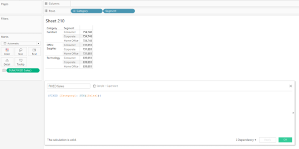
FIXED: The FIXED LOD expression calculates values based on specific dimensions, regardless of the dimensions present in the visualisation. It creates a virtual level of detail for the calculation. For example, {FIXED [Category]: SUM([Sales])} would calculate the total sales for each category, irrespective of other dimensions used in the visualisation.
INCLUDE: The INCLUDE LOD expression calculates values at the specified level while incorporating the dimension(s) used in the visualisation. It allows you to aggregate data for a specific dimension while considering other dimensions in the visualisation. For example, {INCLUDE [Region]: AVG([Profit])} would calculate the average profit for each region, considering all other dimensions in the visualisation.

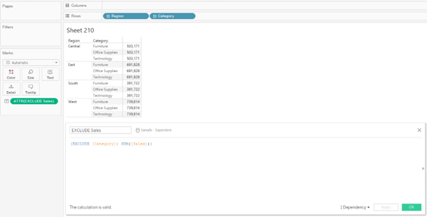
EXCLUDE: The EXCLUDE LOD expression calculates values at the specified level while excluding the dimension(s) used in the visualisation. It enables you to aggregate data for a specific dimension while ignoring other dimensions in the visualisation. For example, {EXCLUDE [Product]: SUM([Revenue])} would calculate the total revenue for each product, excluding any other dimensions present.
FIXED LOD Tableau Function
In Tableau, the FIXED Level of Detail (LOD) is the widely used function that allows you to perform calculations using specific dimensions, irrespective of the dimensions present in the visualisation. It creates a virtual level of detail for the calculation, providing precise control over your analysis's granularity.
Steps to Create a FIXED Level of Detail Tableau Function
In Tableau, the FIXED Level of Detail (LOD) function allows you to perform calculations using specific dimensions, irrespective of the dimensions present in the visualisation. It creates a virtual level of detail for the calculation, providing precise control over your analysis's granularity.
The steps to create the FIXED LOD function are as follows:
- • Create a calculated field. (This can be done by clicking on the drop-down next to the “Search” bar in the dimension pane or by selecting “Analysis” and selecting “Create Calculated Field”)
- • Type in the FIXED LOD Formula in the calculated field and drop the field into the view.
- • We can obtain the syntax of the FIXED expressions when we search for “Aggregate” functions in the calculated field.

Example
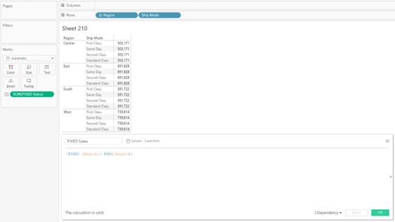
The following FIXED level of detail expression computes the sum of sales per region:
Beinex+ Tableau Offerings
Beinex has 100 years of combined experience in Tableau and is led by professionals who have successfully delivered Tableau projects in the region for large private and public sector organisations. Our team of Tableau-certified consultants are real-life Tableau business users passionate about Tableau and providing a world-class experience. In addition to providing sustainable analytics solutions, Beinex will help organisations to build superior data visual analytics capabilities internally through our bespoke training programs.