How AI Decision-Making is Improving Enterprise Outcomes
Blog
Share 
AI Adoption in HR: Top Five Benefits Powering the Future Workforce
 22 May 2025
  Sumi S
AI in HR refers to deploying machine learning (ML), natural language processing (NLP), and other AI technologies to automate human resources tasks, mitigate bias, and support decision-making. 80% of HR workers confirm that AI will assist their work over the next five years. Overall, 87% of companies utilize AI in their recruitment processes, with over 65% of recruiters employing AI for hiring tasks.
From talent management to health and benefits, compensation, and retirement, AI-powered assistants or tools can ease the burden of HR teams. It’s better not to miss the momentum and welcome AI to boost productivity and empower the workforce.
Book a Guided Demo of Our Document AI Chatbot for HR
From talent management to health and benefits, compensation, and retirement, AI-powered assistants or tools can ease the burden of HR teams. It’s better not to miss the momentum and welcome AI to boost productivity and empower the workforce.
Book a Guided Demo of Our Document AI Chatbot for HR
Related Articles
Top 4 Enterprise Data Visualization Tools: A Complete Guide
What is Data Visualization?
Data visualization is the process of representing data in a graphical or spatial format, allowing for easy visual analysis without technical jargon. Unlike raw numerical data, visual representations like charts, graphs, and maps help quickly identify patterns, trends, and anomalies, facilitating faster and more accurate insights.
Benefits of Data Visualization
Understanding raw data can be challenging due to its complexity. Data visualization addresses this by:
- Simplify Data Interpretation: Converting raw data into charts and graphs makes it easier to understand underlying patterns and relationships.
- Identify Trends and Anomalies: Visual formats highlight trends and anomalies that might be missed in numerical data.
- Improve Accessibility: Data visualization makes information accessible to a broader audience, including those without strong analytical skills, thus improving data-driven decision-making across departments.
- Advanced Data Storytelling: Effective visualization techniques turn data into compelling stories that facilitate better communication and understanding.
What Are Data Visualization Tools?
Data visualization tools provide designers with an efficient way to create visual representations of large data sets. When dealing with data sets that include hundreds of thousands or millions of data points, automating the visualization process simplifies the designer's job considerably.
Key Benefits of Data Visualisation Tools
- Dashboards: To monitor and analyze key performance indicators (KPIs) and metrics in real-time.
- Annual Reports: To present data-driven insights to stakeholders in a clear and engaging manner.
- Sales and Marketing Materials: To showcase trends, performance, and forecasts to potential clients and customers.
- Investor Slide Decks: To communicate financial health and growth prospects effectively.
- General Information Interpretation: To make complex data understandable for decision-making processes in virtually any context where quick interpretation of information is necessary.
A Compact List of Top Data Visualization Tools
Here are the top enterprise data visualization tools for creating compelling visualizations:
- Tableau
- Google Charts
- Zoho Analytics
- Data Wrapper
Tableau
Tableau is a top-tier platform recognized for its user-friendly interface. It adeptly integrates data from multiple sources to create dynamic and visualisations.
Its comprehensive suite of products spans desktop applications, robust server solutions, and flexible web-hosted environments, empowering organizations to drive informed decision-making and achieve actionable insights across their operations.
Connect with us for a free demo: https://www.beinex.com/free-tableau-software
Who Should Use Tableau?
Data scientists and analysts who need to create custom dashboards and advanced visualizations will benefit from Tableau.Key Features of Tableau
• User-Friendly Interface: Easy to learn and navigate, making it accessible for all skill levels. • Mobile-Friendly: Create reports and dashboards optimised for mobile devices, allowing you to access and analyse data on the go. • High Performance: Efficiently handles large datasets, ensuring seamless analysis without performance issues. • Interactive Visualizations: Build interactive and dynamic visualisations, allowing deeper data exploration. • Integration Capabilities: Integrates well with various data sources and other business applications, enhancing data connectivity. • Real-Time Data Updates: Provides real-time data updates, ensuring you have the most current insights. • Collaboration Tools: Facilitates easy sharing and collaboration on reports and dashboards within teams. • Customizable Dashboards: Offers highly customisable dashboards to meet specific business needs and preferences. • Advanced Analytics: Supports advanced analytics features, including trend analysis, forecasting, and statistical summaries. • Security: Ensures data security with robust access controls and permissions.
Learn more: https://www.beinex.com/tableau-partnership-and-consulting-services/Google Charts
Google Charts is a free tool for creating interactive data visualisations, accessible through most web browsers. It supports various data sources, including spreadsheets and databases.
Who Should Use Google Charts?
Students, universities, and businesses needing fundamental charts will find Google Charts useful.Key Features of Google Charts
• User-Friendly Interface: Easy to use with a straightforward setup process. • Wide Range of Chart Types: Supports various chart types, including line, bar, pie, scatter, and more. • Customizable: Offers extensive customization options to tailor charts to specific needs, including colors, fonts, and annotations. • Interactive Charts: Allows for interactive elements such as tooltips, zooming, and panning. • Cross-Platform Compatibility: Ensures charts work seamlessly across different browsers and devices. • Dynamic Data Updates: Supports real-time data updates, keeping charts current with live data feeds. • Integration with Google Services: Easily integrates with other Google services such as Google Sheets and Google Analytics. • Embedding Capabilities: Simple embedding in websites and applications with a few lines of code. • Data Export Options: Provides options to export charts in various formats, including PNG, SVG, and PDF. • Open Source: Free and open source, allowing for extensive customization and community support. • Support for Multiple Data Formats: Works with various data formats, including JSON, CSV, and Google Spreadsheets. • Accessibility Features: These include features to make charts accessible to all users, including screen reader support. • Responsive Design: Ensures charts are responsive and adapt to different screen sizes and resolutions. • Powerful API: Provides a robust API for developers to create complex visualisations and integrate them into applications.
Zoho Analytics
Zoho Analytics combines business intelligence and reporting services, allowing for swift data visualisation. It is user-friendly and integrates well with other Zoho products.Who Should Use Zoho Analytics?
Analytics and sales teams, marketing teams, project managers, and more can benefit from Zoho Analytics.Key Features of Zoho Analytics
• User-Friendly Interface: Intuitive design that simplifies data analysis and visualisation. • Wide Range of Data Sources: Connects to various data sources, including databases, cloud storage, spreadsheets, and other business applications. • Advanced Analytics: Offers features such as predictive analytics, AI-powered insights, and what-if analysis. • Interactive Dashboards: Create and customise interactive dashboards with drag-and-drop ease. • Collaboration Tools: Facilitate sharing and collaboration on reports and dashboards within teams. • Embedded Analytics: Embed reports and dashboards into websites, applications, and portals. • Automated Data Sync: Schedule data imports and synchronise data regularly. • Customizable Visualizations: Provides a variety of chart types and extensive customisation options for data visualisations. • Data Blending: Combine data from multiple sources for comprehensive analysis. • AI-Driven Insights: Leverages AI to offer advanced analytical insights and pattern detection. • Real-Time Data Access: Supports real-time data integration and live dashboards. • Mobile Access: Access and interact with reports and dashboards on mobile devices. • Data Security: Ensures robust security features, including role-based access control, encryption, and compliance with industry standards. • Report Scheduling: Automate the distribution of reports through scheduled emails. • Integrations with Other Zoho Apps: Seamlessly integrate with other Zoho applications for enhanced functionality. • API Support: Provides APIs for developers to integrate analytics capabilities into custom applications. • Data Preparation Tools: These include tools for data cleaning, transformation, and enrichment.
Data Wrapper
Data Wrapper is ideal for media enterprises and allows for the quick creation of charts, maps, and plots. It is completely web-based and easy to use.Who Should Use Data Wrapper?
Data Wrapper can benefit media, news publications, government institutions and finance companies. It is especially useful for creating visually appealing and easily understandable visualisations.Key Features of Data Wrapper
• User-Friendly Interface: Intuitive and easy to use, requiring no coding skills to create professional charts and maps. • Wide Range of Chart Types: Supports a variety of chart types, including bar, line, pie, scatter plots, and maps. • Customisable Visualizations: Offers extensive customisation options for colors, labels, and annotations to match branding and presentation needs. • Responsive Design: Ensures charts and maps are responsive and adapt to different screen sizes and devices. • Interactive Elements: Allows for adding interactive elements like tooltips, hover effects, and clickable legends. • Real-Time Data Integration: Supports live data updates, enabling real-time visualisation. • Embedding Capabilities: Easily embed charts and maps into websites and blogs with simple code snippets. • Export Options: This option lets users download visualisations in various formats, including PNG, PDF, and SVG. • Accessibility: Committed to creating accessible visualisations with features that support screen readers and keyboard navigation. • Data Security: Ensures data security with robust privacy policies and compliance with industry standards. • Collaboration Tools: Allows for team collaboration with shared projects and editing capabilities. • Support for Multiple Languages: Offers multi-language support for creating visualisations in different languages. • Easy Data Import: Supports importing data from various sources, including CSV files, spreadsheets, and web links. • API Integration: Provides APIs for integrating Data wrapper with other applications and services. • Customizable Templates: Use and modify templates to maintain consistency in visualisations. • Annotation Features: Add rich text annotations directly to charts and maps to provide additional context and information.
Always Go for the Best Tool
By choosing the right data visualisation tool, organizations can discover the full potential of their data, making complex information accessible and actionable for everyone. This empowers businesses to make data-driven decisions that drive growth and innovation.
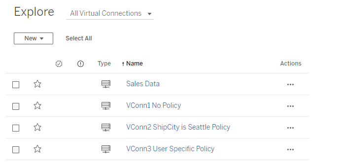
Tableau Version 2021.4: Bringing Automation to Data Management
Bringing automation to data management is one of Tableau’s big focuses for this release, to help users get insights faster.
Some key features that help with that are:
 Centralized Row-Level Security - Bring precision and agility to data protection
In general, Row-Level Security (RLS) refers to filtering out rows of data at query time based on the current user's identity. Due to this, different users can view the same table, viz, or report and see only data they are authorized to see. RLS allows scenarios like having a regional manager only see sales created within their team, but not sales from another manager's team.
Rather than implementing RLS individually on every Tableau workbook or data source accessing a sensitive table, virtual connections can be used to centrally define and manage data policies. These policies will be consistently applied across all connected Tableau Flows, Data Sources, or Workbooks that depend on that data. This gives granular control over data security while bringing flexibility to reuse data sources.
Centralized Row-Level Security - Bring precision and agility to data protection
In general, Row-Level Security (RLS) refers to filtering out rows of data at query time based on the current user's identity. Due to this, different users can view the same table, viz, or report and see only data they are authorized to see. RLS allows scenarios like having a regional manager only see sales created within their team, but not sales from another manager's team.
Rather than implementing RLS individually on every Tableau workbook or data source accessing a sensitive table, virtual connections can be used to centrally define and manage data policies. These policies will be consistently applied across all connected Tableau Flows, Data Sources, or Workbooks that depend on that data. This gives granular control over data security while bringing flexibility to reuse data sources.
 Edit Published Data Source
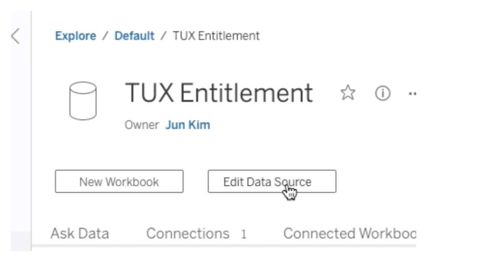
This feature makes managing data sources very effortless. Now we can create, edit and rename data sources directly in Tableau Server and Tableau Online, test the changes, and publish—all without leaving the browser. This streamlines the governance and metadata management.
Edit Published Data Source
This feature makes managing data sources very effortless. Now we can create, edit and rename data sources directly in Tableau Server and Tableau Online, test the changes, and publish—all without leaving the browser. This streamlines the governance and metadata management.
 Parameters in Tableau Prep
 speed up and simplify tasks by enabling users to easily change data inputs, data outputs, and values used throughout a flow which makes reusing them much easier.
Supported step types in 2021.4:
Parameters in Tableau Prep
Parameters in Tableau Prep speed up and simplify tasks by enabling users to easily change data inputs, data outputs, and values used throughout a flow which makes reusing them much easier.
Supported step types in 2021.4:
 Tableau 2021.4 Highlights
- Virtual Connections
- Centralized Row-Level Security
- Edit Published Data Source
- Parameters in Tableau Prep
Centralized Row-Level Security - Bring precision and agility to data protection
In general, Row-Level Security (RLS) refers to filtering out rows of data at query time based on the current user's identity. Due to this, different users can view the same table, viz, or report and see only data they are authorized to see. RLS allows scenarios like having a regional manager only see sales created within their team, but not sales from another manager's team.
Rather than implementing RLS individually on every Tableau workbook or data source accessing a sensitive table, virtual connections can be used to centrally define and manage data policies. These policies will be consistently applied across all connected Tableau Flows, Data Sources, or Workbooks that depend on that data. This gives granular control over data security while bringing flexibility to reuse data sources.
Edit Published Data Source
This feature makes managing data sources very effortless. Now we can create, edit and rename data sources directly in Tableau Server and Tableau Online, test the changes, and publish—all without leaving the browser. This streamlines the governance and metadata management.
Parameters in Tableau Prep
Parameters in Tableau Prep speed up and simplify tasks by enabling users to easily change data inputs, data outputs, and values used throughout a flow which makes reusing them much easier.
Supported step types in 2021.4:
- Inputs /Outputs File path/File name
- Published data source name
- Calculated fields
- Filters
Tableau 2021.4 Highlights
- Data Management
- Virtual Connections
- Centralized Row-Level Security
- Tableau Catalog
- Inherited column descriptions
- Create flows from Catalog pages
- Tableau Prep Builder
- Tableau Prep Parameters
- Create Tiles
- Flow output Subscriptions
- Tableau Online
- Connected Apps
- Tableau Bridge Multi-Pool
- Analytics
- Metric Updates
- Show Metric status with colors
- Customize comparison period and data window
- Embed metrics
- Replay Animations
- Web authoring improvements
- Edit published data sources on Server and Online
- Copy/Paste Dashboard Zones
- Metric Updates
NEW FEATURES OF TABLEAU 2020.1 (BETA)
Soon after Tableau launched the 2019.4 update, they have released a list of super interesting features as part of their path into 2020.1. Despite it being in Beta stage, we have been able to try out some of these and they do change the way we think about visualizations and the way we interact with them.
Let’s go through a sample of the most coveted features, which many of us in the world of BI have probably been dying to have (or at least would be great to have!)


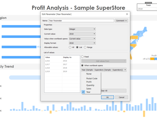
1. Dynamic Parameters
1. This one deserves a whole lot of excitement from the entire Tableau community since parameters are used in just about any viz and the biggest complaint (major pain!) was that if the data gets refreshed, the updated values in the parameter field do not get reflected. A user would have to manually go about refreshing and adding the new fields in the parameter. It was honestly astounding that such a simple thing would be the source of unnecessary emotions soaring. 2. But with the latest update, Tableau has provided. Now it can automatically update its parameters as soon as the data is refreshed and the new values will populate by itself! This saves a ton of time and effort and monitoring headaches for every dashboard created hereon! 3. To us, this would be among the most coveted and REQUIRED updates in this version
2. Viz Animations
In this new day and era, we are used to smooth rendering of just about anything we work on (from an app on our phone to the way an electric car feels on the road). This concept has now been delivered to us by Tableau in their new viz animation capability. Now all our charts can have a smooth flow whenever changed by another filter. This not only enables the user to spot the exact points of change in the chart, but also looks cool beyond measures. On click of an action, we can set up the amount of time it will take for the change to take place in the other charts (and this change is animated smoothly). This beautiful feature can be perfectly explained using an example visualization, rather than any more words. So here goes..
Video Player
As you can see, it looks beautiful. This is an exciting time for the creators, since this feature will definitely make the viz functionality immensely more appealing to an end user.
00:00
00:30
3. Improvements in Explain Data
For those unfamiliar to this feature, explain data is an intelligent tool built in tableau which gives a statistical inference to any singular data point on a chart. It gives us an idea of the why and the general direction of the how of the value. 2020.1 promises to be smarter with Explain Data digging deeper with more refined statistical models in the background. This is a feature which never fails to astonish a new user and Tableau promises to keep improving and building upon this as time goes by.
4. Export the dashboard to formats wanted
This is a simpler feature amidst all the fancy ones, however, may prove to a crucial addition for end user experience. Now we can directly export the dashboard in any format, on click of a button which can take the form of a text or an image and put as part of the dashboard. No more explaining to users to find click the tiny download option on the bottom of the screen and then export, now we can directly do it at the click of a button! We can export to formats like PDF, PowerPoint etc. which is honestly, great.
5. Buffer calculations
Buffer calculation enhances the interactivity when it comes it spatial scenarios. It is a boundary created with respect to any point on the map or location. A buffer calculation should contain three parameters such as location, distance, and a unit of measure like ‘kilometer’, and ‘miles’. Simple use case like, when you wanna know how many restaurants are present near my hotel, say around 1km, the buffer boundary highlights the number of restaurants near a specific location. Here is how the buffer calculation works….
[video width="1296" height="1080" mp4="https://www.beinex.com/wp-content/uploads/Video-2-Buffer-Calculation.mp4"][/video]
So restricting to only the Desktop version of Tableau, we can foresee happier times for all viz lovers. Though these features are just part of the BETA version and may not all be released in the very next update, but these are good to look ahead to.

Beinex Recognized as a Leading Consulting Firm in the Middle East by Consultancy-me
Accolades We Are Proud Of
Beinex earned top rankings across multiple domains: • Platinum in Business Intelligence • Gold in Data Science • Gold in Cloud Services
Industry-Specific Excellence
Our industry-focused consulting capabilities have also been recognized, and our ranking level is as follows: • Government Industry: Gold • Oil & Gas Industry: Gold • Public Sector Industry: Gold • Technology Industry: Gold • Banking Industry: Silver
A Milestone of Achievement
These accolades reaffirm our position as a trusted consulting partner for businesses and government entities across the Middle East. Our success is driven by a team of passionate professionals, innovative technologies, and strategic partnerships. Looking Ahead As we celebrate this achievement, we remain committed to delivering transformative solutions that empower businesses worldwide. Thank you to our clients, partners, and team members for making this success possible. If you are interested in our services, feel free to connect: https://beinex.com/contact-us/
Read More About Our Achievements
Beinex Among Top BI Consulting Firms in the Middle East Beinex Ranked as Top Data Science Consulting Firms in the Middle East Beinex Makes to the League of Top Consulting Firms for Cloud Services in the Middle East 2024
Streamlit & Snowflake: Crafting Dynamic Data and AI Apps
Here Comes Streamlit!
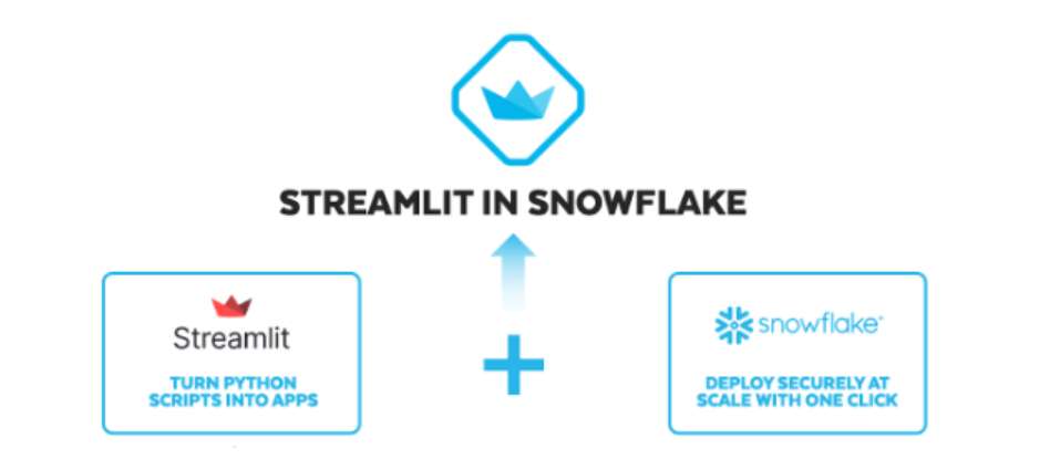
Streamlit, an open-source library, rapidly converts Python scripts into shareable web applications in mere minutes. These applications are crafted entirely in Python, eliminating the need for prior front-end expertise. In recent times, Streamlit has ascended as the prime choice for building Python-based data apps. It flaunts an 80% adoption rate among the Fortune 50 and has captivated the interest of hundreds of thousands of developers worldwide.
Beinex has Developed its Own Streamlit App
Beinex has harnessed Streamlit to craft the 'Track Your Santa' app. This application enables you to track Santa's journey across the globe, offering insights into the flying reindeer's speed and the current count of gifts delivered. It's a fun way to keep tabs on Santa's worldwide adventure!
Within the app, users can discover details and images of children eagerly awaiting Santa. These kids have shared their good deeds, desired gifts, regrets about tantrums, and their New Year resolutions. They're closely tracking Santa's progress, eagerly anticipating the timely arrival of their gifts.
How to login to Beinex Santa Dashboard
Link: https://beinexsnflkchristmasapp-bchnjgsds8fqrzc.streamlit.app/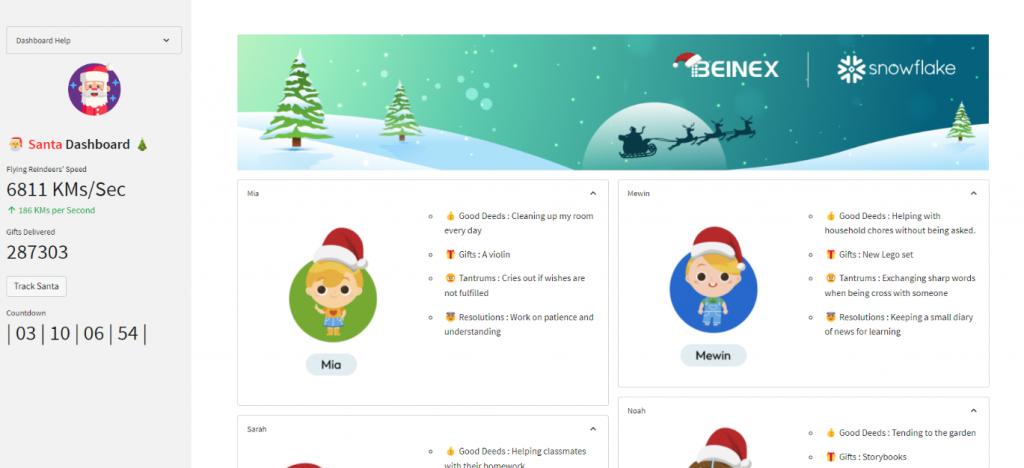
Streamlit: What it Brings to Your Table
1. Streamlit's Interactive Data Visualizations
Streamlit brings data and ML models to life, enabling interactive visualizations that go beyond static displays. Data teams now wield the power to create diverse applications previously unattainable. With Streamlit, builders craft interactive data apps featuring dynamic charting, data editing, collection, and write-back functions, facilitating responsive, decision-centric tools for stakeholders.
2. Accelerated Iteration and Swift Deployment with Streamlit
Leveraging Streamlit means fast iteration and deployment. You can effortlessly test new ideas, incorporating real-time stakeholder feedback with a few lines of code and witnessing immediate output changes. Instead of laboring over a traditional web app with a frontend team, multiple tailored apps can be developed for various use cases in the same time frame, amplifying data team output and impact.
Streamlit in Snowflake elevates this experience by offering data practitioners a fully managed environment. This allows them to focus on their core expertise—translating data into actionable insights—without concerning themselves with infrastructure management.
3. Types of Apps Can You Build with Streamlit

Streamlit's App Development in Snowflake: A Comprehensive Exploration
Let's delve into the process of crafting, modifying, and sharing Streamlit apps within Snowflake.1. Creating and Transforming Apps
Developing Streamlit apps within Snowflake offers a seamless, managed experience. Snowflake handles the intricate tasks, managing the setup of the foundational computing and storage for these apps. These apps operate on Snowflake warehouses, utilizing Snowflake stages for data and file storage.
Initiating an app creation is a straightforward process—a simple click on the "+ Streamlit App" button prompts a dialog requesting basic app details.
Pro Tip: To optimize, begin with an xsmall warehouse for most app needs. For enhanced monitoring of usage and costs, consider employing a dedicated warehouse for your app.
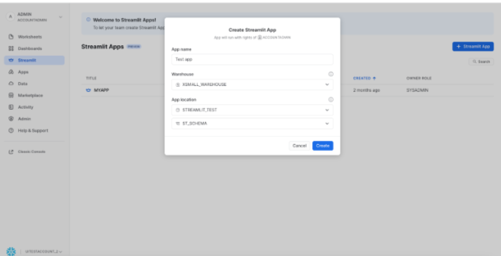 Upon clicking the "Create" button, users enter a side-by-side editing interface. On the left-hand side, the interface displays the app's code, while the right-hand side showcases the app's output. Within this setup, app builders can seamlessly modify the code and witness immediate impacts by clicking the "Run" button. This real-time interaction empowers builders to iteratively refine their app's functionality and appearance effortlessly.
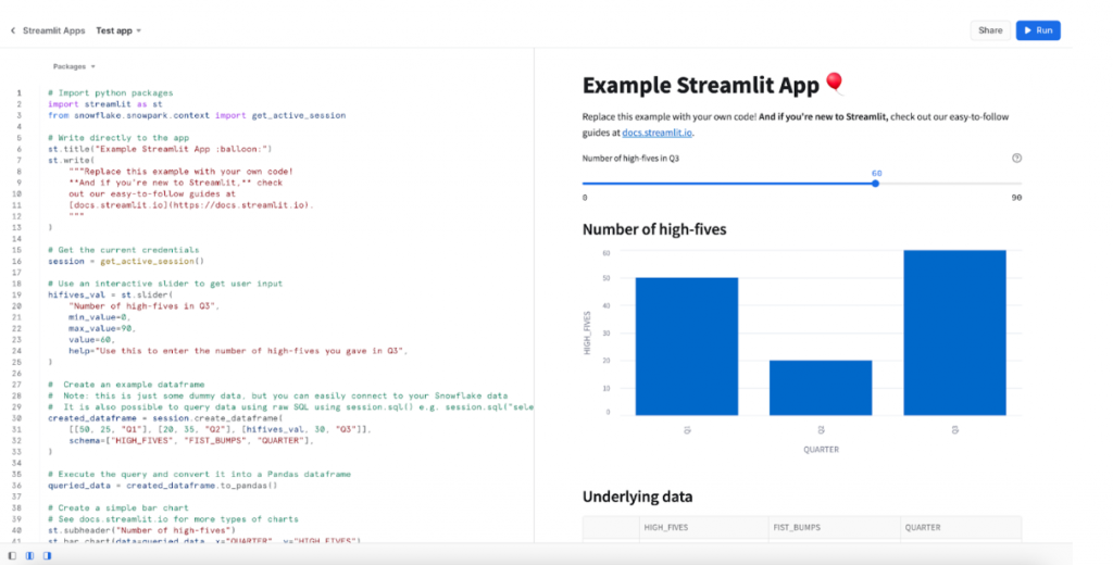 To leverage the complete potential of the Python ecosystem within your Streamlit app, consider installing additional Python packages from the Snowflake Anaconda Channel. This step allows you to access and integrate a wider array of Python libraries, enhancing the functionality and capabilities of your Streamlit application.

2. Navigating Streamlit Apps in Snowflake
Upon accessing Snowflake, users can navigate to the Streamlit tab to view a comprehensive list of all their Streamlit apps. These apps are treated as Snowflake objects and adhere to role-based access control protocols. The list includes apps created within the user's role and those shared with the user's role, offering a consolidated view of accessible Streamlit applications.

3. Efficient Streamlit App Sharing
The process to share within your Snowflake account is streamlined. Clicking on the share button triggers a sharing dialog. Given that Streamlit apps adhere to role-based access control, sharing apps involves a straightforward selection of the intended role and granting permission levels to enable app viewing. This simplified process ensures efficient sharing within the Snowflake environment.

Building Snowflake Native Apps with Streamlit
Streamlit serves as the UX framework for creating Snowflake Native Apps. These apps can be shared widely through the Snowflake Marketplace.
Starting with Streamlit in Snowflake
Creating Your First Streamlit App with Snowflake Marketplace Data: Additional Resources Snowflake Native App Development using Streamlit UX:Beinex + Snowflake Partnership
Beinex is a Snowflake Services Partner Premier Tier, and the partnership reaffirms Beinex's commitment to delivering exceptional data solutions and positions the company at the forefront of industry advancements. Harnessing the true potential of the data, the partnership drives innovation and success in the digital era. Belonging to Snowflake Services Partner Premier Tier, Beinex leverages Snowflake’s advanced capabilities and seamlessly integrates them into its comprehensive data solutions.
All Yours: Sharing the Code Snippet
# Import python packages import streamlit as st import time import datetime import pandas as pd import numpy as np import os import random from snowflake.snowpark.context import get_active_session #Getting all map files from static folder files_in_directory = os.listdir('static/') map_files = [i for i in files_in_directory if i.startswith("Map")] #setting default page config st. set_page_config(layout="wide") st.snow() #making it snow #reading data from Snowflake session = get_active_session() deeds = session.table("christmas_deeds").to_pandas() deed_dict = {} for ind , row in deeds.iterrows(): md = f""" - :thumbsup: Good Deeds : {row['DEEDS']} \n - :gift: Gifts : {row['GIFT']} \n - :angry: Tantrums : {row['TANDRUMS']} \n - :innocent: Resolutions : {row['RESOLUTIONS']} """ deed_dict[row['NAME']] = md #Design elements st.image("static/bg.png") main_col1 ,main_col2 = st.columns(2) with main_col1: with st.expander(label="Mia",expanded=True): c1 , c2 = st.columns(2) with c1 : with st.container(): st.write(""" """) with st.container(): st.image(r"static/Frame 15599.png",use_column_width=True) with st.container(): st.write(" ") with c2: with st.container(): st.markdown(deed_dict['Mia']) with st.container(): st.markdown(""" """) with st.expander(label="Sarah",expanded=True): c1 , c2 = st.columns(2) with c1 : with st.container(): st.image(r"static/Frame 15600.png",use_column_width=True) with c2: with st.container(): st.markdown(deed_dict['Sarah']) with st.container(): st.markdown(""" """) with st.expander(label="Olivia",expanded=True): c1 , c2 = st.columns(2) with c1 : with st.container(): st.image(r"static/Frame 15596.png",use_column_width=True) with c2: with st.container(): st.markdown(deed_dict['Olivia']) with st.container(): st.markdown(""" """) with main_col2: with st.expander(label="Mewin",expanded=True): c1 , c2 = st.columns(2) with c1 : with st.container(): st.image(r"static/Frame 15601.png",use_column_width=True) with c2: with st.container(): st.markdown(deed_dict['Mewin']) with st.container(): st.markdown(""" """) with st.expander(label="Noah",expanded=True): c1 , c2 = st.columns(2) with c1 : with st.container(): st.image(r"static/Frame 15598.png",use_column_width=True) with c2: with st.container(): st.markdown(deed_dict['Noah']) with st.container(): st.markdown(""" """) with st.expander(label="Ethan",expanded=True): c1 , c2 = st.columns(2) with c1 : with st.container(): st.image(r"static/Frame 15597.png",use_column_width=True) with c2: with st.container(): st.markdown(deed_dict['Ethan']) with st.container(): st.markdown(""" """) with st.container(): st.image('static/footer.png',use_column_width=True) #sidebar elements with st.sidebar: with st.expander("Dashboard Help"): st.markdown(""" [User Guide]('Dashboard help.pdf') [Beinex Website](https://beinex.com/) """) col1, col2, col3 = st.columns(3) with col2: st.image('static/santa-claus.png',use_column_width=True) st.title(" :santa: :red[Santa] Dashboard :christmas_tree:") st.metric(label="Flying Reindeers' Speed", value=f"{random.randint(5000,7000)} km/s", delta=f"{random.randint(100,600)} km/s") st.metric(label="Gifts Delivered", value=f"{random.randint(120000,340000)}") if st.button("Track Santa", type='secondary'): st.image(random.choice(map_files),use_column_width=True) ph = st.empty() target_date = datetime.datetime(datetime.datetime.now().year, 12, 25) # Christmas Day with st.expander(" "): #Counter to Christmas while datetime.datetime.now() < target_date: current_date = datetime.datetime.now() + datetime.timedelta(minutes=720) time_diff = target_date - current_date days = str(time_diff.days) if len(str(time_diff.days)) > 1 else "0" + str(time_diff.days) hours, remainder = divmod(time_diff.seconds, 3600) minutes, seconds = divmod(remainder, 60) countdown_str = f"""| {days} | {hours:02d} | {minutes:02d} | {seconds:02d} |""" ph.metric("Countdown",countdown_str) time.sleep(1) ph.write("Merry Christmas!")
Image source: www.snowflake.com