How AI Decision-Making is Improving Enterprise Outcomes
Blog
Share 
10 Tableau Data Dashboard Design Hacks for Clear Insights & Faster Decisions
 26 April 2024
  Sumi S
 1. Understand Your Audience
The best dashboards are built with a specific audience in mind. Consider who will be using your dashboard and what their goals are. Are they busy executives who need to quickly grasp key performance indicators (KPIs), or are they analysts who need to drill down into details? Once you know your audience, you can tailor your dashboard design to their needs.
 Source: https://www.tableau.com/learn/whitepapers/10-best-practices-building-effective-dashboards?utm_medium=blog
2. Optimize Layout
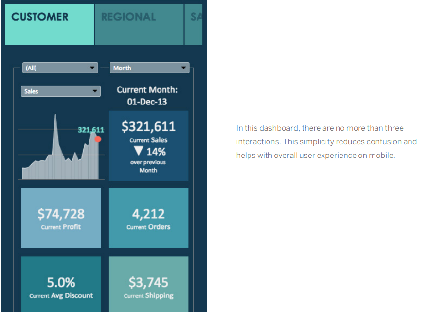
In today's mobile-first world, it's important to design dashboards that look good and function well on a variety of devices. When designing your dashboard, consider how your audience will be consuming the information. If they're primarily using mobile phones, you'll need to prioritize the most important KPIs and optimize the layout for a small screen.
3. Minimize Page Load Times
No one wants to wait for a dashboard to load. Slow load times can be caused by a variety of factors, including the size of your data set and the complexity of your visualizations. To improve load times, you can optimize your data queries, use extracts, and leverage Tableau's built-in performance optimization features.
4. Insights-Based Design
When designing your dashboard layout, consider how your audience will naturally "read" the information. Group related pieces of information together and use visual cues like shading, lines, and white space to guide the eye. The most important information should be placed in the upper left corner of the dashboard, as this is where most viewers will start looking.
5. Minimize Views and Colors
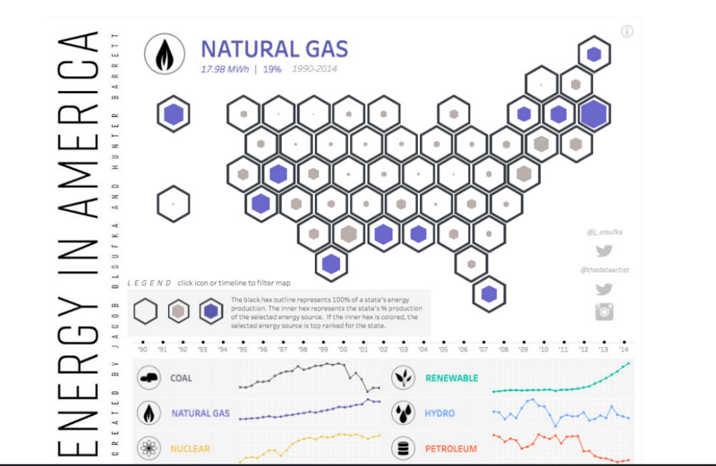
It's tempting to include every relevant piece of data in your dashboard, but this can lead to information overload. Stick to two or three key views, and use color strategically to highlight important trends or patterns. Avoid using too many colors, as this can make your dashboard visually overwhelming.
6. Incorporate Interactive Features
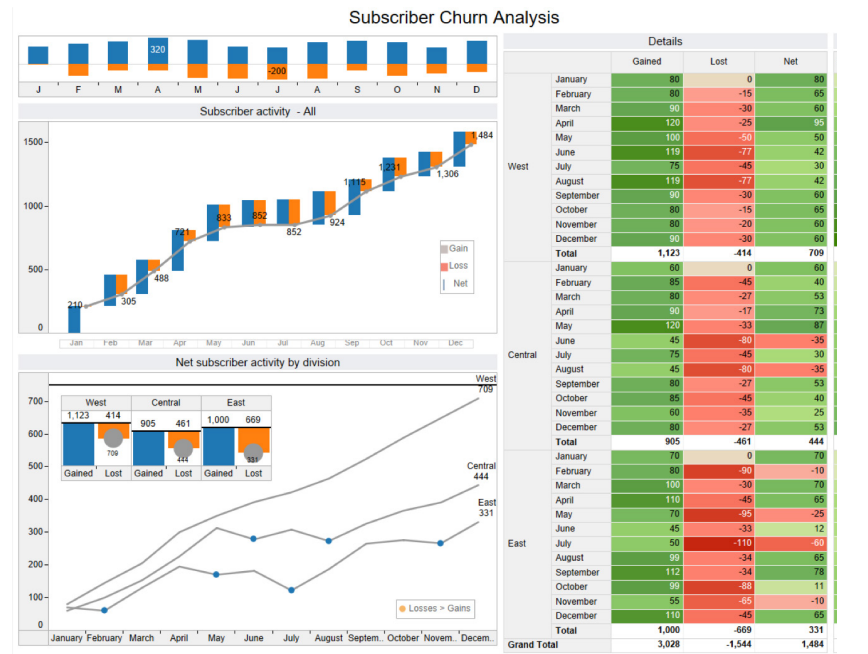
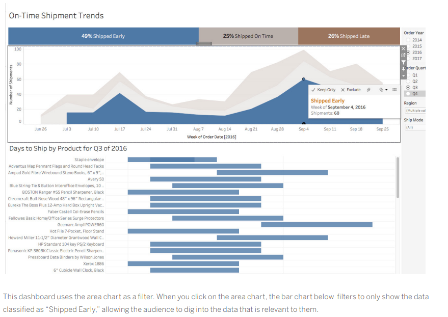
Dashboards are most powerful when they allow users to interact with the data. Use filters, highlights, and actions to let users explore the data in different ways. This will help them to gain a deeper understanding of the information and answer their own questions.
7. Arrange by Hierarchy
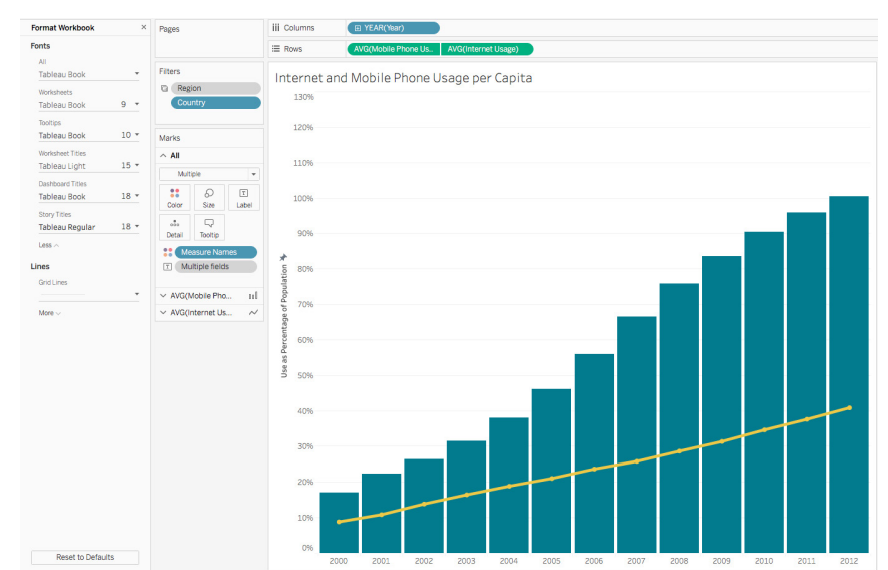
When formatting your dashboard, it's best to start with the largest elements and work your way down to the smallest. This will help you to avoid accidentally overwriting your changes. The hierarchy of dashboard formatting typically follows this order: theme, workbook, and worksheet.
8. Utilize Tooltips and Whitespace for Effective Design
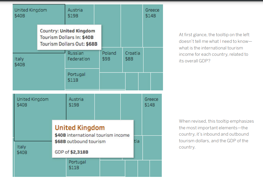
Tooltips are a great way to provide additional information without cluttering up your dashboard. Use tooltips to display detailed data points or to link to external resources. White space is also essential for good dashboard design. It helps to improve readability and make your dashboard less visually overwhelming.
9. Prioritize Clarity
Every element on your dashboard should serve a purpose. If a title, legend, or axis label isn't necessary, get rid of it. Consider using a floating layout to create more white space and improve readability.

10. Ensure Dashboard Effectiveness
Once you've built your dashboard, it's important to test it with your target audience. Ask them how they're using the dashboard and if it helps them answer their questions. Use their feedback to iterate on your design and create dashboards that are truly effective.
By following these best practices, you can create dashboards that are clear, concise, and actionable. Effective dashboards will help your audience understand your data and make better decisions.
How Beinex Can Assist You
Beinex, a premier Tableau partner, provides sustainable analytics solutions to organizations and helps to build superior data visual analytics capabilities internally through our bespoke training programs. Our team of Tableau-certified consultants are real-life Tableau business users who are passionate about Tableau and delivering a world-class experience. Connect with us for a Tableau free trial: www.beinex.com/free-tableau-software
Image source: https://www.tableau.com/learn/whitepapers/10-best-practices-building-effective-dashboards?utm_medium=blog
A dashboard can speak volumes! When the need of the hour demands businesses to rely heavily upon data, dashboards have become an essential tool for communicating insights and informing decisions. But with so much data available, it can be tempting to cram everything onto a single dashboard. This can lead to cluttered, confusing visualizations that fail to communicate effectively. That’s not what an ideal dashboard is supposed to do, right?
Well then, here are some best practices to outweigh the shortcomings.
This blog post will outline ten best practices for building effective dashboards that are clear, concise, and actionable. By following these tips, you can create dashboards that will help your audience understand your data and make better decisions. And as you know, better decisions lead to better business gains.
Related Articles

Beinex Successfully Attains Alteryx Preferred Partner Status
We are delighted to achieve this award with our relentless dedication and unparalleled expertise on the Alteryx platform. With ample product knowledge, technical expertise, and sufficient focus on customer satisfaction, we were able to demonstrate the value that we offer as a partner. Our determination and dedication aided in supplementing our customers with the power to deliver faster and better business outcomes by intelligent decisioning using Alteryx.
 Last year, we were fortunate enough to successfully transform the majority of our clients’ businesses with Analytic Process Automation by quickly automating analytics and the entire data-driven business processes, resulting in quick wins and faster returns on ROI. We were also awarded with Alteryx 2020 Partner of the Year award, Middle East.
With the preferred partner status, we will be able to make even greater collaboration with the Alteryx team, helping us extract its possibilities to the next level.
Alteryx always stands for developing data-driven technical solutions to business problems by empowering its clients to be self-sufficient in handling data analytics and continues to provide unmatched services, like;
Last year, we were fortunate enough to successfully transform the majority of our clients’ businesses with Analytic Process Automation by quickly automating analytics and the entire data-driven business processes, resulting in quick wins and faster returns on ROI. We were also awarded with Alteryx 2020 Partner of the Year award, Middle East.
With the preferred partner status, we will be able to make even greater collaboration with the Alteryx team, helping us extract its possibilities to the next level.
Alteryx always stands for developing data-driven technical solutions to business problems by empowering its clients to be self-sufficient in handling data analytics and continues to provide unmatched services, like;
Last year, we were fortunate enough to successfully transform the majority of our clients’ businesses with Analytic Process Automation by quickly automating analytics and the entire data-driven business processes, resulting in quick wins and faster returns on ROI. We were also awarded with Alteryx 2020 Partner of the Year award, Middle East.
With the preferred partner status, we will be able to make even greater collaboration with the Alteryx team, helping us extract its possibilities to the next level.
Alteryx always stands for developing data-driven technical solutions to business problems by empowering its clients to be self-sufficient in handling data analytics and continues to provide unmatched services, like;
-
- Collecting data from multiple sources for quick analysis and faster insight generation.
- Exploration of data from on-prem databases, the cloud, and big or small data sets, and more.
- Analysis with maps, addressing solutions to deeply understand your customers and locations.
- Augmenting your team’s analytic output to gain insights by using data without any coding or analytics expertise.
- Embracing automation to effectively communicate with your stakeholders and enable intelligent decision-making to drive better, faster business outcomes.

Predictive Analytics in Tableau: A Crystal Ball for Business Success
What is Predictive Analytics?
Predictive analytics is a branch of advanced analytics that uses historical data, statistical algorithms, and machine learning techniques to identify the likelihood of future outcomes based on historical data. The primary goal is to go beyond knowing what has happened to provide the best assessment of what will happen in the future.
Benefits of Predictive Analytics
- Enhanced Decision Making: Make informed decisions based on data-driven insights rather than gut feelings.
- Cost Savings: Optimize resources and reduce waste by predicting demand and managing inventory effectively.
- Risk Management: Identify potential risks and take preventive measures to mitigate them.
- Improved Customer Satisfaction: Anticipate customer needs and preferences, leading to better products and services.
Predictive Analytics Techniques
Predictive analytics techniques offer a wide range of applications powered by various types of models that generate valuable insights. To determine the best predictive analytics techniques for your organization, start with a clearly defined objective. Once you know the specific question you want to answer, you can select the most suitable model.
List of Predictive Analytics Models
- Regression Models: Used to predict continuous outcomes.
- Classification Models: These models categorize data into predefined classes.
- Clustering Models: Group similar data points together based on defined criteria.
- Time Series Models: Analyze data points collected or recorded at specific time intervals to forecast future values.
1. Regression Models in Predictive Analytics
Regression models estimate the relationship between variables, tracking how independent variables impact dependent variables to predict future outcomes. These models range from simple (one independent and one dependent variable) to multiple linear regression (multiple independent variables). Various regression techniques can be applied based on the specific use case.
By defining variable relationships, organizations can conduct scenario or 'what-if' analysis, testing how changes in independent variables affect outcomes.
Application of Regression Models
For example, a company might use a regression model to analyze how product qualities influence purchase likelihood, such as identifying a correlation between blue shirts and higher sales. These insights help refine marketing strategies and product development, optimizing future performance.
2. Classification Models in Predictive Analytics
Classification models categorize data based on historical knowledge. Using a labeled training dataset, the classification algorithm learns correlations between data and labels and then categorizes new data. Popular techniques include decision trees, random forests, and text analytics.
These models are highly adaptable and can be retrained with new data, making them useful across various industries.
Application of Classification Models
For example, banks use classification models to detect fraudulent transactions. By analyzing millions of past transactions, the algorithm identifies patterns indicative of fraud and alerts customers to suspicious activity.
3. Clustering Models in Predictive Analytics
Clustering models group data based on similar attributes. Using a data matrix that associates items with relevant features, the algorithm clusters items with shared features, uncovering hidden patterns. Organizations use clustering models to group customers for personalized targeting strategies.
Application of Clustering Models
A restaurant might cluster customers by location and mail flyers only to those within a certain driving distance of a new location.
4. Time-series Models in Predictive Analytics
Time series models analyze data points in relation to time, making time one of the most common variables in predictive analytics. These models use historical data to predict future metrics. For example, analyzing data from the past year can help forecast the upcoming weeks.
Time series analyses are versatile, used for applications like seasonality analysis (predicting how assets are affected by certain times of the year) and trend analysis (determining asset movements over time).
Application of Time-series Models
Forecasting sales for the next quarter, predicting store visitor numbers, or even determining peak flu seasons.
Predictive Analytics with Tableau
Tableau empowers users to not only visualize their data but also to gain actionable insights through advanced predictive capabilities. Whether you're looking to forecast sales, predict customer behavior, or optimize business operations, Tableau is the right choice.
3 Ways to do Predictive Analytics in Tableau
1. Forecasting in Tableau Desktop
Tableau Desktop offers robust forecasting features that allow users to make data-driven predictions effortlessly. Using exponential smoothing models, Tableau enables you to forecast future data points based on historical trends. Here’s what you can do: Let’s explore the ways to forecast data in Tableau Desktop: • Creating a Forecast: Users can add a forecast to a view by simply dragging a time dimension to the Columns shelf and a measure to the Rows shelf. By right-clicking on the view and selecting "Show Forecast," Tableau generates a forecast based on the selected model. • Customizing Forecasts: Forecast settings can be customized to adjust the prediction length, forecast model, and season length. Users can access these settings through the "Forecast Options" dialog box. • Evaluating Forecasts: Tableau provides a forecast description that includes details about the model, prediction intervals, and underlying statistics. This helps users understand the reliability and accuracy of their forecasts. • Visualizing Forecasts: Forecasts are visualized as shaded areas or lines on the chart, making it easy to compare predicted values with actual data.
2. Bringing R/Python Calculations into Tableau
Integrating R and Python into Tableau Desktop enhances its analytical capabilities, allowing users to perform complex statistical analysis and machine learning tasks. Users can create calculated fields using MODEL calculations, or by using SCRIPT functions that include R or Python scripts to perform custom calculations. These scripts can be used for various purposes, such as regression analysis, clustering, and predictive modeling. Tableau connects to R using Rserve and to Python using TabPy.
3. How to Do Predictive Analytics with Tableau Prep
Tableau Prep enhances your data preparation process by integrating with Einstein Discovery, Salesforce's AI-powered analytics tool. This integration allows you to infuse your data workflows with advanced predictive capabilities. • Einstein Discovery in Tableau Einstein Discovery, part of Salesforce's suite of AI (Artificial Intelligence) tools, is integrated into Tableau to provide advanced predictive analytics capabilities. In Tableau Prep, Einstein Discovery can be used to build and integrate predictive models directly within the data preparation workflow. This feature is available in Tableau Desktop as well. • Generate predicted values by integrating R/Python in Tableau Prep Tableau Prep allows for the integration of R and Python to perform advanced data transformations and generate predicted values.
Here's how you can do it: • Script Steps:
- Tableau Prep includes a "Script" step that lets users run R or Python scripts as part of their data flow.
- This step can be used to perform complex transformations, calculations, and predictions.
- Similar to Tableau Desktop, Tableau Prep connects to R using Rserve and to Python using TabPy.
- Users need to set up these servers and connect them to Tableau Prep to execute scripts.
- Users can import trained models from R or Python into Tableau Prep.
- The "Script" step allows these models to be applied to the data, generating predicted values as part of the data preparation process.
- Using R and Python, users can create dynamic and flexible data preparation workflows that include predictive analytics.
- This enhances the overall data preparation process by integrating advanced analytical techniques.
Real-life Scenarios/ Use cases of Predictive Analytics
Predictive analytics can be applied in numerous business scenarios to enhance decision-making, efficiency, and customer satisfaction. Here are some real-life examples:
- Customer Churn Prediction: • Scenario: A telecom company wants to reduce the number of customers leaving for competitors. • Application: By analyzing customer usage patterns, support interactions, and billing history, the company can predict which customers are at risk of churning and take proactive measures, such as targeted promotions or personalized outreach.
- Fraud Detection: • Scenario: A financial institution wants to identify fraudulent transactions. • Application: By examining transaction histories, user behavior, and other data points, predictive models can flag suspicious activities in real-time, allowing for immediate investigation and action.
- Sales Forecasting: • Scenario: A manufacturing company needs to predict future sales to plan production and manage resources. • Application: Leveraging past sales data, market trends, and economic indicators, the company can generate accurate sales forecasts to inform production schedules and supply chain management.
- Marketing Campaign Optimization: • Scenario: A marketing team wants to improve the effectiveness of their campaigns. • Application: Predictive analytics can help segment customers based on their likelihood to respond to different types of campaigns, enabling more targeted and effective marketing efforts.
- Risk Management: • Scenario: An insurance company needs to assess risk for new policy applicants. • Application: By analyzing historical claims data and applicant information, the company can predict the likelihood of future claims and set premiums accordingly.
Tableau offers a powerful platform for integrating predictive analytics into your data strategy. With its robust forecasting capabilities, seamless integration with R and Python, and advanced features in both Tableau Desktop and Tableau Prep, you can transform raw data into actionable insights. Whether you are aiming to predict future trends, optimize operations, or make data-driven decisions, Tableau equips you with the tools needed to gain the full potential of your data. To know more, connect with us: https://www.beinex.com/tableau-beinex
Strategic Insights with Tableau Pulse: Real-Time Insights for Every Team
Setting Up Metrics Is a Breeze
Configuring metrics in Tableau Pulse takes just minutes. Whether it’s setting up your own custom metrics or utilizing pre-defined ones, the process is straightforward and user-friendly. And once set up, the visuals, descriptions, and insights are generated automatically, enabling team members to stay updated on performance with ease.
Pro Tip: You can also customize existing metrics to meet specific goals. For example, a custom metric was developed to track interactions generated by teams in the field, with a target of reaching a high engagement level within a set timeframe. This tailored approach has streamlined the process of monitoring performance and recognizing accomplishments.
Integrating Data into the Flow of Work
Tableau Pulse effortlessly integrates data into the tools you use daily, like Slack or email, allowing you to stay informed without disrupting your workflow. Each morning, you can start your day by reviewing the Pulse Digest in Slack, which provides a snapshot of key metrics, trends, and insights.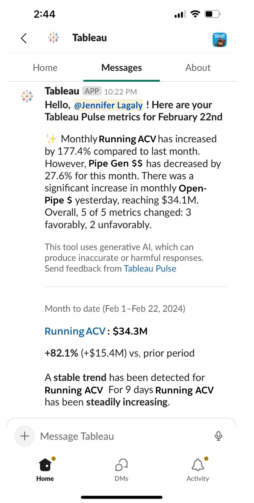 Source:https://www.tableau.com/blog/how-tableau-chief-revenue-officer-uses-tableau-pulse
Decipher Trends with Intelligent Metrics
Monitoring metrics is not solely focused on tracking numbers; it also involves identifying opportunities and addressing challenges. With AI-generated summaries of key metrics like Annual Contract Value (ACV) and Pipeline Generation, Tableau Pulse helps you understand the context behind the data. The live updates ensure that any changes are reflected immediately, providing real-time insights that are always up-to-date.
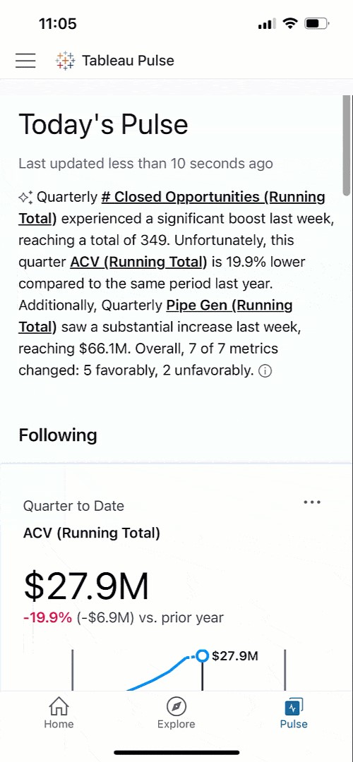
Get a Clear View of Business Performance
Tableau Pulse’s intuitive visualizations and natural language summaries make it easy to compare current and past performance, helping you identify areas that may need closer attention. For instance, if Pipeline Generation is up 10.9% year over year but showing signs of slowing, Pulse allows you to dig deeper, understand the cause, and take timely action to keep growth on track.
Tableau Pulse is available on mobile, and these insights are accessible wherever you are, making it easy to stay connected to your data on the go.
Analyze Business Segments with Precision
Tableau Pulse enables detailed analysis of various business segments, offering a clear view of how different teams and departments contribute to overall success. With just a click, you can explore revenue trends, track team performance, and understand the impact of different strategies across the organization.This level of analysis, which once required hours of manual work, is now at your fingertips. You can easily filter by segment, product, or deal size to gain nuanced insights that drive better decision-making.
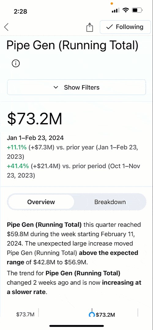
Ask Smart, Data-Driven Questions
Powered by AI, Tableau Pulse does more than just report numbers. It actively helps you explore trends by suggesting relevant questions and providing insights in clear, understandable language. Whether it’s identifying which sales regions are thriving or where potential issues may arise, Pulse empowers you to make data-driven decisions with confidence.
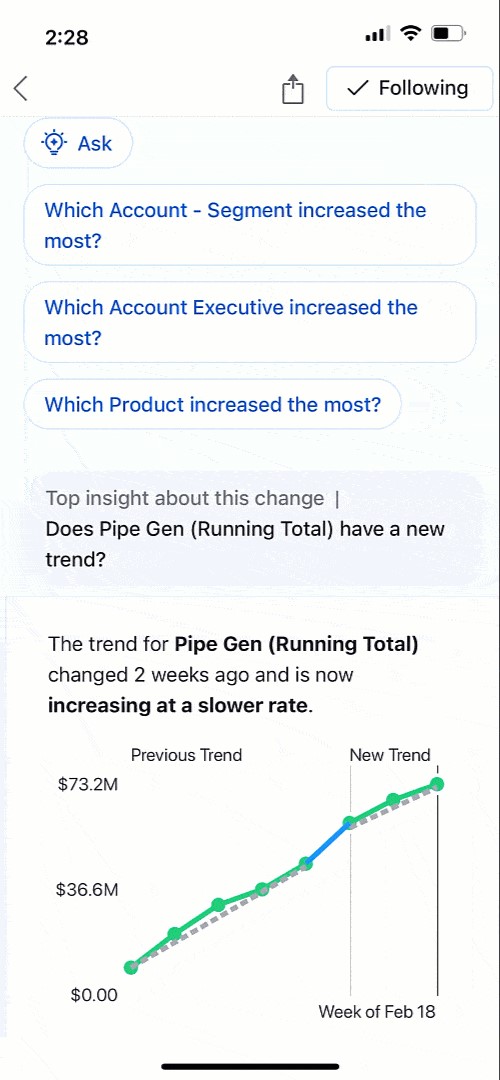
Foster a Data-Driven Culture
Tableau Pulse is designed to be accessible to everyone, regardless of their level of data expertise. By integrating insights into tools like Slack, Pulse ensures that critical information is always at hand, promoting a culture of informed decision-making across the organization. This democratization of data means that every team member can contribute meaningfully to achieving our shared goals.
Tableau Pulse has truly transformed how we approach strategic decisions, placing personalized, contextually relevant insights directly in our workflow. It empowers everyone to be data-driven, aligning efforts towards achieving your company objectives and navigating the dynamic challenges of business with agility and insight.
Want to Transform Your Business?
Watch our demo to see how Tableau Pulse, powered by Tableau AI, can elevate your business strategy, and start your free Tableau Pulse trial today: https://www.beinex.com/free-tableau-software/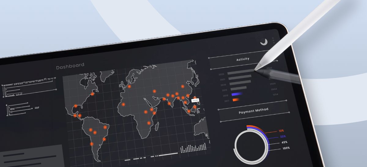
Top 4 Enterprise Data Visualization Tools: A Complete Guide
What is Data Visualization?
Data visualization is the process of representing data in a graphical or spatial format, allowing for easy visual analysis without technical jargon. Unlike raw numerical data, visual representations like charts, graphs, and maps help quickly identify patterns, trends, and anomalies, facilitating faster and more accurate insights.
Benefits of Data Visualization
Understanding raw data can be challenging due to its complexity. Data visualization addresses this by:
- Simplify Data Interpretation: Converting raw data into charts and graphs makes it easier to understand underlying patterns and relationships.
- Identify Trends and Anomalies: Visual formats highlight trends and anomalies that might be missed in numerical data.
- Improve Accessibility: Data visualization makes information accessible to a broader audience, including those without strong analytical skills, thus improving data-driven decision-making across departments.
- Advanced Data Storytelling: Effective visualization techniques turn data into compelling stories that facilitate better communication and understanding.
What Are Data Visualization Tools?
Data visualization tools provide designers with an efficient way to create visual representations of large data sets. When dealing with data sets that include hundreds of thousands or millions of data points, automating the visualization process simplifies the designer's job considerably.
Key Benefits of Data Visualisation Tools
- Dashboards: To monitor and analyze key performance indicators (KPIs) and metrics in real-time.
- Annual Reports: To present data-driven insights to stakeholders in a clear and engaging manner.
- Sales and Marketing Materials: To showcase trends, performance, and forecasts to potential clients and customers.
- Investor Slide Decks: To communicate financial health and growth prospects effectively.
- General Information Interpretation: To make complex data understandable for decision-making processes in virtually any context where quick interpretation of information is necessary.
A Compact List of Top Data Visualization Tools
Here are the top enterprise data visualization tools for creating compelling visualizations:
- Tableau
- Google Charts
- Zoho Analytics
- Data Wrapper
Tableau
Tableau is a top-tier platform recognized for its user-friendly interface. It adeptly integrates data from multiple sources to create dynamic and visualisations.
Its comprehensive suite of products spans desktop applications, robust server solutions, and flexible web-hosted environments, empowering organizations to drive informed decision-making and achieve actionable insights across their operations.
Connect with us for a free demo: https://www.beinex.com/free-tableau-software
Who Should Use Tableau?
Data scientists and analysts who need to create custom dashboards and advanced visualizations will benefit from Tableau.Key Features of Tableau
• User-Friendly Interface: Easy to learn and navigate, making it accessible for all skill levels. • Mobile-Friendly: Create reports and dashboards optimised for mobile devices, allowing you to access and analyse data on the go. • High Performance: Efficiently handles large datasets, ensuring seamless analysis without performance issues. • Interactive Visualizations: Build interactive and dynamic visualisations, allowing deeper data exploration. • Integration Capabilities: Integrates well with various data sources and other business applications, enhancing data connectivity. • Real-Time Data Updates: Provides real-time data updates, ensuring you have the most current insights. • Collaboration Tools: Facilitates easy sharing and collaboration on reports and dashboards within teams. • Customizable Dashboards: Offers highly customisable dashboards to meet specific business needs and preferences. • Advanced Analytics: Supports advanced analytics features, including trend analysis, forecasting, and statistical summaries. • Security: Ensures data security with robust access controls and permissions.
Learn more: https://www.beinex.com/tableau-partnership-and-consulting-services/Google Charts
Google Charts is a free tool for creating interactive data visualisations, accessible through most web browsers. It supports various data sources, including spreadsheets and databases.
Who Should Use Google Charts?
Students, universities, and businesses needing fundamental charts will find Google Charts useful.Key Features of Google Charts
• User-Friendly Interface: Easy to use with a straightforward setup process. • Wide Range of Chart Types: Supports various chart types, including line, bar, pie, scatter, and more. • Customizable: Offers extensive customization options to tailor charts to specific needs, including colors, fonts, and annotations. • Interactive Charts: Allows for interactive elements such as tooltips, zooming, and panning. • Cross-Platform Compatibility: Ensures charts work seamlessly across different browsers and devices. • Dynamic Data Updates: Supports real-time data updates, keeping charts current with live data feeds. • Integration with Google Services: Easily integrates with other Google services such as Google Sheets and Google Analytics. • Embedding Capabilities: Simple embedding in websites and applications with a few lines of code. • Data Export Options: Provides options to export charts in various formats, including PNG, SVG, and PDF. • Open Source: Free and open source, allowing for extensive customization and community support. • Support for Multiple Data Formats: Works with various data formats, including JSON, CSV, and Google Spreadsheets. • Accessibility Features: These include features to make charts accessible to all users, including screen reader support. • Responsive Design: Ensures charts are responsive and adapt to different screen sizes and resolutions. • Powerful API: Provides a robust API for developers to create complex visualisations and integrate them into applications.
Zoho Analytics
Zoho Analytics combines business intelligence and reporting services, allowing for swift data visualisation. It is user-friendly and integrates well with other Zoho products.Who Should Use Zoho Analytics?
Analytics and sales teams, marketing teams, project managers, and more can benefit from Zoho Analytics.Key Features of Zoho Analytics
• User-Friendly Interface: Intuitive design that simplifies data analysis and visualisation. • Wide Range of Data Sources: Connects to various data sources, including databases, cloud storage, spreadsheets, and other business applications. • Advanced Analytics: Offers features such as predictive analytics, AI-powered insights, and what-if analysis. • Interactive Dashboards: Create and customise interactive dashboards with drag-and-drop ease. • Collaboration Tools: Facilitate sharing and collaboration on reports and dashboards within teams. • Embedded Analytics: Embed reports and dashboards into websites, applications, and portals. • Automated Data Sync: Schedule data imports and synchronise data regularly. • Customizable Visualizations: Provides a variety of chart types and extensive customisation options for data visualisations. • Data Blending: Combine data from multiple sources for comprehensive analysis. • AI-Driven Insights: Leverages AI to offer advanced analytical insights and pattern detection. • Real-Time Data Access: Supports real-time data integration and live dashboards. • Mobile Access: Access and interact with reports and dashboards on mobile devices. • Data Security: Ensures robust security features, including role-based access control, encryption, and compliance with industry standards. • Report Scheduling: Automate the distribution of reports through scheduled emails. • Integrations with Other Zoho Apps: Seamlessly integrate with other Zoho applications for enhanced functionality. • API Support: Provides APIs for developers to integrate analytics capabilities into custom applications. • Data Preparation Tools: These include tools for data cleaning, transformation, and enrichment.
Data Wrapper
Data Wrapper is ideal for media enterprises and allows for the quick creation of charts, maps, and plots. It is completely web-based and easy to use.Who Should Use Data Wrapper?
Data Wrapper can benefit media, news publications, government institutions and finance companies. It is especially useful for creating visually appealing and easily understandable visualisations.Key Features of Data Wrapper
• User-Friendly Interface: Intuitive and easy to use, requiring no coding skills to create professional charts and maps. • Wide Range of Chart Types: Supports a variety of chart types, including bar, line, pie, scatter plots, and maps. • Customisable Visualizations: Offers extensive customisation options for colors, labels, and annotations to match branding and presentation needs. • Responsive Design: Ensures charts and maps are responsive and adapt to different screen sizes and devices. • Interactive Elements: Allows for adding interactive elements like tooltips, hover effects, and clickable legends. • Real-Time Data Integration: Supports live data updates, enabling real-time visualisation. • Embedding Capabilities: Easily embed charts and maps into websites and blogs with simple code snippets. • Export Options: This option lets users download visualisations in various formats, including PNG, PDF, and SVG. • Accessibility: Committed to creating accessible visualisations with features that support screen readers and keyboard navigation. • Data Security: Ensures data security with robust privacy policies and compliance with industry standards. • Collaboration Tools: Allows for team collaboration with shared projects and editing capabilities. • Support for Multiple Languages: Offers multi-language support for creating visualisations in different languages. • Easy Data Import: Supports importing data from various sources, including CSV files, spreadsheets, and web links. • API Integration: Provides APIs for integrating Data wrapper with other applications and services. • Customizable Templates: Use and modify templates to maintain consistency in visualisations. • Annotation Features: Add rich text annotations directly to charts and maps to provide additional context and information.
Always Go for the Best Tool
By choosing the right data visualisation tool, organizations can discover the full potential of their data, making complex information accessible and actionable for everyone. This empowers businesses to make data-driven decisions that drive growth and innovation.

Top 5 Benefits of Google Cloud Platform: Be Ready to be Blown Away by Google Cloud Offerings
What is Google Cloud Platform (GCP)?
GCP is not just a cloud solution; it's a comprehensive package that integrates Infrastructure as a Service (IaaS), Platform as a Service (PaaS), and Software as a Service (SaaS). It's your all-in-one place for managing projects, handling resources, storing data securely, running applications effortlessly, processing vast datasets efficiently, and streamlining development workflows.
What sets GCP apart is its versatility. Whether you're a startup with a dream or an enterprise with complex demands, GCP is designed to make your cloud experience smoother and more efficient. It's not just about computing in the cloud; it's about transforming how you work, collaborate, and innovate.
Why is GCP gaining immense popularity? The answer lies in its ability to adapt and serve many functions. It's the go-to platform for managing projects seamlessly, storing and retrieving data efficiently, running applications flawlessly, and tackling large-scale data processing tasks with finesse.
Google Cloud Platform (GCP): Top Five Benefits
GCP simplifies the complexities of cloud computing, offering an extensive array of solutions catering to the unique needs of businesses and individuals. Whether you're a tech-savvy developer or a business owner seeking streamlined operations, GCP covers you. Let’s take a look at the top five benefits of GCP:
- Comprehensive Suite of Services: Shaping Tools to Your Needs
- Cost Efficiency: Hardware and Software Overheads
- Robust Security: Trust Google's Expertise in Cloud Computing
- Scalability: Unlimited Business Growth
- Customization: GCP Meets Your Unique Requirements
Google Cloud Platform provides an extensive array of services, ensuring that businesses can find the perfect tools for their unique requirements. From software development to app development, GCP's "cloud native" approach guarantees applications that seamlessly leverage the cloud's scalability and flexibility. The platform is backed by Google's world-class infrastructure, ensuring optimal availability and performance.
GCP empowers businesses to slash hardware and software costs significantly. Organizations can sidestep hefty investments in infrastructure and maintenance through managed environments for development and cloud-native applications. The pay-as-you-go pricing model further allows businesses to manage costs effectively, with additional training and support resources ensuring maximum returns on investment.
Leverage Google Cloud Platform's robust security features to safeguard your data effectively. With tools like Identity and Access Management, Data Loss Prevention, and Security Health Analytics, businesses can confidently ensure the safety and integrity of their data within the GCP ecosystem.
Google Cloud Platform offers unparalleled scalability, allowing businesses to develop and deploy applications without concerns about underlying infrastructure. Ideal for those embracing a cloud-native approach, GCP harnesses Google's top-tier data centers and global network, enabling businesses to scale usage up or down as needed without incurring additional costs.
The high level of customization afforded by Google Cloud Platform makes it a powerful tool for businesses of all sizes. Whether for software development, app creation, or transitioning to the cloud, GCP's flexibility ensures it can be configured to meet the specific needs of any business, offering versatility and adaptability.
If your business is poised for growth, the Google Cloud Platform is invaluable. With diverse features and benefits, GCP enhances efficiency, communication, collaboration, and security making your business a worthwhile investment.
Bonus Section: Exploring Google Cloud Platform Services for Business Enhancement
Google Cloud Platform goes beyond conventional cloud services, offering a comprehensive suite of features that can revolutionize how businesses operate and innovate. Whether you're a startup or an established enterprise, GCP has the tools to propel your business forward.
Improved Features: Google Cloud offers collaborative project features, unlimited data, and better security, providing an upgraded experience compared to Google Drive.
Unlimited Data: GCP's unlimited data storage is particularly beneficial for businesses involved in large projects, such as video games or movies.
Gather Data Effectively: BigQuery provides real-time analytics, allowing businesses to make informed decisions based on up-to-the-minute data.
Take Advantage of Tutorials: Google Cloud offers many resources, including tutorials and support forums, ensuring businesses can effectively utilize the platform's capabilities.
Advanced Services: GCP caters to specific industries, offering tailored services for live streamers, healthcare professionals, telecommunications, and retailers.
Make Websites and Apps: GCP's app creator and website hosting simplify digital endeavors for businesses, providing special deals for popular site builders like WordPress.
Train AI: Google Cloud stands out with its AI/ML features, enabling businesses to develop chatbots, crunch data, and enhance overall data gathering and generation.
Beinex Offerings
Beinex, a Google Cloud Platform service partner, assists organisations in advancing their digital transformation initiatives by leveraging the cloud infrastructure, data analytics and AI capabilities of Google Cloud Platform. We offer our clients expert guidance in implementing future-ready solutions and utilising Google Cloud for better data-driven decisions, tackling business challenges and fostering competitiveness, efficiency, and growth.